Wondering how your logo performs? 🧐
Get professional logo reviews in seconds and catch design issues in time.
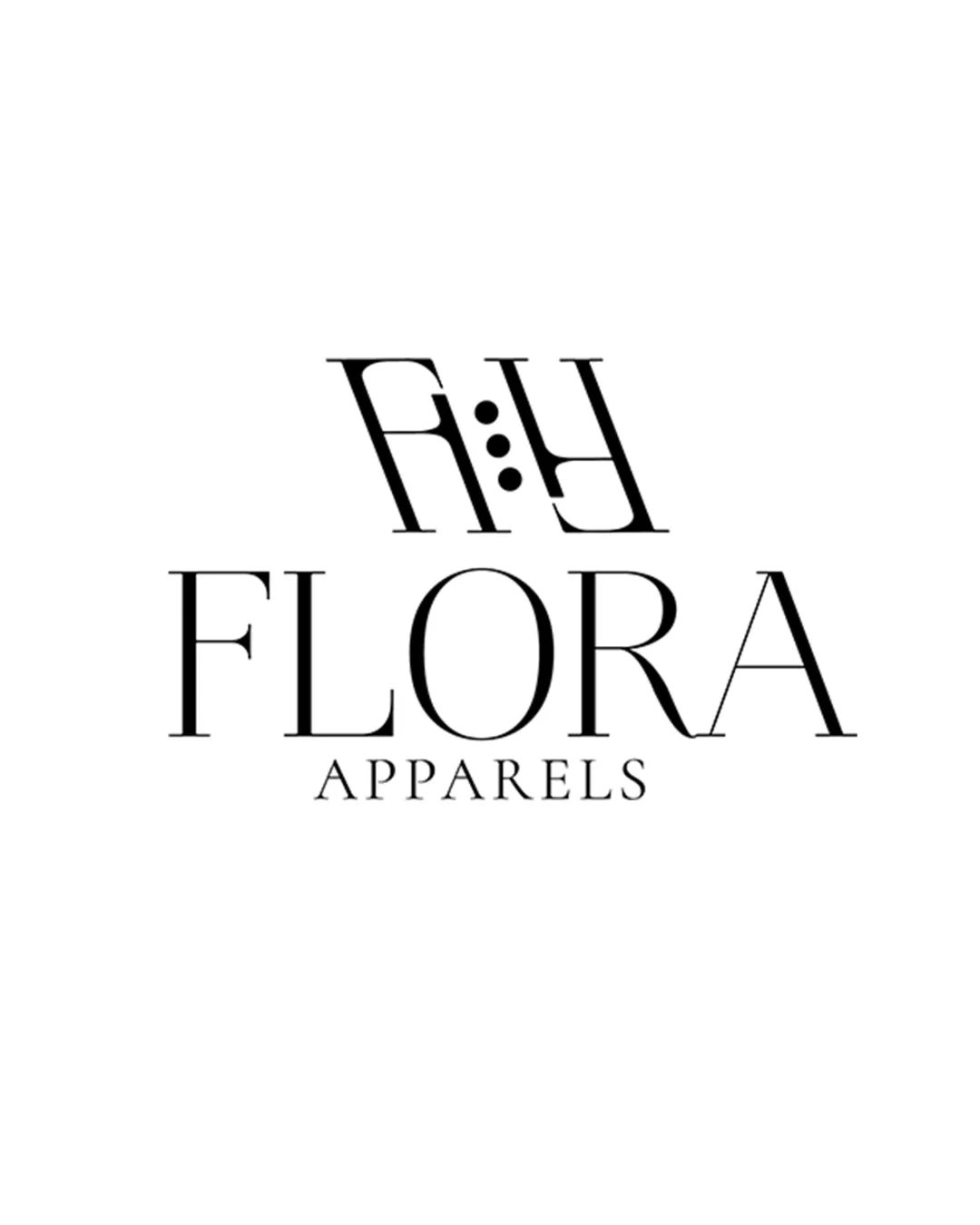
Try it Now!Logo review of FLORA APPARELS
 Logo analysis by AI
Logo type:
Style:
Detected symbol:
Detected text:
Business industry:
Review requested by Pekan
**If AI can recognize or misinterpret it, so can people.
Structured logo review
Legibility
![]() The wordmark 'FLORA APPARELS' is highly readable due to the spacious serif font.
The wordmark 'FLORA APPARELS' is highly readable due to the spacious serif font.![]() Clear separation between the two words.
Clear separation between the two words.
![]() The 'FH' monogram above the wordmark is somewhat difficult to interpret at a glance, especially with the stylized vertical dots.
The 'FH' monogram above the wordmark is somewhat difficult to interpret at a glance, especially with the stylized vertical dots.
Scalability versatility
![]() Simple black-and-white palette aids in scalability across different backgrounds.
Simple black-and-white palette aids in scalability across different backgrounds.![]() Works well on flat applications such as tags or printed materials.
Works well on flat applications such as tags or printed materials.
![]() Thin serif lines, particularly in the wordmark, may lose visibility at very small sizes like embroidery or favicons.
Thin serif lines, particularly in the wordmark, may lose visibility at very small sizes like embroidery or favicons.![]() The detail in the monogram (dots and stylized letterforms) may not reproduce crisply at tiny scales.
The detail in the monogram (dots and stylized letterforms) may not reproduce crisply at tiny scales.
200x250 px
100×125 px
50×62 px
Balance alignment
![]() The elements are aligned centrally, giving a formal structure.
The elements are aligned centrally, giving a formal structure.
![]() The heavy and busy monogram on top feels disconnected from the refined, airy wordmark below.
The heavy and busy monogram on top feels disconnected from the refined, airy wordmark below.![]() Visually, the weight distribution is somewhat top-heavy, making the mark less harmonious.
Visually, the weight distribution is somewhat top-heavy, making the mark less harmonious.

Originality
![]() The use of evenly spaced dots within the monogram adds a unique twist.
The use of evenly spaced dots within the monogram adds a unique twist.
![]() The overall structure of stacked monogram above a serif wordmark is somewhat common in fashion branding.
The overall structure of stacked monogram above a serif wordmark is somewhat common in fashion branding.
Logomark wordmark fit
![]() Monogram is distinct and visually separated from the wordmark.
Monogram is distinct and visually separated from the wordmark.
![]() Different font treatments and visual densities between the monogram and the wordmark make them feel disconnected.
Different font treatments and visual densities between the monogram and the wordmark make them feel disconnected.![]() The monogram’s complexity contrasts awkwardly with the clean wordmark, reducing cohesiveness.
The monogram’s complexity contrasts awkwardly with the clean wordmark, reducing cohesiveness.
Aesthetic look
![]() The serif font choice is elegant and appropriate for a fashion brand.
The serif font choice is elegant and appropriate for a fashion brand.![]() Minimal color palette keeps the design modern and upscale.
Minimal color palette keeps the design modern and upscale.
![]() The monogram adds a cluttered look compared to the otherwise sophisticated composition.
The monogram adds a cluttered look compared to the otherwise sophisticated composition.![]() Visual unity could be enhanced for a more premium look.
Visual unity could be enhanced for a more premium look.
Dual meaning and misinterpretations
![]() No inappropriate symbolism detected.
No inappropriate symbolism detected.![]() Monogram and typography are both suitable for the intended industry.
Monogram and typography are both suitable for the intended industry.
Color harmony
![]() Black and white palette is timeless, luxurious, and universally applicable.
Black and white palette is timeless, luxurious, and universally applicable.![]() No color clutter or contrast issues.
No color clutter or contrast issues.
Black
#000000
White
#FFFFFF