Wondering how your logo performs? 🧐
Get professional logo reviews in seconds and catch design issues in time.
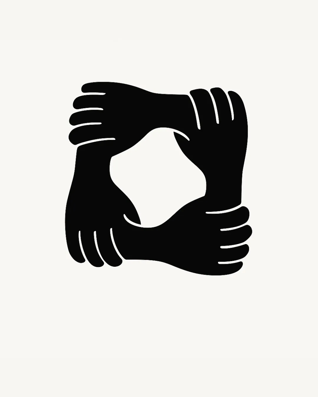
Try it Now!Logo review of four hands grasping each other's wrists to form a ..
 Logo analysis by AI
Logo type:
Style:
Detected symbol:
Negative space:
Business industry:
Review requested by Dev00134
**If AI can recognize or misinterpret it, so can people.
Structured logo review
Scalability versatility
![]() Bold and simple design ensures clarity at both small and large sizes
Bold and simple design ensures clarity at both small and large sizes![]() Works equally well on posters, business cards, and digital icons
Works equally well on posters, business cards, and digital icons![]() No fine lines or unnecessary detail, suitable for embroidery or signage
No fine lines or unnecessary detail, suitable for embroidery or signage
200x250 px
100×125 px
50×62 px
Balance alignment
![]() Symmetrical arrangement delivers a sense of unity and balance
Symmetrical arrangement delivers a sense of unity and balance![]() Four elements are evenly distributed around the center
Four elements are evenly distributed around the center
![]() Slight variability in hand placement may cause very minor irregularity in perceived weight
Slight variability in hand placement may cause very minor irregularity in perceived weight

Originality
![]() Clever use of four intersecting hands to communicate partnership and unity
Clever use of four intersecting hands to communicate partnership and unity![]() Negative space in the center forms a unique geometric shape
Negative space in the center forms a unique geometric shape![]() Avoids generic handshake or heart symbols
Avoids generic handshake or heart symbols
![]() Abstract human hands forming a square is a concept seen in some charity/community imagery, but the execution here is more creative than most
Abstract human hands forming a square is a concept seen in some charity/community imagery, but the execution here is more creative than most
Aesthetic look
![]() Minimal and modern visual style
Minimal and modern visual style![]() Monochrome palette looks elegant and timeless
Monochrome palette looks elegant and timeless![]() Clean curves and spacing create visual harmony
Clean curves and spacing create visual harmony
Dual meaning and misinterpretations
![]() No inappropriate or confusing secondary shapes detected
No inappropriate or confusing secondary shapes detected
Color harmony
![]() Black and white palette enhances contrast and broad applicability
Black and white palette enhances contrast and broad applicability![]() No unnecessary color distractions
No unnecessary color distractions
Black
#000000
Alabaster
#F8F7F3