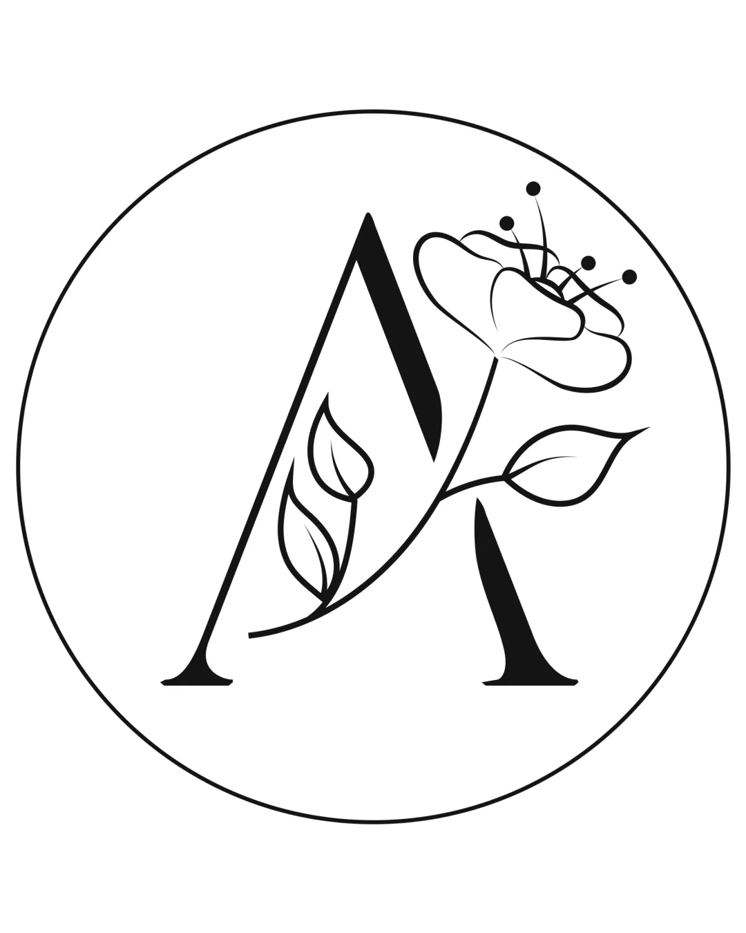
A monogram and flower logo logo review
3.8/5
Logo score Monogram category

A monogram and flower logo

creative636225 Essential logo review

A visually appealing, context-fitting monogram with strong concept; main improvement is ensuring all details are preserved in miniature or low-quality reproduction.

This monogram shows solid execution, supported by distinctive construction and visual balance; improving clarity at smaller sizes is the clearest next step.

Monogram Line Art Florist
5/5
Legibility
4/5
Originality
4/5
Balance
3/5
Scale
Your next steps

What to fix first

Focus on the changes that matter. Keep what makes the logo work.

1

flower and thin lines in monogram, especially top right area

Test at small sizes and thicken the thinnest lines if detail is lost or legibility drops.

High priority Visible issue Medium effort

The flower illustration and some line elements are delicate and thin, making them susceptible to detail loss when scaled down.

See the category review

Detailed review

Logo performance breakdown

5/5

Brief & logo match

The monogram and integrated floral illustration clearly express a boutique flower shop, supporting themes of freshness and personalization; minor line thickness refinement may help in practical use.

5/5

Legibility

  • 'A' is cleanly legible with harmonious floral embellishment.
5/5

Misinterpretations

  • No negative or confusing alternate interpretations.
4/5

Originality

  • Integration of floral elements into an 'A' is distinctive and relevant to context.
4/5

Balance alignment

Available in Advanced logo reviews
3/5

Scalability

Available in Advanced logo reviews
Try your own review

Wondering how your logo performs?

Get a clear logo score, key risks, and priority fix ideas before your client or audience sees it.

Review my logo