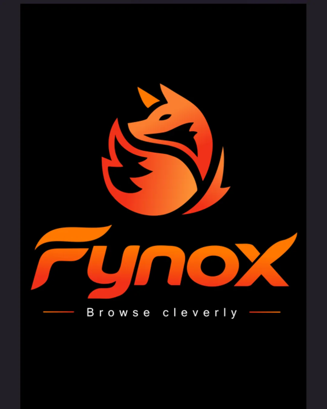
Fynox Browse cleverly logo review
4.2/5
Logo score
Logo review of

Fynox Browse Cleverly

A visually strong, modern combination mark with good synergy between symbol and wordmark; minor refinements will ensure optimal versatility.

Combination Mark Modern Gradient, Tech-inspired Technology
4.5/5
Legibility
4/5
Originality
5/5
Misread
4.5/5
Balance
4/5
Scale
Your next steps

What to fix first

Focus on the changes that matter. Keep what makes the logo work.

1

Prepare monotone and small-scale responsive versions without gradients or tagline.

High priority Medium effort

Gradient and tagline will not hold up in all contexts; single-color versions improve flexibility.

Ensures strong reproduction across all use-cases and sizes.

2

Slightly refine wordmark-legibility, especially the 'F' character.

Medium priority Low effort

Minor modification could balance uniqueness and recognition for new viewers.

Boosts instant readability and type clarity without losing distinctiveness.

Detailed review

Logo performance breakdown

Not scored

Brief & logo match

From the original review
  • Relevance To Browsing/tech

    Visually aligns well with tech and browsing themes via the fox and tagline.

  • Personality

    Evokes cleverness, speed, and approachability.

4.5/5

Legibility

  • Wordmark is bold and clear with distinctive custom typography.
  • Tagline is readable at moderate sizes.
  • Custom 'F' may slightly hinder instant readability for some viewers.
4/5

Originality

  • Fox mark is uniquely stylized and energetic.
  • Custom type gives distinctive personality.
  • Fox imagery is common in browser/tech sectors, slightly reducing uniqueness.
4/5

Color harmony

  • Vibrant orange gradient draws attention and fits the 'fox' concept.
  • High contrast with black background aids legibility.
  • Gradient may cause color shift issues on some backgrounds or in print.
Orange#FF6C0A
Light Orange#FF981E
Black#000000

Estimated colors. Use the original design file for exact values.

Create a full color palette using these colors

Create new palette

4.5/5

Balance alignment

  • Good alignment between logomark, wordmark, and tagline.
  • Optical weight is well-managed, creating a unified appearance.
  • Tagline spacing could be slightly tighter to reinforce visual connection.
Uploaded logoAlignment guide overlay

Inspect spacing with the guide. Optical balance may differ from geometric centering.

4/5

Scalability

  • Logomark uses simple, bold forms suitable for scaling.
  • Wordmark remains readable at most practical sizes.
  • Fine gradients may be lost at very small sizes.
  • Tagline is likely to become illegible when scaled down significantly.
Uploaded logo at 200 pixels wide
200 × 250 px
Uploaded logo at 100 pixels wide
100 × 125 px
Uploaded logo at 50 pixels wide
50 × 63 px

Compare the detail at different sizes. Labels show the full image dimensions.

5/5

Misinterpretations

  • No plausible negative or confusing alternate readings.
4.5/5

Symbol & text fit

  • Logomark and wordmark share color and stylistic elements.
  • Both evoke a sense of motion and cleverness.
  • Slight style disconnect between geometric logomark and rounded wordmark curves.

Black & white

Does the shape still work without color?

These tests are available only for logos uploaded in vector (SVG) format.

Background contrast

Find the surfaces where your logo stays clear.

These tests are available only for logos uploaded in vector (SVG) format.

Blur & silhouette

A 3px blur softens fine details so you can check whether the overall shape stays recognizable. If key gaps close or elements merge, the logo may rely too heavily on detail.

These tests are available only for logos uploaded in vector (SVG) format.

Try your own review

Wondering how your logo performs?

Get a clear logo score, key risks, and priority fix ideas before your client or audience sees it.

Review my logo