gaya logo review
3.7/5
Logo score Abstract and illustrative category

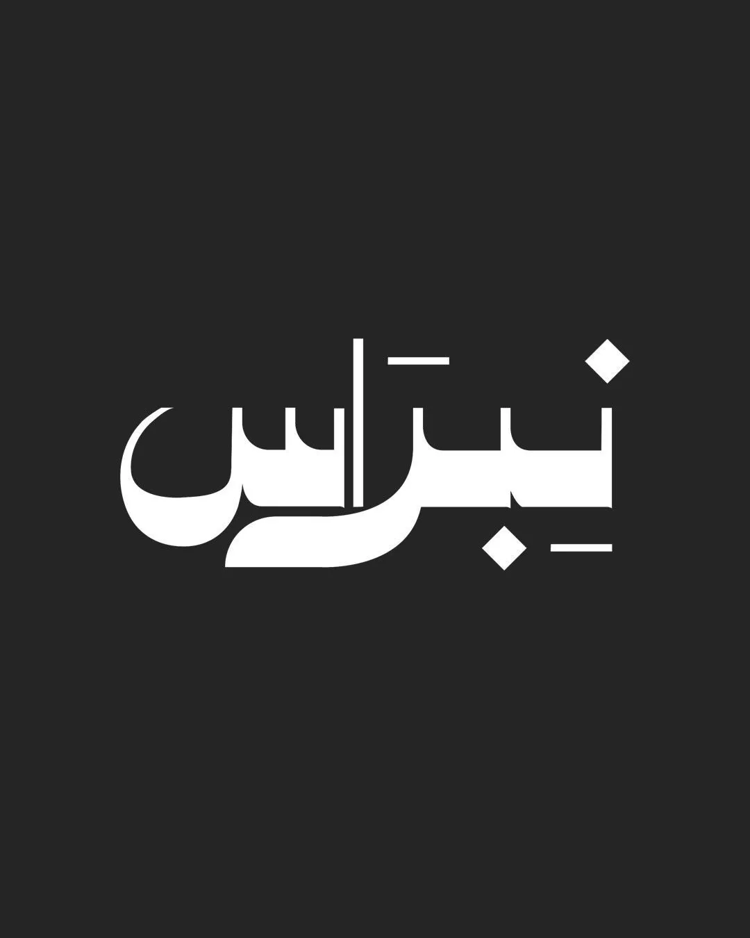
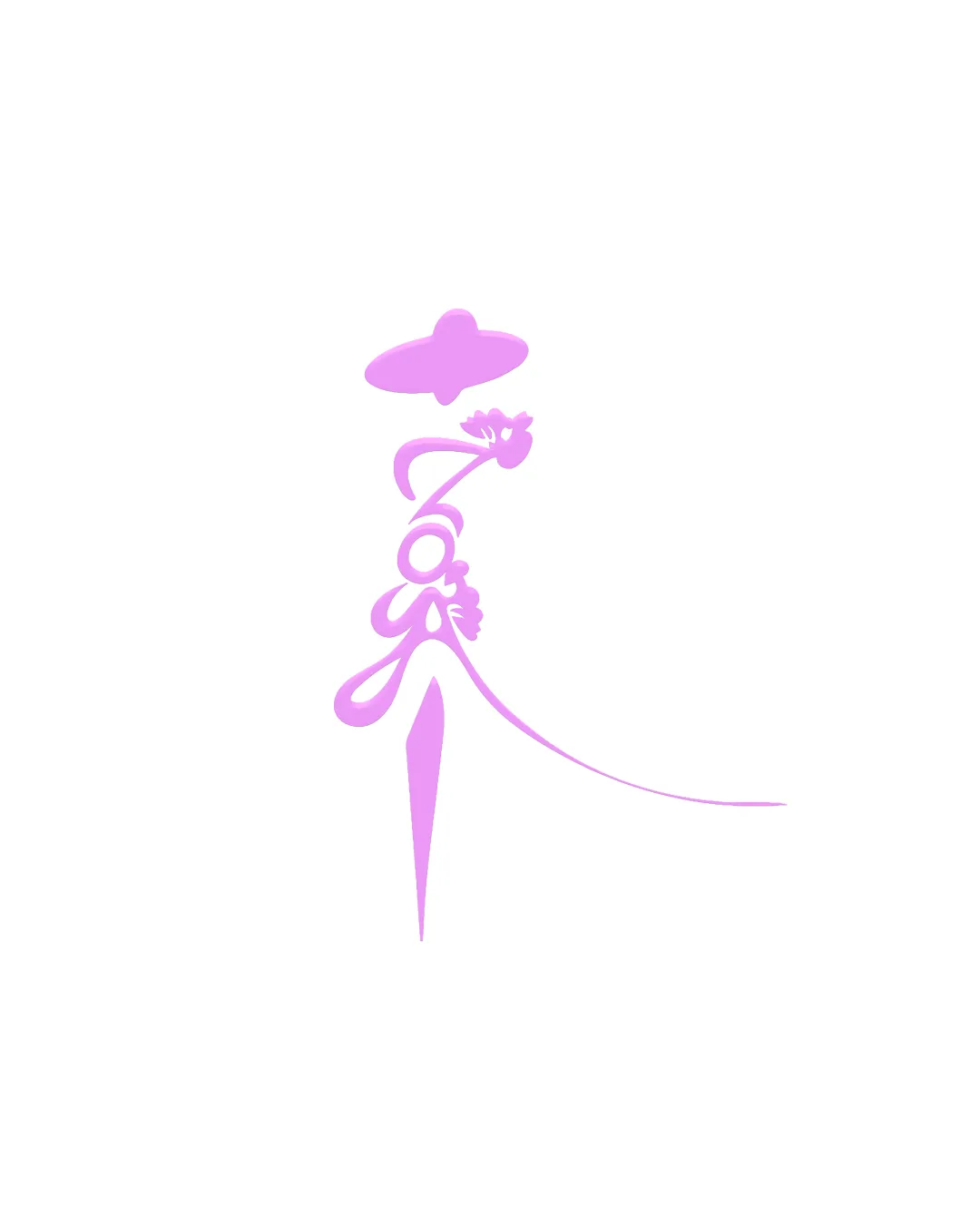
gaya

Elie222 Essential logo review

Review the detailed scores below to see what is working and what should be refined first.

Symbols recognized:
Stylized hat, floral elements
Legible text:
gaya
Abstract And Illustrative Elegant, Whimsical, Feminine Fashion Or Beauty
2/5
Legibility
4/5
Originality
4/5
Balance
3/5
Scale
Detailed review

Logo performance breakdown

2/5

Legibility

  • Elegant typography adds artistic flair.
  • Text is not very legible and could be misread.
3/5

Scalability

  • Limited color palette aids scalability.
  • Fine details may be lost at smaller sizes.
4/5

Originality

  • Unique use of floral and fashion elements.
  • Abstract theme might not convey the message clearly.
4/5

Color harmony

  • Consistent color scheme enhances brand identity.
  • Limited color use might reduce vibrancy.
4/5

Balance alignment

  • The design is visually appealing and balanced.
Uploaded logoAlignment guide overlay

Inspect spacing with the guide. Optical balance may differ from geometric centering.

Try your own review

Wondering how your logo performs?

Get a clear logo score, key risks, and priority fix ideas before your client or audience sees it.

Review my logo