What to preserve
The logo effectively combines classic educational tools (scissors, pencil, ruler/triangle) into a cohesive and recognizable mark representing creativity, learning, and school projects.
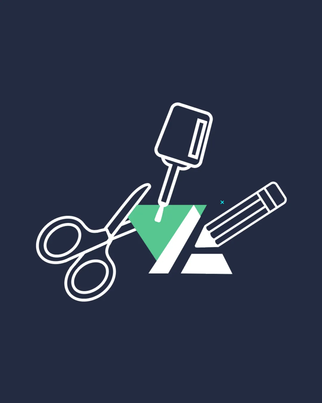
A creative, visually appealing education-themed symbol that is functional for apparel but needs refinement for best print clarity.
This logomark shows solid execution, supported by distinctive construction and color harmony; improving clarity at smaller sizes is the clearest next step.
Focus on the changes that matter. Keep what makes the logo work.
The logo effectively combines classic educational tools (scissors, pencil, ruler/triangle) into a cohesive and recognizable mark representing creativity, learning, and school projects.
Logo preview unavailable. The written feedback is still available on this card.
overlapping_elements
Multiple outlined tools (scissors, pencil, ruler/triangle, screwdriver) visibly overlap and intersect, which creates some visual clutter at the convergence point.
See the category reviewDistinctive arrangement of classic school tools matches an academic T-shirt context, but detail density may affect small-scale print clarity.
Estimated colors. Use the original design file for exact values.
Create a full color palette using these colors
Create new paletteMultiple outlined tools (scissors, pencil, ruler/triangle, screwdriver) visibly overlap and intersect, which creates some visual clutter at the convergence point.
Try: Consider slightly adjusting overlaps for cleaner separation or hierarchy between objects.
Logo preview unavailable. The written feedback is still available on this card.

Inspect spacing with the guide. Optical balance may differ from geometric centering.
Thin white outlines and intersecting details may lose clarity or merge when reduced for smaller prints (e.g., smaller T-shirt sizes or badges).
Get a clear logo score, key risks, and priority fix ideas before your client or audience sees it.
More credits needed
Add credits to continue without losing your work.
Then $7/month. Cancel anytime.
Essential logo review with AI
Estimated progress