View review
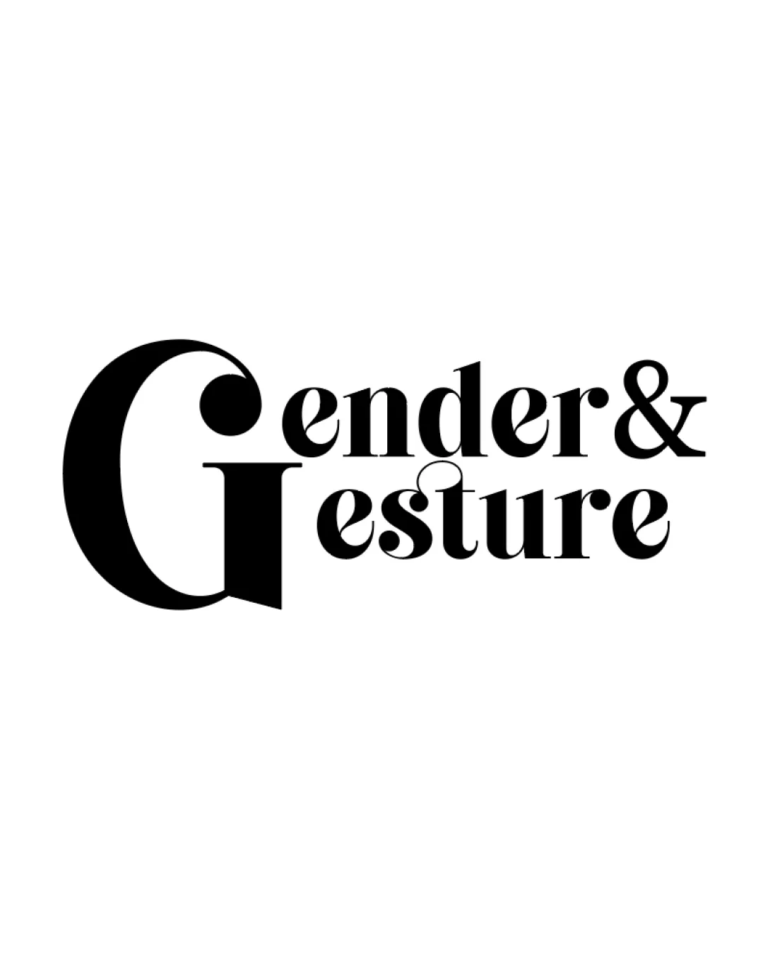
Gender & Gesture
Review the detailed scores below to see what is working and what should be refined first.
Objective AI feedback. Your creative decision.
Logo performance breakdown
Legibility
Large G is bold and quickly identifiable.
The overall type is readable at medium to large sizes.
Contrast is high due to black on white.
Intertwined letters and varying weights may hamper clarity at small sizes.
Some overlap in the 'G' and 'e' may cause minor confusion on first glance.

Originality
Creative integration of two words with a single oversized G.
Serif touches and weight contrast stand out from typical sans-serif marks.
Large initial solutions are not entirely unique in editorial branding.
No additional iconography or negative space use for further depth.
Color harmony
Classic high-contrast black on white palette is universally harmonious.
Single-color usage enhances professionalism and printing ease.
Black
#000000
White
#FFFFFF
Balance alignment
Heavy left anchor with large G gives visual interest.
Text sits neatly along the baseline.
Disproportionate G dominates, causing left-weighted visual imbalance.
Upper and lowercase type combo creates uneven rhythm between words.
Scalability
Simple color palette ensures adaptability to different backgrounds.
Would work well on websites, posters, or editorial layouts.
Thin details and close letter spacing might get lost at favicon/app icon scale.
Large initial G may overpower or feel awkward on small merchandise or embroidery.
200x250 px
100×125 px
50×62 px
Misinterpretations
No inappropriate or questionable symbols detected.
Gestalt plays with gender/gesture concept positively.
Wondering how your logo performs?
Get a clear logo score, key risks, and priority fix ideas before your client or audience sees it.



