Strengthen integration of tree icons with text for a more unified mark.
Currently, trees are visually appended rather than seamlessly connected.
Boosts logo cohesion and memorability.
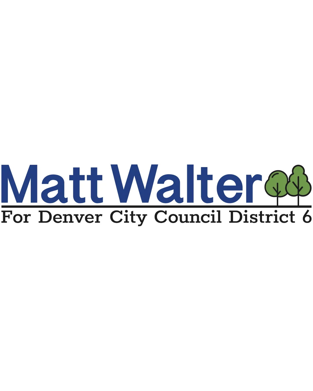
Solid, legible campaign logo that meets requirements but would benefit from stronger integration and originality.
Focus on the changes that matter. Keep what makes the logo work.
Currently, trees are visually appended rather than seamlessly connected.
Boosts logo cohesion and memorability.
Long tagline may lose clarity at small sizes.
Improves versatility for print and digital assets.
Logo is currently generic beyond the tree/environmental cue.
Increases distinctiveness in a crowded political field.
Appropriate style and clarity for a political city council campaign.
Primary candidate name highly prominent.
Secondary tagline solidly communicates the campaign's scope.
Estimated colors. Use the original design file for exact values.
Create a full color palette using these colors
Create new palette
Inspect spacing with the guide. Optical balance may differ from geometric centering.
Compare the detail at different sizes. Labels show the full image dimensions.
Does the shape still work without color?
Find the surfaces where your logo stays clear.
A 3px blur softens fine details so you can check whether the overall shape stays recognizable. If key gaps close or elements merge, the logo may rely too heavily on detail.
Implements standard political campaign logo conventions without strong differentiation.
The logo is functional and trustworthy but follows familiar visual tropes, creating some risk of blending in among similar political logos.
Strong genre match for city council campaign branding; instantly recognizable purpose.
Looks professional and appropriate to politics.
Limited originality; visual similarity to other campaign signs could reduce memorability.
Could be mistaken for another candidate's campaign at a glance.
Trust, environmental focus, and approachability conveyed adequately.
Delivers positive, established campaign signals.
How the logo may work in practice, and what to check before production.
Large, clear type ensures visibility.
Tagline and trees may need simplification or removal at small sizes.
Design scales adequately for print.
Fits well for web branding, though tagline can be resized or stacked.
Tree icons may need to be bolder and tagline omitted.
The logo versions to prepare before sending final files to a client or team.
A mark and wordmark are both visible in the uploaded asset.
Export the wordmark separately, without the symbol or tagline, for narrow placements and smaller sizes.
Export the existing symbol, mascot, or monogram on its own for avatars, favicons, and compact placements. Check its clarity at small sizes.
Prepare a separate wordmark with the existing tagline for larger placements. Keep the tagline-free wordmark for small sizes.
Prepare a monochrome version for restricted print and production methods.
Prepare a light version for dark brand backgrounds.
Put the design into words. Use these notes to build your client presentation.
The elements that make up the identity.
Bold blue wordmark 'Matt Walter' with stylized green tree icons at the end, tagline 'For Denver City Council District 6' underneath in serif font.
Clean, modern sans-serif font in navy blue conveys professionalism and trust.
Two stylized green trees in solid fill, outlined in black, visually appended to the wordmark to suggest environmental consciousness.
Navy blue for the wordmark, green and light green for the trees, black outlines and secondary serif text.
The story and thinking behind the design.
This logo emphasizes the candidate's name with a trustworthy, modern typeface, accented by tree icons that suggest environmental stewardship and local community.
Get a clear logo score, key risks, and priority fix ideas before your client or audience sees it.
More credits needed
Add credits to continue without losing your work.
Then $7/month. Cancel anytime.