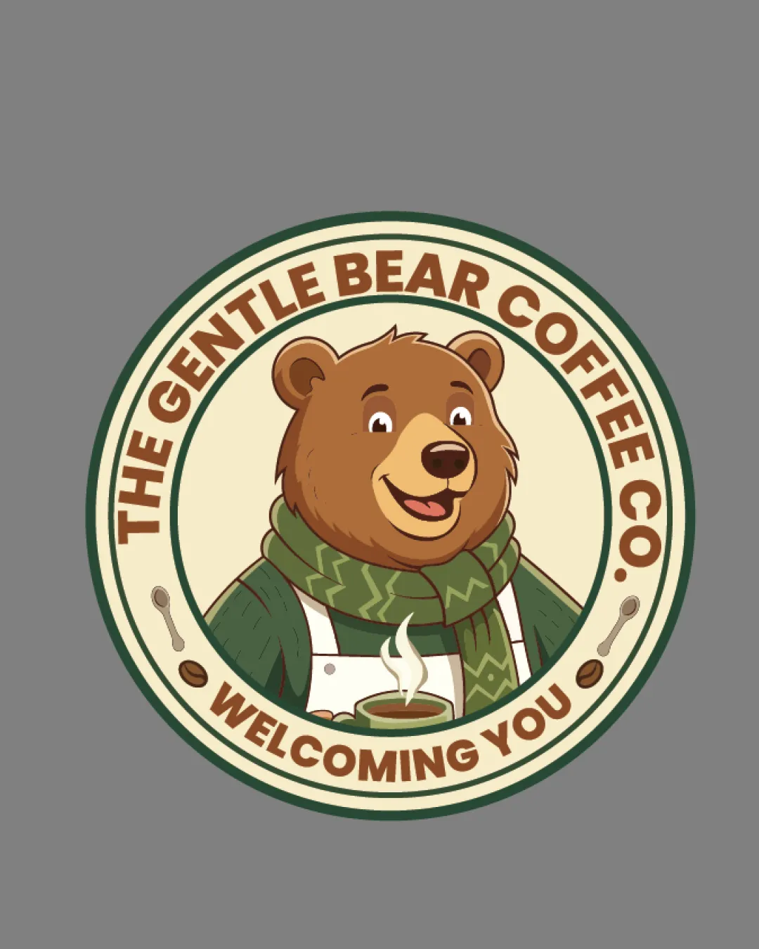
THE GENTLE BEAR COFFEE CO. WELCOMING YOU logo review
4/5
Logo score
Logo review of

The Gentle Bear Coffee Co. Welcoming You

A strong, approachable mascot-based emblem that fits a welcoming coffee brand, with minor tuning and scalability improvements suggested.

Emblem Playful Mascot Badge Coffee Shop / Cafe
4/5
Legibility
4/5
Originality
5/5
Misread
4/5
Balance
3/5
Scale
Your next steps

What to fix first

Focus on the changes that matter. Keep what makes the logo work.

1

mascot illustration and small text

Test in small print and digital sizes; consider a simplified version for small usage.

Worth testing High priority Medium effort
Area to inspectApproximate location

Detailed mascot illustration and small elements (steam, beans, spoons) may lose clarity at small sizes.

How to check

Verify critical mascot features and text are recognizable at reduced size.

See the category review
2

emblem border and text alignment

Refine text spacing, especially along the lower curve.

Optional refinement Medium priority Low effort
Area to inspectApproximate location

Slight visual tension between the curved text on top and bottom; bottom arc feels slightly compressed compared to top.

How to check

Confirm the text flows evenly and reads comfortably around the whole circle.

See the category review
Detailed review

Logo performance breakdown

4/5

Brief & logo match

Based on an inferred industry
Compared with

coffee shop or cafe; friendly and inviting brand image is prioritized.

The logo convincingly communicates a welcoming coffee shop with a friendly, gentle bear mascot, though mascot detail may require adaptation for all uses.

  • Approachable Brand Personality

    The cheerful bear mascot and warm wording express welcome and friendliness.

  • Coffee Shop Identity

    Emblem badge and coffee elements clearly signal a cafe brand.

4/5

Legibility

  • Large text is bold and readable
  • Tagline is clear
4/5

Originality

  • Mascot approach creates a friendly, differentiated identity
4/5

Color harmony

  • Earthy colors suit the coffee theme and reinforce warmth
Brown#554539
Beige#E9DFC8
Olive Green#64744D
Light Brown#E3B97F
White#FFFFFF
Dark Green#3B5A38

Estimated colors. Use the original design file for exact values.

Create a full color palette using these colors

Create new palette
4/5

Balance alignment

  • Circular layout is cohesive and visually appealing
  • Slight visual tension between the curved text on top and bottom; bottom arc feels slightly compressed compared to top.

    Optional refinement emblem border and text alignment

    Try: Refine text spacing, especially along the lower curve.

    Check: Confirm the text flows evenly and reads comfortably around the whole circle.

    Area to inspectApproximate location
Uploaded logoAlignment guide overlay

Inspect spacing with the guide. Optical balance may differ from geometric centering.

3/5

Scalability

  • Detailed mascot supports distinctive branding
  • Detailed mascot illustration and small elements (steam, beans, spoons) may lose clarity at small sizes.

    Worth testing mascot illustration and small text

    Try: Test in small print and digital sizes; consider a simplified version for small usage.

    Check: Verify critical mascot features and text are recognizable at reduced size.
    Area to inspectApproximate location
Uploaded logo at 200 pixels wide
200 × 250 px
Uploaded logo at 100 pixels wide
100 × 125 px
Uploaded logo at 50 pixels wide
50 × 63 px

Compare the detail at different sizes. Labels show the full image dimensions.

5/5

Misinterpretations

  • No unintended readings or negative associations spotted
4/5

Symbol & text fit

  • Mascot and text integration reinforce the warm theme

Black & white

Does the shape still work without color?

These tests are available only for logos uploaded in vector (SVG) format.

Background contrast

Find the surfaces where your logo stays clear.

These tests are available only for logos uploaded in vector (SVG) format.

Blur & silhouette

A 3px blur softens fine details so you can check whether the overall shape stays recognizable. If key gaps close or elements merge, the logo may rely too heavily on detail.

These tests are available only for logos uploaded in vector (SVG) format.

Try your own review

Wondering how your logo performs?

Get a clear logo score, key risks, and priority fix ideas before your client or audience sees it.

Review my logo