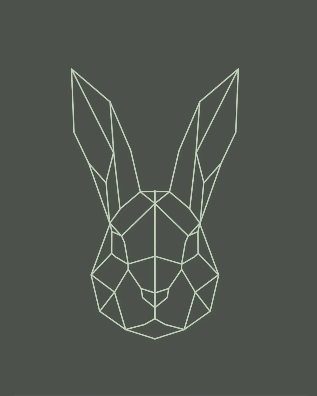
Geometric line art rabbit head, symmetrical, styli.. logo review
3.5/5
Logo score
Logo review of

Geometric Line Art Rabbit Head, Symmetrical, Styli..

A stylish and well-balanced geometric rabbit mark with solid tech appeal, but may need bolder lines or a unique detail to ensure visibility and stand out in a crowded trend.

Standalone Mark Geometric Line Art Web Design
3/5
Originality
5/5
Misread
5/5
Balance
3/5
Scale
Your next steps

What to fix first

Focus on the changes that matter. Keep what makes the logo work.

1

Standalone mark

Test mark visibility and line integrity at smallest intended application sizes.

Worth testing High priority Medium effort
Area to inspectApproximate location

Thin lines may lose clarity or disappear at very small sizes, reducing legibility and impact.

How to check

Test print and digital icons at favicon and small app icon sizes.

See the category review
2

Standalone mark

Consider a unique twist, color accent, or integrated detail distinct for the brand.

Optional refinement Medium priority Medium effort
Area to inspectApproximate location

Geometric animal heads are a current trend and can risk blending in, despite a clean execution.

How to check

Survey peer web design brands for similar geometric animals.

See the category review
Detailed review

Logo performance breakdown

4/5

Brief & logo match

Based on your brief
Compared with

Webdesign

Contemporary geometric style fits the web design context well, but distinctiveness could be improved for clearer brand differentiation.

  • Modern Digital Appeal

    The geometric construction signals tech-savvy, innovation, and clarity aligning with web design expectations.

  • Brand Distinctiveness

    Geometric animal motifs are visually engaging but commonly used; standalone mark may not uniquely signal this specific web design brand.

3/5

Originality

  • Stylish geometric animal mark fits digital sector.
  • Geometric animal heads are a current trend and can risk blending in, despite a clean execution.

    Optional refinement Standalone mark

    Try: Consider a unique twist, color accent, or integrated detail distinct for the brand.

    Check: Survey peer web design brands for similar geometric animals.

    Area to inspectApproximate location
5/5

Balance alignment

  • Excellent bilateral symmetry and proportional coherence.
Uploaded logoAlignment guide overlay

Inspect spacing with the guide. Optical balance may differ from geometric centering.

3/5

Scalability

  • Crisp geometric lines scale well at moderate sizes.
  • Thin lines may lose clarity or disappear at very small sizes, reducing legibility and impact.

    Worth testing Standalone mark

    Try: Test mark visibility and line integrity at smallest intended application sizes.

    Check: Test print and digital icons at favicon and small app icon sizes.
    Area to inspectApproximate location
Uploaded logo at 200 pixels wide
200 × 250 px
Uploaded logo at 100 pixels wide
100 × 125 px
Uploaded logo at 50 pixels wide
50 × 63 px

Compare the detail at different sizes. Labels show the full image dimensions.

5/5

Misinterpretations

  • No obvious negative secondary readings.

Black & white

Does the shape still work without color?

These tests are available only for logos uploaded in vector (SVG) format.

Background contrast

Find the surfaces where your logo stays clear.

These tests are available only for logos uploaded in vector (SVG) format.

Blur & silhouette

A 3px blur softens fine details so you can check whether the overall shape stays recognizable. If key gaps close or elements merge, the logo may rely too heavily on detail.

These tests are available only for logos uploaded in vector (SVG) format.

Try your own review

Wondering how your logo performs?

Get a clear logo score, key risks, and priority fix ideas before your client or audience sees it.

Review my logo