Standalone mark
Test legibility and recognizability at favicon and small print sizes.
The fine star shape at the center may become unclear or lost at small sizes.
See the category review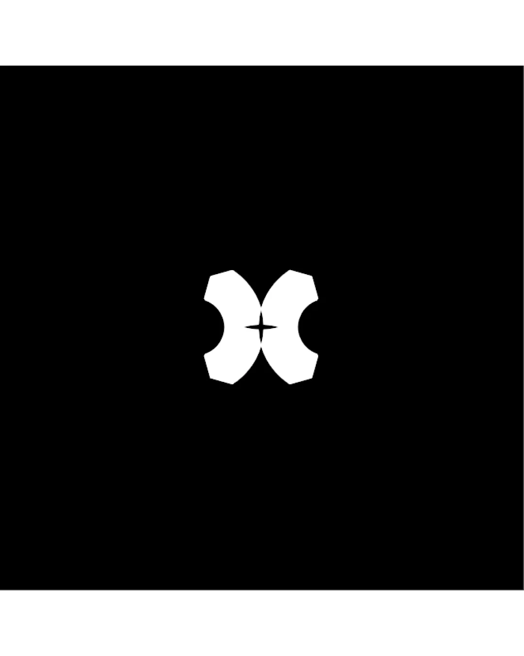
A balanced abstract mark with high visual symmetry, suitable for versatile use but may need reinforcement of central details for tiny applications.
This logomark has a workable foundation; improving distinctiveness is the clearest next step.
Focus on the changes that matter. Keep what makes the logo work.
Standalone mark
The fine star shape at the center may become unclear or lost at small sizes.
See the category reviewThere isn't enough brand context to assess the match.

Inspect spacing with the guide. Optical balance may differ from geometric centering.
Get a clear logo score, key risks, and priority fix ideas before your client or audience sees it.
More credits needed
Add credits to continue without losing your work.
Then $7/month. Cancel anytime.
Essential logo review with AI
Estimated progress