Abstract M monogram logo logo review
4.2/5
Logo score Monogram category

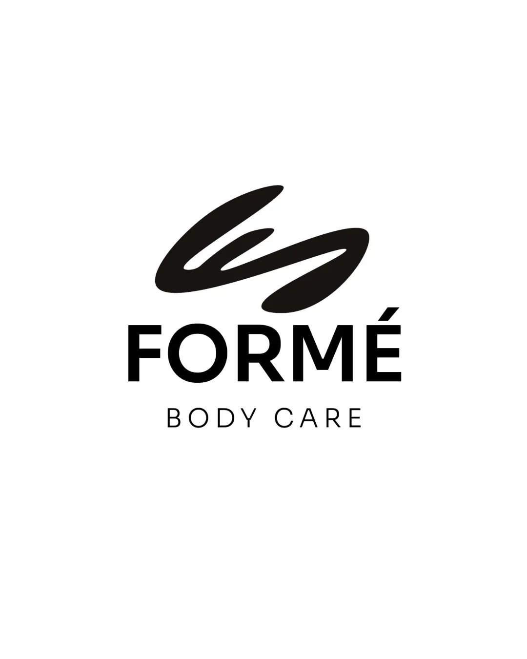
Abstract M monogram logo

creative988641 Essential logo review

A creative and bold monogram with strong concept and excellent legibility, slightly weakened by stroke and curve imbalance.

This monogram shows strong execution, supported by distinctive construction and clarity at smaller sizes; improving visual balance is the clearest next step.

Monogram Geometric, Minimal, Solid Design/creative
5/5
Legibility
4/5
Originality
3/5
Balance
5/5
Scale
Your next steps

What to fix first

Focus on the changes that matter. Keep what makes the logo work.

1

entire monogram

Refine stroke weights and symmetry to improve geometric balance.

High priority Visible issue Low effort

The right vertical bar appears slightly thicker and curves more than the left, creating minor visual imbalance.

See the category review
Detailed review

Logo performance breakdown

4/5

Brief & logo match

The geometric, abstract 'M' monogram is well-suited for creative services like design and crafts, though balancing the strokes would better embody visual precision expected in the field.

5/5

Legibility

  • Distinct 'M' shape; no risk of misreading.
5/5

Scalability

  • Bold, simple forms support reproduction at various sizes.
5/5

Misinterpretations

  • No plausible misinterpretation.
4/5

Originality

Available in Advanced logo reviews
3/5

Balance alignment

Available in Advanced logo reviews
Try your own review

Wondering how your logo performs?

Get a clear logo score, key risks, and priority fix ideas before your client or audience sees it.

Review my logo