What to preserve
A stylized 'G' is cleverly integrated into the negative space of a hexagonal mark, producing a memorable and robust monogram.
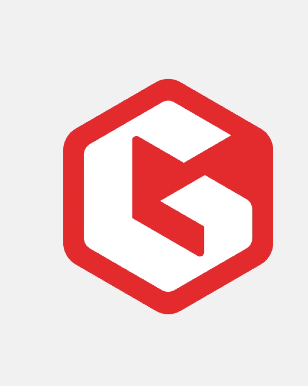
A strong, scalable, and legible monogram with modern appeal but modest originality due to the common geometric framing.
Focus on the changes that matter. Keep what makes the logo work.
A stylized 'G' is cleverly integrated into the negative space of a hexagonal mark, producing a memorable and robust monogram.
Logo preview unavailable. The written feedback is still available on this card.
lettermark
Hexagon-framed 'G' is visually striking but relies on a familiar geometric container used frequently in modern marks; lessifies instant distinctiveness.
Compare with similar monogram brands to identify overlap.
There isn't enough brand context to assess the match.
Hexagon-framed 'G' is visually striking but relies on a familiar geometric container used frequently in modern marks; lessifies instant distinctiveness.
Try: Explore subtle customizations to the hexagon or 'G' for enhanced uniqueness.
Check: Compare with similar monogram brands to identify overlap.
Logo preview unavailable. The written feedback is still available on this card.

Inspect spacing with the guide. Optical balance may differ from geometric centering.
Get a clear logo score, key risks, and priority fix ideas before your client or audience sees it.
More credits needed
Add credits to continue without losing your work.
Then $7/month. Cancel anytime.
Essential logo review
Usually takes under a minute