 View review
Logo score
Logo review of
Glam Haven, Gh
Review the detailed scores below to see what is working and what should be refined first.
Objective AI feedback. Your creative decision.
Legibility
Originality
Misread
Balance
Scale
Detailed review
Logo performance breakdown
Legibility
 Main wordmark text is clear and easy to read despite geometric letterforms All-caps style supports impact and brand recognition
 The stylized 'g' in both the wordmark and icon may cause slightly delayed recognition
Originality
The geometric modifications to 'g' and 'A' add unique character Custom monogram is distinctive
Monogram approach (using two initials) is common in the fashion industry, limiting originality No negative space or conceptual symbolism present
Color harmony
Strong color balance with a primary blue and supporting black/white Limited palette aids versatility and elegance
Dark Blue
#3546D9
Black
#000000
White
#FFFFFF
Balance alignment
Excellent alignment across all logo versions Wordmark spacing and icon proportions feel well-resolved Badge maintains central focus and radial typography balance

Scalability
Strong geometric forms hold up at various sizes Monogram icon version is minimalist and print-friendly Badge version offers solid branding flexibility
The badge format may become illegible at very small sizes due to circular text The geometric cuts in the wordmark could be hard to read on very small print applications
200x250 px
100×125 px
50×62 px
Misinterpretations
No problematic or inappropriate imagery present
Symbol & text fit
Logomark and wordmark share the same geometric visual language
Consistent line weight and letter styling create seamless cohesion across all lockups
Presentation kit
Finalize and present this logo
Logo description
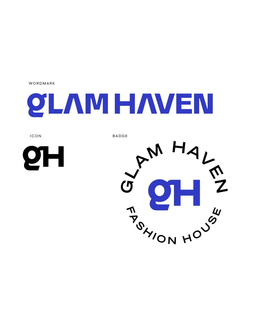
The GLAM HAVEN logo system employs a modern, geometric sans-serif style suited for a contemporary fashion house. The wordmark features stylized cuts in the 'G', 'A', and other letterforms, lending a bold and custom feel. A monogram icon based on 'gH' offers a compact visual shorthand for brand recognition across digital and physical touchpoints. The badge lockup encircles the monogram with the full name, creating a premium look ideal for packaging or storefront use. The dominant blue color projects confidence, professionalism, and style while the black and white palette ensures maximum versatility. These coordinated logo variations enable a cohesive brand presence across all media and merchandise.
Tips for the logo presentation
Mockup ideas
- Embroidered clothing tags to test icon clarity on fabric.
- Branded shopping bags with the badge version for boutique retail experience.
- Letterhead and business cards using the wordmark and icon separately.
- Storefront signage with backlit badge version.
- Social media profile icons and circular avatars in the badge format.
- Fashion magazine ads using high-contrast blue on white.
- Website header with wordmark and simplified monogram favicon.
Try your own review
Review my logo
Wondering how your logo performs?
Get a clear logo score, key risks, and priority fix ideas before your client or audience sees it.
Keep exploring


