View review
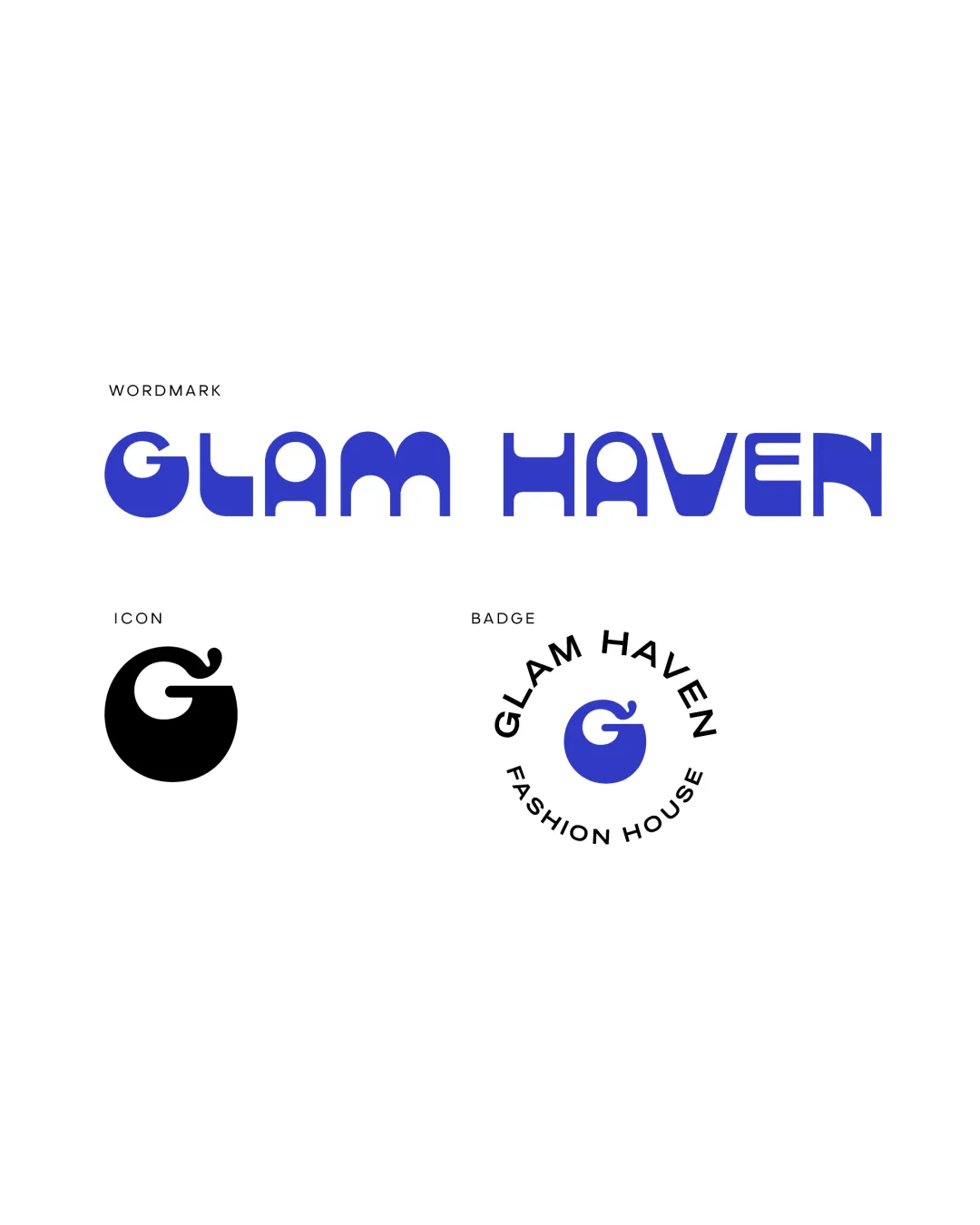
Glam Haven
Review the detailed scores below to see what is working and what should be refined first.
Objective AI feedback. Your creative decision.
Logo performance breakdown
Legibility
Wordmark characters are mostly clear and well-spaced.
Distinct geometric forms give a unique visual identity.
The stylized 'A', 'M', and 'V' may cause slight reading hesitation for unfamiliar viewers.
The flourish on the 'G' icon could be misconstrued at small sizes.

Originality
Custom monogram 'G' with flourish and stylized wordmark letterforms set it apart.
Badge construction is modern within the fashion context.
Flourish on the 'G' feels slightly derivative of fruit or similar motifs.
Rounded geometric wordmarks are increasingly common—could be confused with other trendy brands.
Color harmony
Excellent restraint with a single accent color and neutrals.
Bold blue used consistently; black and white variants maintain logo impact.
Absolute Blue
#3B3BCC
Black
#000000
White
#FFFFFF
Balance alignment
Badge is circularly balanced and text encircles the monogram harmoniously.
Wordmark uses consistent geometry and height baseline.
The geometric uniformity sacrifices some flow in legibility.
The playful 'G' icon style feels slightly mismatched with the sharper wordmark geometry.
Scalability
Simple shapes will translate decently across various applications: signage, packaging, digital icons.
Single-color variant provided for the icon promotes easy adaptation.
Flourish on 'G' icon may blur at favicon/app icon scale.
Badge version becomes cluttered or loses clarity on very small surfaces like tags or embroidery.
200x250 px
100×125 px
50×62 px
Misinterpretations
No overtly inappropriate or unintended imagery detected.
Flourish is abstract enough to avoid clear misinterpretation.
Symbol & text fit
Both logomark and wordmark share rounded geometric DNA.
The playful, organic detail on 'G' does not perfectly echo the abstract, modular wordmark style.
The sizing between logomark and badge text could feel slightly disproportionate in some uses.
Finalize and present this logo
Logo description
The 'Glam Haven' logo suite presents a contemporary, geometric wordmark paired with a custom 'G' monogram. The wordmark utilizes rounded modular letterforms to convey modernity and a sense of playful sophistication ideal for the fashion industry. The monogram features a distinctive flourish, adding personality and branding flexibility as a standalone symbol. Three logo formats are provided: a clean wordmark, a versatile icon, and a circular badge lockup with supporting text. The restrained use of bold blue alongside monochromatic options ensures strong brand presence across digital and print media. This adaptable identity supports everything from apparel labeling to boutique signage, capturing the essence of a modern fashion house.
Tips for the logo presentation
Mockup ideas
- Embossed leather fashion tag on a handbag.
- Storefront signage with illuminated wordmark and badge.
- Branded shopping bag featuring the icon.
- Apparel label or clothing tag with icon-only version.
- Website header with horizontal wordmark.
- Social media avatar using the single 'G' icon.
Wondering how your logo performs?
Get a clear logo score, key risks, and priority fix ideas before your client or audience sees it.