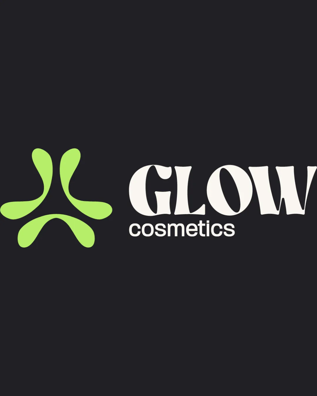
GLOW cosmetics logo review
3.5/5
Logo score
Logo review of

Glow Cosmetics

Distinctive and vibrant, the logo has real personality but needs typographic balancing and subtle integration tweak for polish.

Combination Bold Organic Cosmetics/beauty
4/5
Legibility
4/5
Originality
5/5
Misread
3/5
Balance
3.5/5
Scale
Your next steps

What to fix first

Focus on the changes that matter. Keep what makes the logo work.

1

wordmark 'GLOW'

Refine spacing and shapes for better wordmark evenness.

Visible issue High priority Medium effort

The exaggerated, irregular letterforms in 'GLOW' create uneven negative space, notably around the G and O, which impacts cohesion and optical balance.

How to check

Check for improved visual harmony across the wordmark.

See the category review
2

overall logo

Harmonize mark and type through subtle style or weight alignment.

Optional refinement Medium priority Medium effort

The energetic symbol and bold 'GLOW' type have personality but the mark's organic softness contrasts sharply with the heavy typographic weight, risking a disjointed impression.

How to check

Ensure a smoother visual transition between mark and wordmark.

See the category review
Detailed review

Logo performance breakdown

4/5

Brief & logo match

Based on an inferred industry
Compared with

beauty/cosmetics, mass or boutique

Logo is lively and distinctive but could better integrate symbol with wordmark for full polish.

  • Visual Impact

    Logo delivers strong, distinctive presence appropriate for beauty/cosmetics.

  • Brand Differentiation

    Abstract organic symbol and type are memorable, separating it from more literal cosmetic marks.

4/5

Legibility

  • 'cosmetics' tagline is clean and readable.
  • GLOW is bold and eye-catching.
4/5

Originality

  • Distinct symbol and expressive type provide personality.
4/5

Color harmony

  • Fresh, youthful color contrast.
Light Green#ADE437
Charcoal#202025
White#FFFFFF

Estimated colors. Use the original design file for exact values.

Create a full color palette using these colors

Create new palette
3/5

Balance alignment

  • Logo feels dynamic and playful.
  • The exaggerated, irregular letterforms in 'GLOW' create uneven negative space, notably around the G and O, which impacts cohesion and optical balance.

    Visible issue wordmark 'GLOW'

    Try: Refine spacing and shapes for better wordmark evenness.

    Check: Check for improved visual harmony across the wordmark.
Uploaded logoAlignment guide overlay

Inspect spacing with the guide. Optical balance may differ from geometric centering.

3.5/5

Scalability

  • Symbol is generally simple with bold strokes.
  • The relatively thin terminals of the mark could lose clarity at smaller sizes depending on reproduction method.

    Worth testing Standalone mark

    Try: Test symbol legibility at small scale in print/digital applications.

    Check: Verify that all 'arms' remain visible and distinct at reduced size.

Uploaded logo at 200 pixels wide
200 × 250 px
Uploaded logo at 100 pixels wide
100 × 125 px
Uploaded logo at 50 pixels wide
50 × 63 px

Compare the detail at different sizes. Labels show the full image dimensions.

5/5

Misinterpretations

  • No accidental negative space readings.
3/5

Symbol & text fit

  • Both parts have strong identities.
  • The energetic symbol and bold 'GLOW' type have personality but the mark's organic softness contrasts sharply with the heavy typographic weight, risking a disjointed impression.

    Optional refinement overall logo

    Try: Harmonize mark and type through subtle style or weight alignment.

    Check: Ensure a smoother visual transition between mark and wordmark.

Black & white

Does the shape still work without color?

These tests are available only for logos uploaded in vector (SVG) format.

Background contrast

Find the surfaces where your logo stays clear.

These tests are available only for logos uploaded in vector (SVG) format.

Blur & silhouette

A 3px blur softens fine details so you can check whether the overall shape stays recognizable. If key gaps close or elements merge, the logo may rely too heavily on detail.

These tests are available only for logos uploaded in vector (SVG) format.

Try your own review

Wondering how your logo performs?

Get a clear logo score, key risks, and priority fix ideas before your client or audience sees it.

Review my logo