View review
Logo score
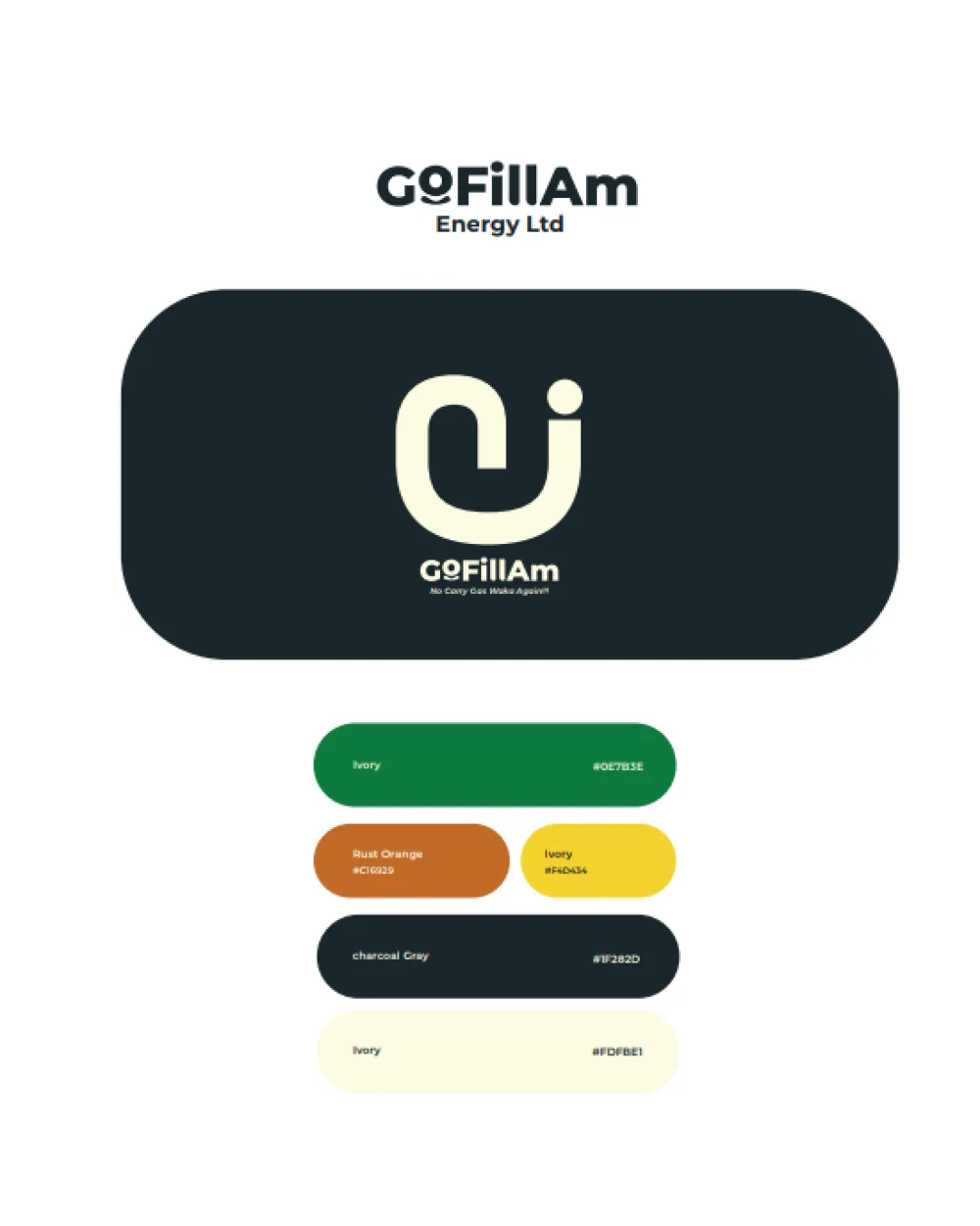
Logo review ofGofillam Energy Ltd
Review the detailed scores below to see what is working and what should be refined first.
Legibility
Originality
Misread
Balance
Scale
Detailed review
Logo performance breakdown
Legibility
![]() Primary text 'GoFillAm' is clear and easy to read
Primary text 'GoFillAm' is clear and easy to read![]() Use of a clean sans-serif font improves legibility
Use of a clean sans-serif font improves legibility
![]() Tagline text is extremely small, making it unreadable at smaller sizes
Tagline text is extremely small, making it unreadable at smaller sizes
Originality
![]() Clever integration of the G and F to form a unique monogram
Clever integration of the G and F to form a unique monogram![]() Distinctive form helps brand recognition
Distinctive form helps brand recognition
![]() Integration could be pushed further for a more memorable or industry-relevant twist
Integration could be pushed further for a more memorable or industry-relevant twist
Color harmony
![]() Modern color palette with solid contrast between ivory and charcoal gray
Modern color palette with solid contrast between ivory and charcoal gray![]() Use of accent colors adds some energy
Use of accent colors adds some energy
![]() Multiple accent colors could create inconsistent brand perception if not used judiciously
Multiple accent colors could create inconsistent brand perception if not used judiciously![]() Variety risks visual clutter when used together or in small-scale scenarios
Variety risks visual clutter when used together or in small-scale scenarios
charcoal gray
#1F282D
ivory
#FDFBE1
rust orange
#C16329
green
#0E7B1E
yellow
#FDAA34
Color may be holding this logo back. Explore stronger palette options with Colorfly.design before updating the logo.
Explore palettesBalance alignment
![]() Well-placed monogram above the wordmark creates a balanced composition
Well-placed monogram above the wordmark creates a balanced composition![]() Text and symbol alignment feel intentional and considered
Text and symbol alignment feel intentional and considered
![]() Tiny size of the tagline breaks visual harmony and could feel disconnected from the main elements
Tiny size of the tagline breaks visual harmony and could feel disconnected from the main elements

Scalability
![]() Monogram logomark is simple and can scale well for many use cases like app icons and stationery
Monogram logomark is simple and can scale well for many use cases like app icons and stationery![]() Works well for larger applications such as billboards or signage
Works well for larger applications such as billboards or signage
![]() Tagline will not be visible or legible at small scales such as business cards or favicons
Tagline will not be visible or legible at small scales such as business cards or favicons![]() Color gradients and multiple color palettes may not reproduce consistently across all media, particularly in embroidery or single-color applications
Color gradients and multiple color palettes may not reproduce consistently across all media, particularly in embroidery or single-color applications
200x250 px
100×125 px
50×62 px
Misinterpretations
![]() No inappropriate or misleading secondary meanings detected in the symbol or text
No inappropriate or misleading secondary meanings detected in the symbol or text
Symbol & text fit
![]() Monogram and wordmark share similar weight and cohesiveness, resulting in a unified identity
Monogram and wordmark share similar weight and cohesiveness, resulting in a unified identity
Try your own review
Review my logo
Wondering how your logo performs?
Get a clear logo score, key risks, and priority fix ideas before your client or audience sees it.
Keep exploring