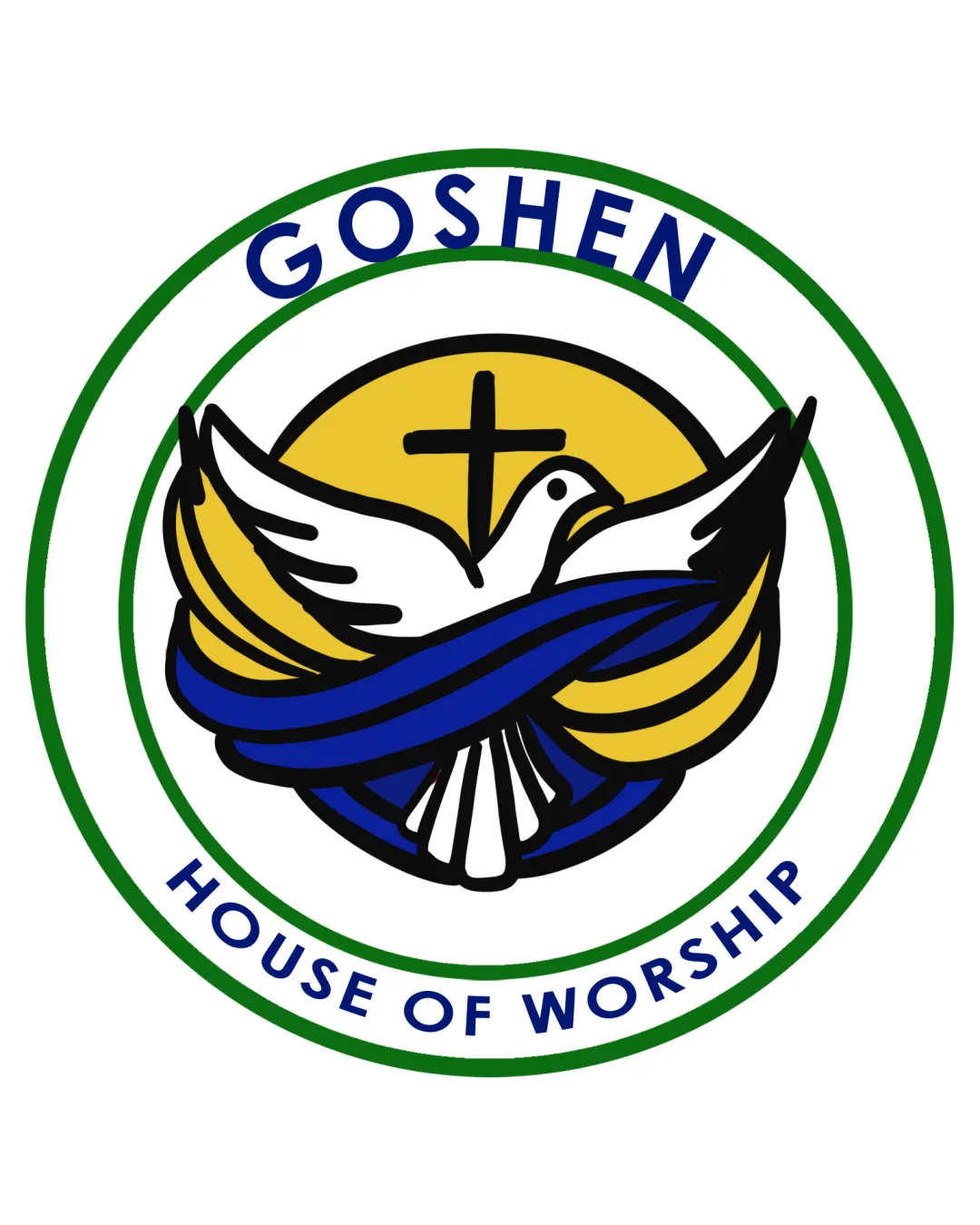
GOSHEN HOUSE OF WORSHIP logo review
4.0 / 5
Logo score
Logo review of

Goshen House Of Worship

A strong, appropriate religious emblem with inviting symbolism and clear text. Some over-detail and color use should be refined for best results.

Objective AI feedback. Your creative decision.

Emblem Illustrated, Traditional Religious Emblem Church Or Religious Organization
4.5/5
Legibility
3.5/5
Originality
4.5/5
Misread
4/5
Balance
3.5/5
Scale
Action plan

What to fix first

The most important fixes to handle before polishing the full presentation.

1

Simplify illustrated details, especially around the ribbon and tail, to enhance clarity at small sizes.

High priority

Currently, fine lines and dense areas may not reproduce well at reduced sizes.

Impact: Improves Scalability And Overall Professionalism. · Effort: Medium

2

Evaluate whether the blue and yellow ribbons can be streamlined or unified in color use.

Medium priority

Multiple color bands add some visual complexity that may be unnecessary for recognition.

Impact: Could Improve Visual Clarity And Reduce Busyness. · Effort: Low

Detailed review

Logo performance breakdown

4.5/5

Legibility

Checkmark icon Text is clear and readable with good contrast.

Warning icon Slight curve on 'GOSHEN' may affect legibility at very small sizes.

3.5/5

Originality

Checkmark icon Effective integration of several religious symbols.
Checkmark icon Friendly illustrative style.

Warning icon Dove and cross are common motifs in church logos.

4/5

Color harmony

Checkmark icon Color palette is harmonious and appropriate for religious context.

Warning icon Use of several strong colors makes the emblem busy.

Green
#20603D

Yellow
#FFE066

Blue
#0A205F

White
#FFFFFF

Black
#000000

Your palette is close. Refine the color roles and combinations before updating the logo.

Build brand colors
4/5

Balance alignment

Checkmark icon Central dove and cross are well-balanced, text is symmetrically arranged.

Warning icon Ribbon and tail areas introduce minor visual density.

logo 200x250 pixels scalability test alignment grid overlay
3.5/5

Scalability

Checkmark icon Shapes are bold; core icon remains recognizable when reduced.

Warning icon Fine black outlines and detailed ribbon may lose clarity at small sizes.

logo 200x250 pixels scalability test

200x250 px

logo 100x125 pixels scalability test

100×125 px

logo 50x62 pixels scalability test

50×62 px

4.5/5

Misinterpretations

Checkmark icon No evident secondary or inappropriate readings.

4 / 5

Logo structure & brief match

Checkmark icon Wordmark integrates smoothly into the emblem circle.

Warning icon Minor tension between the illustrative style and the sans-serif typeface.

Checkmark icon Church Functions: Logo is highly relevant with strong faith-based symbols and a welcoming, recognizable emblem form.

Try your own review

Wondering how your logo performs?

Get a clear logo score, key risks, and priority fix ideas before your client or audience sees it.

Review my logo