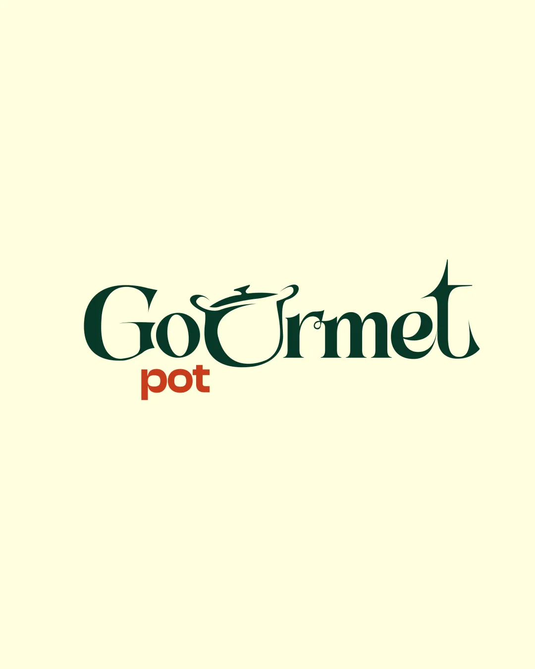
GoUrmet pot logo review
4/5
Logo score
Logo review of

Gourmet Pot

Distinctive, memorable wordmark that cleverly integrates a food motif, well-suited for brand character and ready for refinement.

Combination Mark Playful Modern Serif, Illustrative Touch Food
4/5
Legibility
4/5
Originality
5/5
Misread
3/5
Balance
3/5
Scale
Your next steps

What to fix first

Focus on the changes that matter. Keep what makes the logo work.

1

Stylized 'U' as pot lid and handle

Test the logo at reduced sizes to ensure the pot detail is always discernible or prepare a simplified alternate mark.

Worth testing High priority Medium effort
Area to inspectApproximate location

Fine detail in the 'U' pot lid and handle may become hard to read at very small sizes, especially for labels or social avatars.

How to check

Print or render the logo at smallest intended size to verify visual clarity.

See the category review
2

Wordmark overall

Explore subtle optical refinements in the surrounding letters to smooth overall wordmark rhythm.

Optional refinement Medium priority Medium effort
Area to inspectApproximate location

There is a slight imbalance between the large, wide 'U' and the tighter, sharper letter shapes elsewhere, causing a visual pause in flow.

How to check

Compare adjusted versions for more balanced optical flow at a glance.

See the category review
Detailed review

Logo performance breakdown

5/5

Brief & logo match

Based on your brief
Compared with

Nigerian food brand for students, aiming for playful, luxury food vibes and flexible label/profile usage.

Logo creatively expresses the playful gourmet theme with a strong food connection and luxurious feel.

  • Playful Food Symbolism

    The stylized pot as 'U' creates an immediate link to food and echoes playfulness.

  • Luxury And Gourmet Feel

    Elegant serif type and deep color palette suggest a premium vibe, aided by the unique type modulation.

4/5

Legibility

  • Text is clear despite the creative styling.
  • Color contrast aids readability.
4/5

Originality

  • Pot-as-U concept is lively and relevant.
  • Custom letter shapes give unique flavor.
4/5

Color harmony

  • Deep green and rust red evoke food richness.
  • Color block for 'pot' adds visual hierarchy.
DarkGreen#223828
RustRed#C25734
LightBeige#FAF8DC

Estimated colors. Use the original design file for exact values.

Create a full color palette using these colors

Create new palette
3/5

Balance alignment

  • Playful central motif draws focus.
  • There is a slight imbalance between the large, wide 'U' and the tighter, sharper letter shapes elsewhere, causing a visual pause in flow.

    Optional refinement Wordmark overall

    Try: Explore subtle optical refinements in the surrounding letters to smooth overall wordmark rhythm.

    Check: Compare adjusted versions for more balanced optical flow at a glance.

    Area to inspectApproximate location
Uploaded logoAlignment guide overlay

Inspect spacing with the guide. Optical balance may differ from geometric centering.

3/5

Scalability

  • Mark is distinct at medium-large sizes.
  • Mostly simple form supports reproduction.
  • Fine detail in the 'U' pot lid and handle may become hard to read at very small sizes, especially for labels or social avatars.

    Worth testing Stylized 'U' as pot lid and handle

    Try: Test the logo at reduced sizes to ensure the pot detail is always discernible or prepare a simplified alternate mark.

    Check: Print or render the logo at smallest intended size to verify visual clarity.

    Area to inspectApproximate location
Uploaded logo at 200 pixels wide
200 × 250 px
Uploaded logo at 100 pixels wide
100 × 125 px
Uploaded logo at 50 pixels wide
50 × 63 px

Compare the detail at different sizes. Labels show the full image dimensions.

5/5

Misinterpretations

  • No plausible misreading detected.

Black & white

Does the shape still work without color?

These tests are available only for logos uploaded in vector (SVG) format.

Background contrast

Find the surfaces where your logo stays clear.

These tests are available only for logos uploaded in vector (SVG) format.

Blur & silhouette

A 3px blur softens fine details so you can check whether the overall shape stays recognizable. If key gaps close or elements merge, the logo may rely too heavily on detail.

These tests are available only for logos uploaded in vector (SVG) format.

Try your own review

Wondering how your logo performs?

Get a clear logo score, key risks, and priority fix ideas before your client or audience sees it.

Review my logo