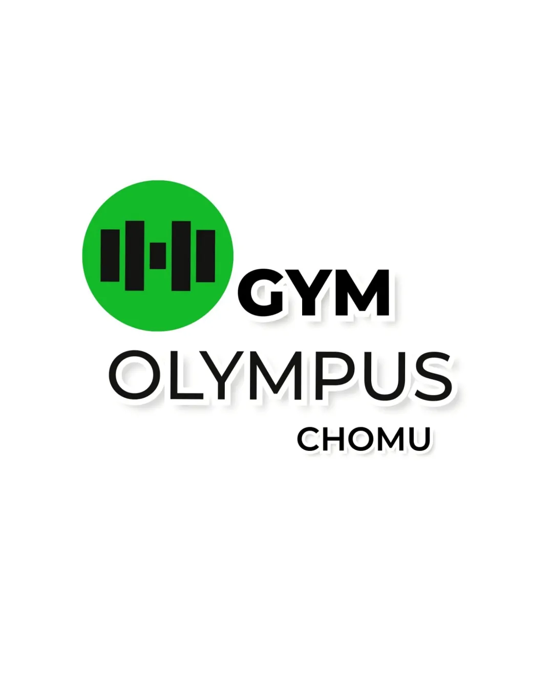
GYM OLYMPUS CHOMU logo review
3.5/5
Logo score
Logo review of

Gym Olympus Chomu

A clear and functional gym logo with effective bold presence, but it needs a more distinctive mark for lasting impact.

Combination Mark Bold Modern Gym Logo Fitness/gym
5/5
Legibility
2/5
Originality
5/5
Misread
3/5
Balance
4/5
Scale
Your next steps

What to fix first

Focus on the changes that matter. Keep what makes the logo work.

1

barbell symbol (top horizontal band)

Explore more unique or stylized representations of strength or fitness to enhance distinctiveness.

Visible issue High priority Medium effort
Area to inspectApproximate location

The barbell icon is a very common fitness logo symbol, making the mark generic rather than distinctive.

How to check

Compare silhouette and design elements to typical gym logos for differentiation.

See the category review
2

overall lockup

Refine scale or adjust circle color intensity for better balance between mark and type.

Optional refinement Medium priority Low effort

The visual weight and size of the barbell symbol slightly overpowers the wordmark, especially with the bright green circle.

How to check

Test visual harmony at different sizes to ensure neither element dominates.

See the category review
Detailed review

Logo performance breakdown

4/5

Brief & logo match

Based on an inferred industry
Compared with

Fitness and gym branding; needs to communicate strength and activity in a recognizable and inviting way.

The logo clearly signals a gym and has good energy, but lacks uniqueness to stand out among fitness brands.

  • Bold, Energetic Presence

    Green barbell icon and all-caps type provide a strong and active energy; color reinforces vitality.

  • Clarity Of Fitness Offering

    Barbell mark instantly communicates fitness/gym sector, leaving no ambiguity for potential clients.

5/5

Legibility

  • Text is bold and highly readable
  • Good spacing and clear typeface
2/5

Originality

  • Recognizable fitness symbol
  • The barbell icon is a very common fitness logo symbol, making the mark generic rather than distinctive.

    Visible issue barbell symbol (top horizontal band)

    Try: Explore more unique or stylized representations of strength or fitness to enhance distinctiveness.

    Check: Compare silhouette and design elements to typical gym logos for differentiation.
    Area to inspectApproximate location
4/5

Color harmony

  • High contrast between green, black, and white
Green#2ECC40
Black#000000
White#FFFFFF

Estimated colors. Use the original design file for exact values.

Create a full color palette using these colors

Create new palette
3/5

Balance alignment

  • Structured stacking of elements
  • The alignment between the barbell icon, 'GYM', 'OLYMPUS', and 'CHOMU' could be better optically balanced for a more unified feel.

    Optional refinement wordmark and lockup

    Try: Fine-tune vertical and horizontal alignment between elements for a more integrated appearance.

    Check: Review with alignment guides and check the optical center line.

Uploaded logoAlignment guide overlay

Inspect spacing with the guide. Optical balance may differ from geometric centering.

4/5

Scalability

  • Simple mark is scalable
  • Works well in both small and large formats
Uploaded logo at 200 pixels wide
200 × 250 px
Uploaded logo at 100 pixels wide
100 × 125 px
Uploaded logo at 50 pixels wide
50 × 63 px

Compare the detail at different sizes. Labels show the full image dimensions.

5/5

Misinterpretations

  • No plausible misinterpretation risks detected
3/5

Symbol & text fit

  • Gym symbol and wordmark are visually linked
  • The visual weight and size of the barbell symbol slightly overpowers the wordmark, especially with the bright green circle.

    Optional refinement overall lockup

    Try: Refine scale or adjust circle color intensity for better balance between mark and type.

    Check: Test visual harmony at different sizes to ensure neither element dominates.

Black & white

Does the shape still work without color?

These tests are available only for logos uploaded in vector (SVG) format.

Background contrast

Find the surfaces where your logo stays clear.

These tests are available only for logos uploaded in vector (SVG) format.

Blur & silhouette

A 3px blur softens fine details so you can check whether the overall shape stays recognizable. If key gaps close or elements merge, the logo may rely too heavily on detail.

These tests are available only for logos uploaded in vector (SVG) format.

Try your own review

Wondering how your logo performs?

Get a clear logo score, key risks, and priority fix ideas before your client or audience sees it.

Review my logo