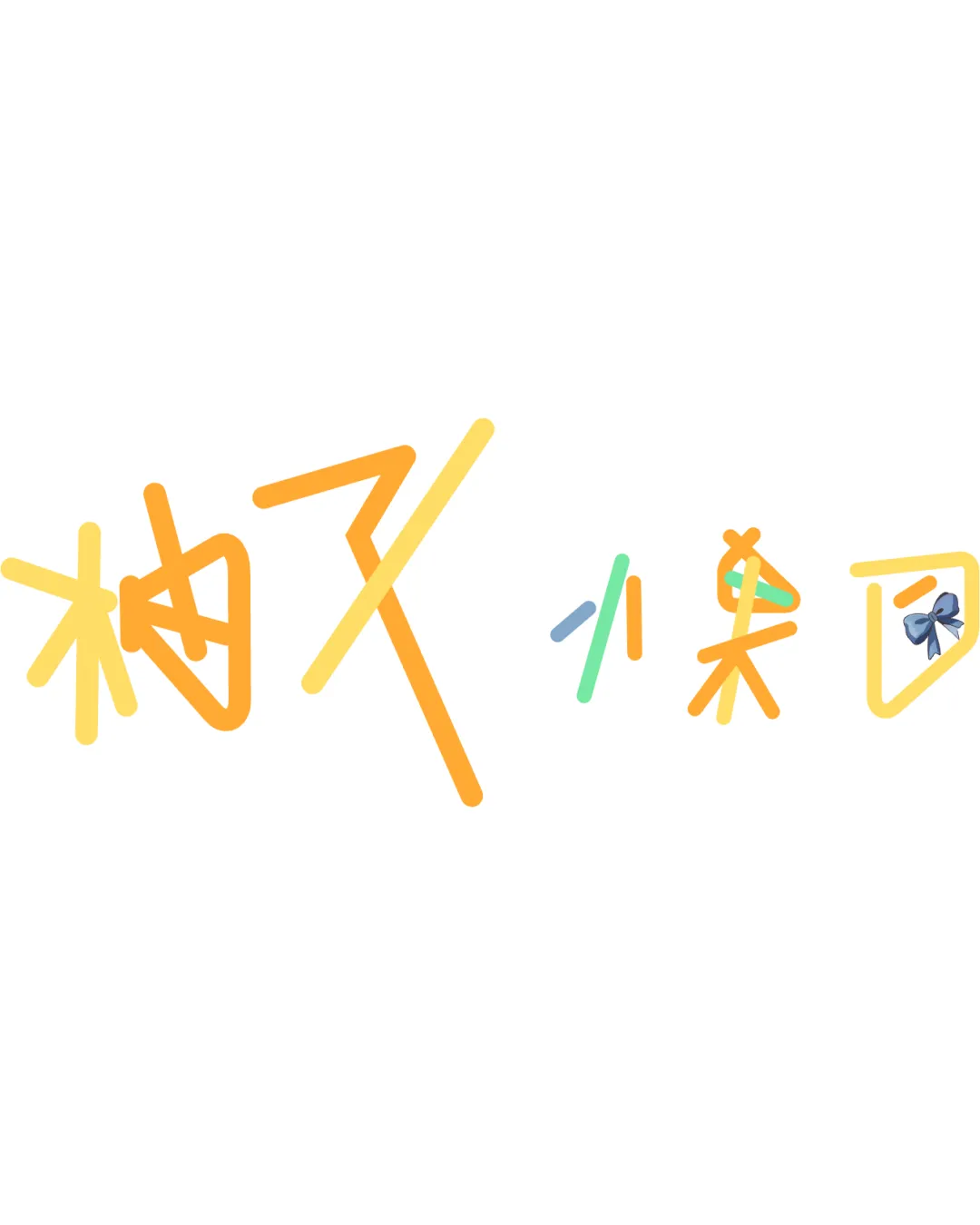
柚又小果団 logo logo review
2.8/5
Logo score Wordmark category

柚又小果団 logo

creative642070 Essential logo review

A lively, original, and playful wordmark that successfully conveys a youthful personal brand, but requires clarity and scaling optimization to function well on digital platforms.

This wordmark has a workable foundation; improving text readability is the clearest next step.

Wordmark Hand-drawn, Playful Content Creator / VTuber
2/5
Legibility
4/5
Originality
3/5
Balance
2/5
Scale
3/5
Color
Your next steps

What to fix first

Focus on the changes that matter. Keep what makes the logo work.

Concept & direction

A playful, hand-drawn logotype in stylized Chinese/Japanese characters with colorful strokes and a bow accent, conveying a friendly and youthful online identity.

Spelling & grammar

Confirm the wording

Characters appear as 柚又小果団 (potentially a stylized name); verify for correct intended meaning.

1

entire wordmark

Test logo at small sizes to ensure all characters remain legible.

High priority Visible issue Low effort

Thin, colorful lines with a hand-drawn style may reduce clarity and recognizability, especially when scaled down for use as a bilibili or YouTube avatar or thumbnail.

See the category review
Detailed review

Logo performance breakdown

3/5

Brief & logo match

The hand-drawn and colorful style matches the casual, friendly image suited to a vTuber or online content creator, but the main text may not be clearly readable in small digital uses as needed for bilibili and YouTube.

5/5

Misinterpretations

  • No problematic dual readings detected.
4/5

Originality

  • Distinct colorful hand-drawn style and bow accent.
3/5

Color harmony

  • Bright, cheerful palette.
Yellow#FFD54F
Orange#FFB74D
Teal#4DD0E1
Blue#64B5F6

Estimated colors. Use the original design file for exact values.

Create a full color palette using these colors

Create new palette
3/5

Balance alignment

  • Playfully uneven but intentionally varied for informal tone.
  • The small blue bow accent on the last character is visually separate, drawing attention away from the whole phrase rather than integrating cohesively.

    Optional refinement bow on last character
Uploaded logoAlignment guide overlay

Inspect spacing with the guide. Optical balance may differ from geometric centering.

2/5

Legibility

  • Highly stylized, overlapping strokes in handwritten kanji make some characters difficult to read, especially for those unfamiliar with the style.

    Visible issue entire wordmark
2/5

Scalability

  • Thin, colorful lines with a hand-drawn style may reduce clarity and recognizability, especially when scaled down for use as a bilibili or YouTube avatar or thumbnail.

    Visible issue entire wordmark

    Try: Test logo at small sizes to ensure all characters remain legible.

Try your own review

Wondering how your logo performs?

Get a clear logo score, key risks, and priority fix ideas before your client or audience sees it.

Review my logo