 View review
Logo score
Logo review of
Hand Made, Sami Amin
Review the detailed scores below to see what is working and what should be refined first.
Objective AI feedback. Your creative decision.
Legibility
Originality
Misread
Balance
Scale
Detailed review
Logo performance breakdown
Legibility
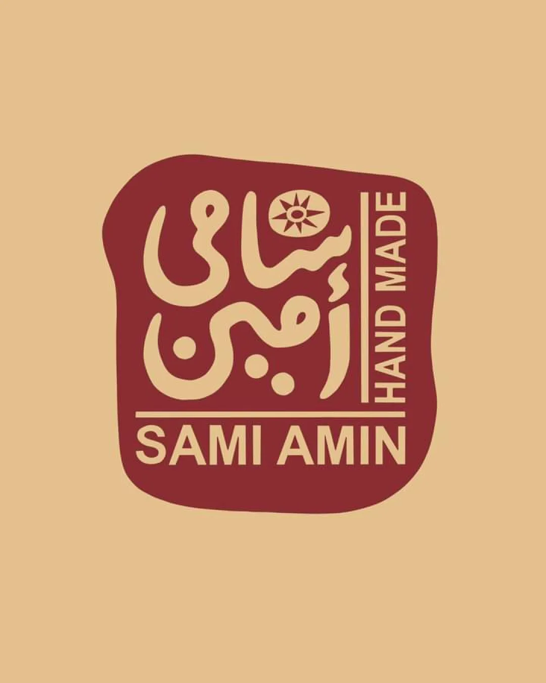
 Latin text 'SAMI AMIN' and 'HAND MADE' is highly legible with clear, bold type. Handcrafted style of Arabic calligraphy fits the artisanal brand concept.
 The vertical orientation of 'HAND MADE' could reduce legibility at small sizes or for quick scanning. Arabic calligraphy, while visually appealing, might be hard to read for non-Arabic speakers.
Originality
Distinctive blend of Arabic calligraphy with a sun motif creates a unique visual identity. Irregular border enhances the handmade appeal—well-suited for the industry.
Color harmony
Two-tone palette is harmonious, with strong contrast for easy readability. Colors evoke tradition, warmth, and uniqueness.
Teak
#B7996E
Burnt Sienna
#822F28
Balance alignment
Overall central alignment and compartmentalized text blocks feel intentional and harmonious. Good visual weight distribution between symbol, calligraphy, and Latin text.
The vertical 'HAND MADE' disrupts the otherwise horizontal layout, slightly challenging balance. Margins between logo edge and text are inconsistent, leading to some tight areas.

Scalability
Simplified color palette supports print reproduction. Bold block shape would be visible on signage, packaging, or tags.
Fine details within the Arabic calligraphy and the sun symbol might be lost at very small sizes such as embroidery or favicons. Square-ish form may not adapt well to horizontal applications like website headers or long product labels.
200x250 px
100×125 px
50×62 px
Misinterpretations
No inappropriate or confusing double meanings detected. Cultural calligraphy and sun motif are contextually relevant to handmade crafts.
Symbol & text fit
The handcrafted type, calligraphy, and symbol complement each other stylistically.
Color and thickness of Latin text work well with the boldness of the calligraphic elements.
Try your own review
Review my logo
Wondering how your logo performs?
Get a clear logo score, key risks, and priority fix ideas before your client or audience sees it.
Keep exploring