1
Category Fit
Good fitFits visual language of natural/organic honey brands (bee icon, earthy palette, script typography).
No mismatch; meets category norms.
Strong, memorable mark with industry-appropriate style and robust usability.
The most important fixes to handle before polishing the full presentation.
Small details may not reproduce cleanly at reduced scales.
Impact: Improved Legibility In Small Use Cases · Effort: Low
Currently strong, but more colorways may be needed for broader applications.
Impact: Greater Versatility In Multi-platform Branding · Effort: Medium
Bee icon is common; ensure the humanized bee sets this mark apart sufficiently.
Impact: Protects Distinctiveness In Market · Effort: Low
![]() 'Hanora' and 'Honey' both easily readable
'Hanora' and 'Honey' both easily readable![]() Script and display fonts are well chosen
Script and display fonts are well chosen
![]() Bee-woman hybrid is an uncommon and memorable twist
Bee-woman hybrid is an uncommon and memorable twist![]() Unique mark with clear industry link
Unique mark with clear industry link
![]() Bee iconography is familiar in honey industry
Bee iconography is familiar in honey industry
![]() Cohesive honey-toned palette that's on-brand
Cohesive honey-toned palette that's on-brand![]() Colors complement the friendly, organic style
Colors complement the friendly, organic style
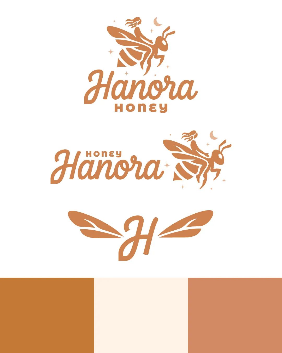
Copper
#B87B3E
Cream
#FBEADA
Tan
#CE8A67
![]() Even visual weight between icon and text
Even visual weight between icon and text![]() Good spacing and layout hierarchy
Good spacing and layout hierarchy

![]() Simple, consistent lines and clear iconography
Simple, consistent lines and clear iconography![]() Works in one color and reduced detail
Works in one color and reduced detail
![]() Small decorative elements (stars, moon) may lose clarity at tiny sizes
Small decorative elements (stars, moon) may lose clarity at tiny sizes
200x250 px
100×125 px
50×62 px
![]() No inappropriate or confusing visual resemblance detected
No inappropriate or confusing visual resemblance detected
![]() Mark and wordmark work harmoniously in all lockups
Mark and wordmark work harmoniously in all lockups
![]() Industry Fit: Bee/honey integration, warm color palette, and playful style fit a honey or artisan food product.
Industry Fit: Bee/honey integration, warm color palette, and playful style fit a honey or artisan food product.
Distinct with some familiar tropes
The logo fits the honey/artisan food category perfectly, though the bee motif is common. The humanizing of the bee gives it a point of difference, and the custom script wordmark signals quality and care.
Fits visual language of natural/organic honey brands (bee icon, earthy palette, script typography).
No mismatch; meets category norms.
Bee iconography is widely used; human/bee hybrid mitigates but does not eliminate this risk.
May be mistaken for other bee-based brands at a glance.
Communicates natural, artisan, and trustworthy brand attributes.
Strong market positioning for premium honey.
Where the logo is ready to use, where it needs adjustment, and where it may break in real applications.
Full logo lockup will display well at web header size.
Simplify or use just the 'H' or bee mark for best clarity.
Logo maintains integrity in monochrome applications.
Monogram or bee symbol works at avatar size.
Clean lines and high contrast suit print.
A practical checklist of the logo versions to prepare before sending the final files to a client or team.
Main brand mark, required for most uses.
Ideal for packaging and web uses.
Crucial for avatars, favicons, and small spaces.
Ensures universal usability and print clarity.
Could improve fit for specific merch or co-branding scenarios.
A combination mark featuring a stylized bee with a female silhouette over the flowing 'Hanora Honey' wordmark, accompanied by subtle celestial elements.
A rounded, friendly script for 'Hanora' paired with a geometric 'HONEY' that grounds the identity.
The logomark is a memorable bee-woman hybrid, evoking care, craft, and natural origins, with optional supporting wing motifs for versatility across touchpoints.
The palette uses warm honey and earth tones—copper, cream, and tan—for an inviting, organic impression.
A playful yet refined logo capturing the artisan, natural spirit of Hanora Honey, blending warmth and memorability.
Bee-woman icon expresses the handcrafted and nurturing aspect of the brand.
The script wordmark and natural palette reinforce approachability and food quality cues.
Get a clear logo score, key risks, and priority fix ideas before your client or audience sees it.