Wondering how your logo performs? 🧐
Get professional logo reviews in seconds and catch design issues in time.
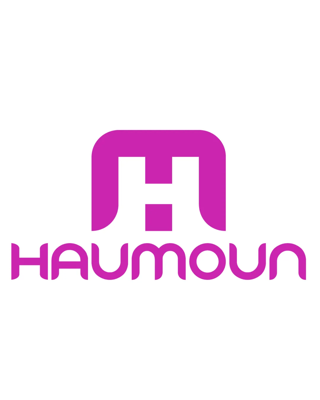
Try it Now!Logo review of HAUMOUN
 Logo analysis by AI
Logo type:
Style:
Detected symbol:
Detected text:
Business industry:
Review requested by Haumoun
**If AI can recognize or misinterpret it, so can people.
Structured logo review
Legibility
![]() Text is clear and not overly stylized, allowing for basic readability.
Text is clear and not overly stylized, allowing for basic readability.![]() Color contrast between the vivid pink and white background aids in legibility.
Color contrast between the vivid pink and white background aids in legibility.
![]() The geometric typeface is non-standard and creates ambiguity, especially with the 'N' looking similar to a 'U'.
The geometric typeface is non-standard and creates ambiguity, especially with the 'N' looking similar to a 'U'.![]() Rounded and uniform width reduces differentiation between some characters.
Rounded and uniform width reduces differentiation between some characters.![]() Legibility may decrease at small sizes due to identical curvature in letters.
Legibility may decrease at small sizes due to identical curvature in letters.
Scalability versatility
![]() Simple shapes and single color support decent scalability.
Simple shapes and single color support decent scalability.![]() Looks usable on business cards, digital icons, and promotional materials with solid color backgrounds.
Looks usable on business cards, digital icons, and promotional materials with solid color backgrounds.
![]() Thin letter forms and negative space in the logomark may lose clarity at very small sizes, especially as a favicon or embroidery.
Thin letter forms and negative space in the logomark may lose clarity at very small sizes, especially as a favicon or embroidery.![]() May not be highly distinctive at large billboard scale due to generic shape.
May not be highly distinctive at large billboard scale due to generic shape.![]() The single color approach risks looking flat in some applications without variation.
The single color approach risks looking flat in some applications without variation.
200x250 px
100×125 px
50×62 px
Balance alignment
![]() Logomark is centered above the wordmark, providing structural balance.
Logomark is centered above the wordmark, providing structural balance.![]() Visual weight feels mostly even between mark and type.
Visual weight feels mostly even between mark and type.
![]() Spacing between the logomark and wordmark feels overly generous, disconnecting the two components.
Spacing between the logomark and wordmark feels overly generous, disconnecting the two components.![]() Geometric type’s consistent thickness does not visually complement the heavier logomark.
Geometric type’s consistent thickness does not visually complement the heavier logomark.

Originality
![]() Custom geometric type creates some visual differentiation.
Custom geometric type creates some visual differentiation.![]() Promise of brandable logomark with the square 'H' motif.
Promise of brandable logomark with the square 'H' motif.
![]() The square 'H' symbol is commonly used and lacks distinctive features.
The square 'H' symbol is commonly used and lacks distinctive features.![]() Font concept is reminiscent of several dated tech start-up logos.
Font concept is reminiscent of several dated tech start-up logos.![]() No evident creative twist or clever negative-space usage that would set it apart.
No evident creative twist or clever negative-space usage that would set it apart.
Logomark wordmark fit
![]() Both mark and font share rounded, geometric qualities.
Both mark and font share rounded, geometric qualities.
![]() Mark and wordmark seem mismatched in weight and presence, making the logo feel segmented rather than unified.
Mark and wordmark seem mismatched in weight and presence, making the logo feel segmented rather than unified.![]() Font is delicate compared to the much bolder mark above, leading to visual imbalance.
Font is delicate compared to the much bolder mark above, leading to visual imbalance.
Aesthetic look
![]() Clean execution and contemporary color choice.
Clean execution and contemporary color choice.![]() Consistent geometric styling throughout the logo elements.
Consistent geometric styling throughout the logo elements.
![]() Overall aesthetic is quite generic and forgettable.
Overall aesthetic is quite generic and forgettable.![]() Lacks unique flourish or memorable detail due to over-reliance on basic geometric forms.
Lacks unique flourish or memorable detail due to over-reliance on basic geometric forms.
Dual meaning and misinterpretations
![]() No inappropriate or unintended double meanings detected.
No inappropriate or unintended double meanings detected.![]() Abstract 'H' form feels safe for broad audiences.
Abstract 'H' form feels safe for broad audiences.
Color harmony
![]() Monochrome pink scheme is consistent and not overwhelming.
Monochrome pink scheme is consistent and not overwhelming.![]() Good contrast with white background keeps it visually appealing.
Good contrast with white background keeps it visually appealing.
![]() Relying on a single color can make the design feel flat and undynamic in certain contexts.
Relying on a single color can make the design feel flat and undynamic in certain contexts.
Vivid Pink
#D42DA1
White
#FFFFFF