Legibility
- Readable text for the main title
- Contrasting colors aid visibility
- The subtitle is unclear
- Thin fonts can be hard to read from a distance
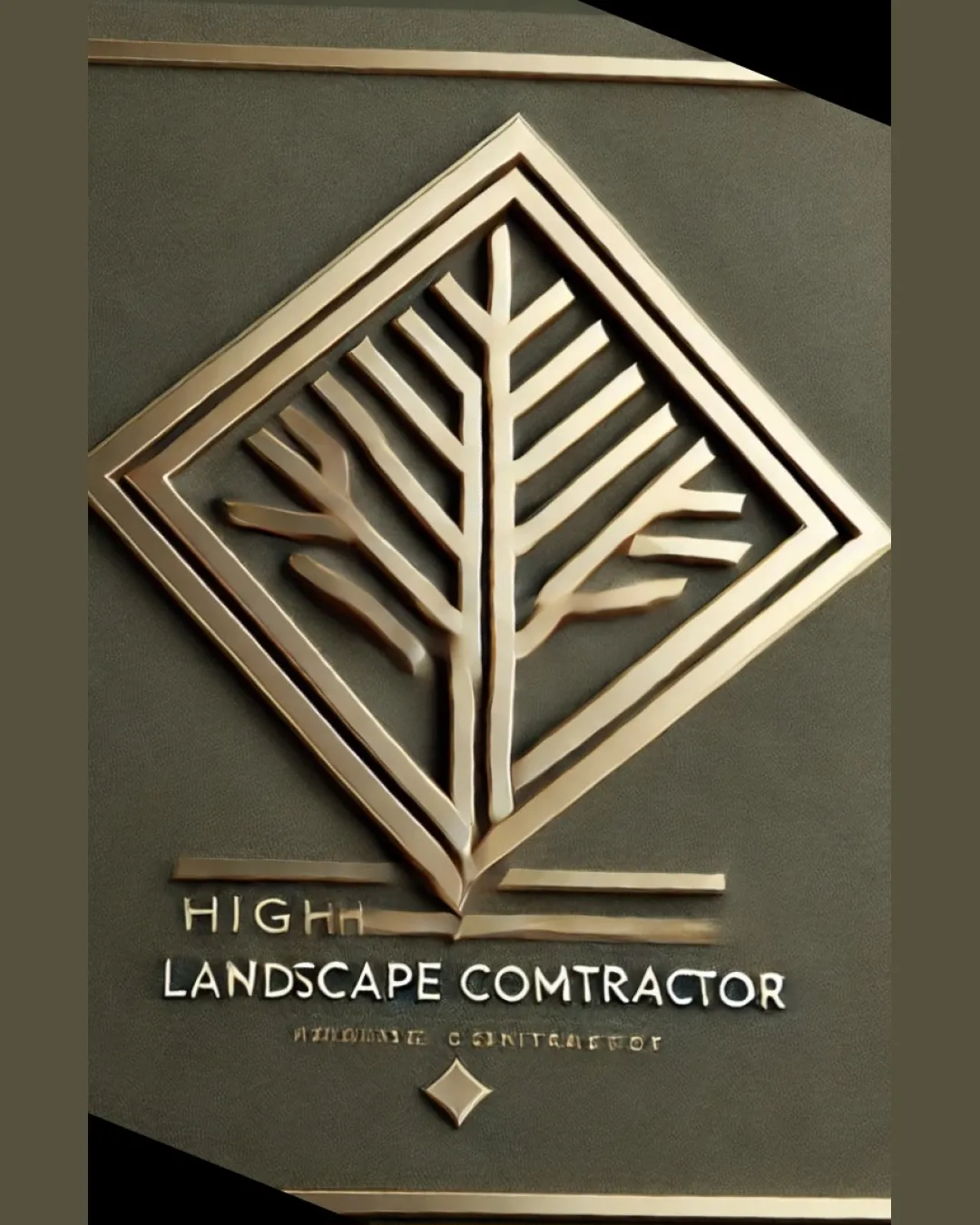
Review the detailed scores below to see what is working and what should be refined first.
Inspect spacing with the guide. Optical balance may differ from geometric centering.
Get a clear logo score, key risks, and priority fix ideas before your client or audience sees it.
More credits needed
Add credits to continue without losing your work.
Then $7/month. Cancel anytime.
Essential logo review
Usually takes under a minute