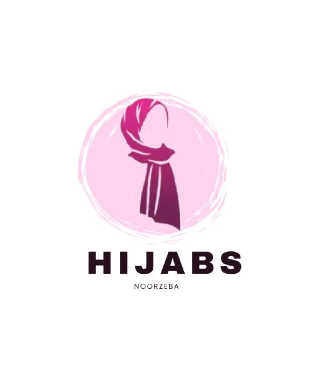
HIJABS, NOORZEBA logo review
4/5
Logo score
Logo review of

Hijabs, Noorzeba

Review the detailed scores below to see what is working and what should be refined first.

Combination Mark Modern, Feminine, Illustrative Fashion
4/5
Legibility
3/5
Originality
5/5
Misread
4/5
Balance
3/5
Scale
Detailed review

Logo performance breakdown

4/5

Legibility

  • Main wordmark 'HIJABS' is highly readable with bold, sans-serif typography.
  • Subtext 'NOORZEBA' is clear in isolation.
  • Subtext 'NOORZEBA' is quite small compared to the wordmark and may lose legibility at reduced sizes.
3/5

Originality

  • Abstract feminine figure with hijab is specific to the industry and adds some distinction.
  • Brush circle creates a frame-like effect, adding energy.
  • Stylized figure with headscarf is a common motif for hijab/fashion brands, so not highly unique.
  • Design does not deploy negative space in new or creative ways.
5/5

Color harmony

  • Analogous reds and pinks create a cohesive and appealing palette.
  • Dark text contrasts well with light background and pink elements.
Violet Red#E37CAB
Magenta#C03E6A
Light Pink#F8BBD0
Black#231F20

Estimated colors. Use the original design file for exact values.

Create a full color palette using these colors

Create new palette

4/5

Balance alignment

  • Central alignment between symbol and text provides a harmonious structure.
  • The rounded, sketched border visually frames the subject well.
  • Visual weight of the logomark slightly overpowers the wordmark, especially due to bold colors and shape.
Uploaded logoAlignment guide overlay

Inspect spacing with the guide. Optical balance may differ from geometric centering.

3/5

Scalability

  • Clear silhouette and bold wordmark enhance recognizability on business cards, signage, and social media.
  • Logo works on light backgrounds due to contrasting dark color scheme.
  • Sketched circle and small subtext details may not translate well to embroidery, tiny favicons, or very small print applications.
  • Detailed brush effects inside the circle could blur at small scale.
Uploaded logo at 200 pixels wide
200 × 250 px
Uploaded logo at 100 pixels wide
100 × 125 px
Uploaded logo at 50 pixels wide
50 × 63 px

Compare the detail at different sizes. Labels show the full image dimensions.

5/5

Misinterpretations

  • No inappropriate or unintended secondary meanings detected.
  • Instantly conveys a feminine/fashion-oriented identity.
4/5

Symbol & text fit

  • Logomark subject is directly relevant to wordmark and brand theme.
  • Both share a modern, minimalistic aesthetic.
  • Slight visual disconnect due to difference in style density between dynamic brushstroke symbol and geometric font.

Black & white

Does the shape still work without color?

These tests are available only for logos uploaded in vector (SVG) format.

Background contrast

Find the surfaces where your logo stays clear.

These tests are available only for logos uploaded in vector (SVG) format.

Blur & silhouette

A 3px blur softens fine details so you can check whether the overall shape stays recognizable. If key gaps close or elements merge, the logo may rely too heavily on detail.

These tests are available only for logos uploaded in vector (SVG) format.

Try your own review

Wondering how your logo performs?

Get a clear logo score, key risks, and priority fix ideas before your client or audience sees it.

Review my logo