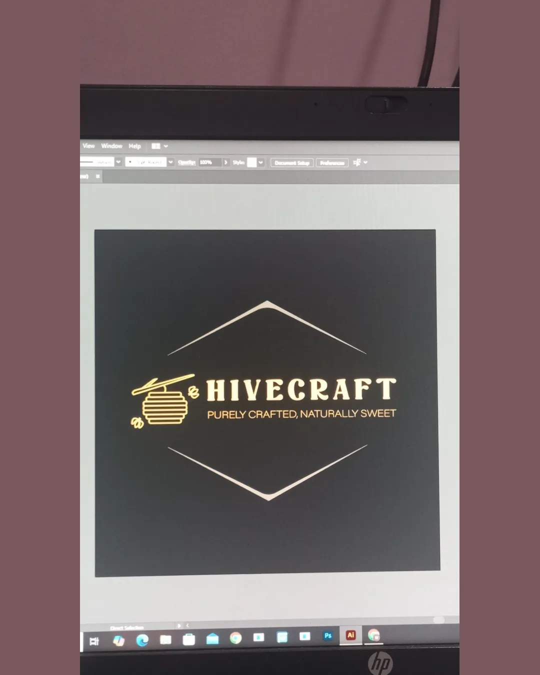
HIVECRAFT PURELY CRAFTED, NATURALLY SWEET logo review
4.8 / 5
Logo score
Logo review of

Hivecraft Purely Crafted, Naturally Sweet

Review the detailed scores below to see what is working and what should be refined first.

Objective AI feedback. Your creative decision.

Combination Mark Rustic And Natural Honey Or Beekeeping
5/5
Legibility
4/5
Originality
5/5
Balance
4/5
Scale
Detailed review

Logo performance breakdown

5/5

Legibility

Checkmark icon The text is clear and easy to read.

4/5

Originality

Checkmark icon The combination of a beehive and bee is well-executed and thematic.

Warning icon Bee and hive symbols are common in this industry.

5/5

Color harmony

Checkmark icon The gold color palette is harmonious and suggests quality.

5/5

Balance alignment

Checkmark icon The elements are well balanced within the geometric frame.

logo 200x250 pixels scalability test alignment grid overlay
4/5

Scalability

Checkmark icon The logo's lines are clean, making it suitable for various sizes.

Warning icon The fine lines in the beehive might be less visible at smaller sizes.

logo 200x250 pixels scalability test

200x250 px

logo 100x125 pixels scalability test

100×125 px

logo 50x62 pixels scalability test

50×62 px

5 / 5

Symbol & text fit

Checkmark icon The symbol and text complement each other well.

Try your own review

Wondering how your logo performs?

Get a clear logo score, key risks, and priority fix ideas before your client or audience sees it.

Review my logo