1
Category Fit
Good fitStrong correlation with real estate and home services.
Visual cues are intuitive and expected.
Strong concept and execution, with only minor technical adjustments needed to optimize scalability and stylistic harmony.
The most important fixes to handle before polishing the full presentation.
Details in the fingers could blur or merge at smaller scales.
Impact: Improves Versatility And Clarity For Digital And Print Applications. · Effort: Medium
Balances visual weight for professional appeal.
Impact: Better Harmony Between Mark And Wordmark For Polished, Unified Presentation. · Effort: Low
Current style pairing is good but could be further optimized for brand consistency.
Impact: Creates A Holistically Unified Look. · Effort: Medium
![]() Text is highly readable with sufficient spacing and clear typography.
Text is highly readable with sufficient spacing and clear typography.
![]() Symbol combines hands and a home, which is a moderately original take for real estate.
Symbol combines hands and a home, which is a moderately original take for real estate.
![]() Hands forming a house is a common visual metaphor in real estate branding.
Hands forming a house is a common visual metaphor in real estate branding.
![]() Consistent blue and white palette associates well with trust and professionalism.
Consistent blue and white palette associates well with trust and professionalism.
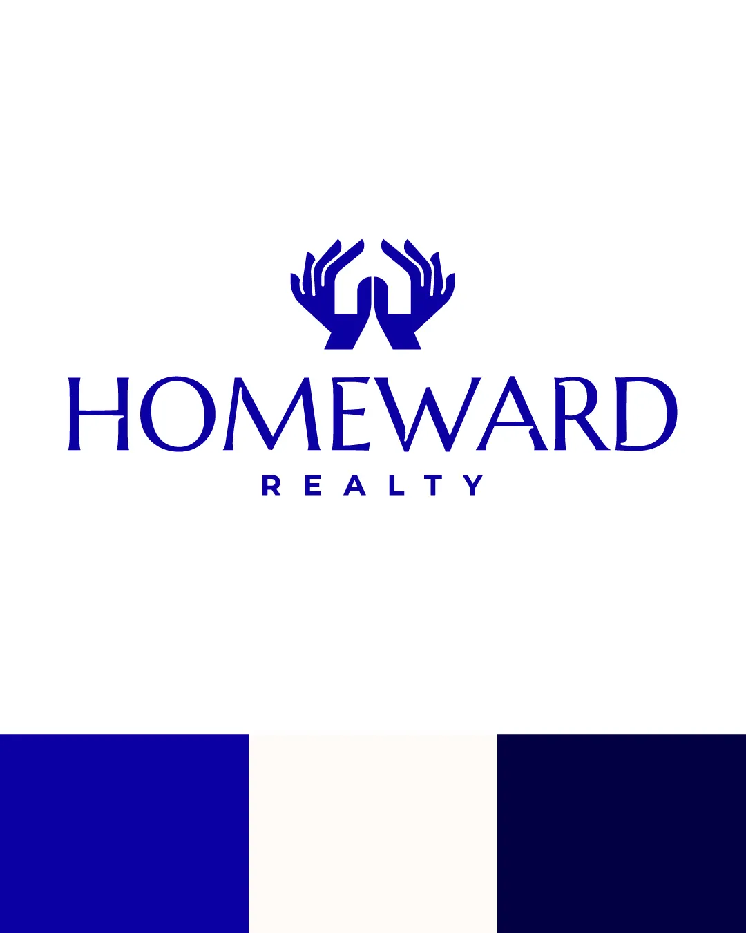
Dark Blue
#03038D
White
#FFFFFF
Navy
#070739
![]() The mark is well-centered above the wordmark.
The mark is well-centered above the wordmark.![]() Text alignment is consistent and visually anchored.
Text alignment is consistent and visually anchored.
![]() The mark feels slightly heavy compared to the wordmark and could overpower at small sizes.
The mark feels slightly heavy compared to the wordmark and could overpower at small sizes.

![]() The mark and text are both bold enough to scale reasonably well.
The mark and text are both bold enough to scale reasonably well.![]() Simple forms enable reproduction in one color.
Simple forms enable reproduction in one color.
![]() Mark may lose some clarity at favicon or very small scale due to detail in the hands.
Mark may lose some clarity at favicon or very small scale due to detail in the hands.
200x250 px
100×125 px
50×62 px
![]() No inappropriate or embarrassing visual resemblance detected.
No inappropriate or embarrassing visual resemblance detected.
![]() The mark conceptually supports the brand name and industry.
The mark conceptually supports the brand name and industry.
![]() Stylistic contrast between sharp geometric mark and classic serif type may need better cohesion.
Stylistic contrast between sharp geometric mark and classic serif type may need better cohesion.
![]() Industry Relevance: Visuals of hands and house directly fit the real estate sector, reinforcing a theme of protection and homecoming.
Industry Relevance: Visuals of hands and house directly fit the real estate sector, reinforcing a theme of protection and homecoming.
Good category fit, but moderate differentiation risk.
The mark fits real estate standards (care, home) but the hands/house metaphor is widely used, so brand distinctiveness relies on execution details.
Strong correlation with real estate and home services.
Visual cues are intuitive and expected.
Moderate, due to commonness of hands/house metaphor.
May blend in among similar metropolitan or residential realty logos.
Signals trust and expertise appropriately.
Color and serif type enhance professional perception.
Where the logo is ready to use, where it needs adjustment, and where it may break in real applications.
Legible and recognizable at typical web sizes.
Detailed fingers could blur at tiny sizes; consider alternative icon.
Logo structure remains readable in solid fill.
Mark may need simplification for clarity at small social sizes.
Sufficient contrast and clarity for larger formats.
A practical checklist of the logo versions to prepare before sending the final files to a client or team.
Core presentation is shown and client-ready.
Essential for small spaces and favicons.
Allows flexible use where symbol is redundant or too small.
Important for diverse printing/embroidery needs.
Extra versatility in signage and layout.
This logo features a pair of stylized hands forming the roof and outline of a house above the wordmark, visually representing care and homeownership.
The wordmark uses a classic serif typeface that conveys reliability and sophistication, enhanced by wide spacing and all-caps 'REALTY' below.
The standalone mark consists of two upward-cupped hands visually creating a home rooftop, evoking security, warmth, and trust.
A monochromatic blue palette is used, supporting brand trustworthiness and working well across light and dark backgrounds.
The logo blends trust, guidance, and the concept of home, symbolizing security and a personal touch for real estate clients.
Hands forming a home visually convey care, approachability, and expertise relevant to real estate.
Royal blue accent reinforces professionalism and reliability.
Get a clear logo score, key risks, and priority fix ideas before your client or audience sees it.