BFF, বাংলাদেশ logo review
3.2/5
Logo score
Logo review of

Bff, বাংলাদেশ

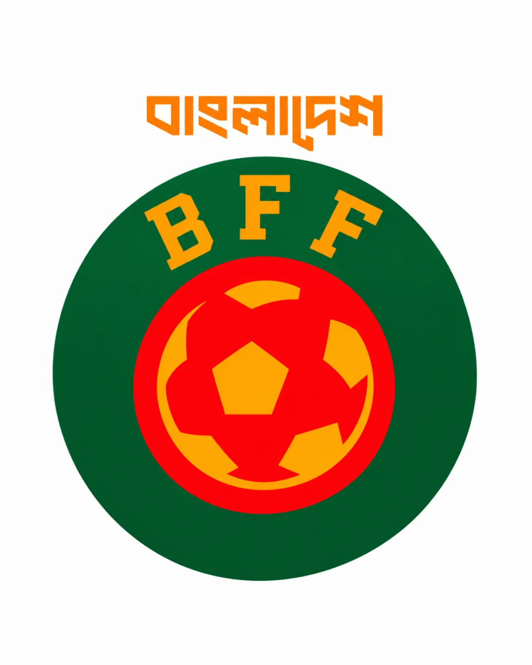
A relevant, functional logo blending national and sport symbols, but lacking in unique flair and high-impact clarity. Readiness for professional, widespread use is moderate—fine for local sport applications, but below top-tier federation standards.

Combination Mark Flat, Geometric Sports Badge Sports
3.5/5
Legibility
3/5
Originality
5/5
Misread
3.5/5
Balance
3/5
Scale
Your next steps

What to fix first

Focus on the changes that matter. Keep what makes the logo work.

1

Simplify or restyle the Bengali wordmark for clarity at all sizes

High priority Medium effort

Highly abstract script risks misreading, harming accessibility.

Improves legibility and broader recognition
2

Refine the football icon for improved balance and distinctiveness

Medium priority Medium effort

Football motif is generic; minor custom touches would add uniqueness and balance.

Strengthens visual identity and modern appeal

Detailed review

Logo performance breakdown

Not scored

Brief & logo match

From the original review
  • Symbolize The Nation

    Incorporates Bengali text and colors associated with Bangladesh, supporting national symbolism.

  • Football/sports Identity

    Football icon and athletic badge structure communicate the sport clearly.

3.5/5

Legibility

  • BFF initials are bold and clear
  • Distinctive Bengali script for 'Bangladesh'
  • Bengali wordmark uses a highly stylized font that may reduce readability, especially at small sizes
  • Monogram could be more distinctive
3/5

Originality

  • Combination of national colors, local script, and football is relevant
  • Badge structure and basic football icon are common for football associations globally; lacks unique twist
4/5

Color harmony

  • Bold use of national colors (green, red, yellow, orange) reflects the Bangladesh flag
  • Some colors (yellow and orange) are relatively close in shade, reducing contrast in the ball detail
Orange#FF9900
Green#008000
Red#FF0000
Yellow#FFFF00

Estimated colors. Use the original design file for exact values.

Create a full color palette using these colors

Create new palette

3.5/5

Balance alignment

  • Good use of central alignment and circular framing
  • Elements are visually centered
  • Text proportions and football placement feel visually heavy in the lower center, creating slight imbalance
Uploaded logoAlignment guide overlay

Inspect spacing with the guide. Optical balance may differ from geometric centering.

3/5

Scalability

  • Simple, bold forms suitable for medium-to-large uses
  • Fine detail in football pattern and thin lines of text could degrade at small sizes
Uploaded logo at 200 pixels wide
200 × 250 px
Uploaded logo at 100 pixels wide
100 × 125 px
Uploaded logo at 50 pixels wide
50 × 63 px

Compare the detail at different sizes. Labels show the full image dimensions.

5/5

Misinterpretations

  • No confusing negative space or unintended interpretations
3/5

Symbol & text fit

  • All elements relate to football and nation
  • Visual connection between the Bengali wordmark and central icon is weak; feels like separate modules

Black & white

Does the shape still work without color?

These tests are available only for logos uploaded in vector (SVG) format.

Background contrast

Find the surfaces where your logo stays clear.

These tests are available only for logos uploaded in vector (SVG) format.

Blur & silhouette

A 3px blur softens fine details so you can check whether the overall shape stays recognizable. If key gaps close or elements merge, the logo may rely too heavily on detail.

These tests are available only for logos uploaded in vector (SVG) format.

Try your own review

Wondering how your logo performs?

Get a clear logo score, key risks, and priority fix ideas before your client or audience sees it.

Review my logo