 View review
Logo score
Logo review of
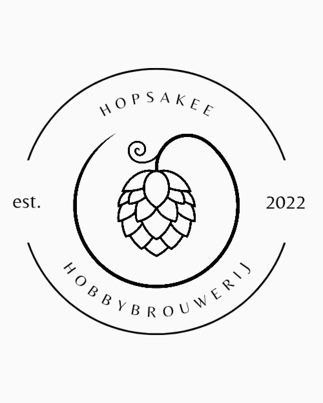
Hopsakee, Hobbybrouwerij, Est. 2022
Review the detailed scores below to see what is working and what should be refined first.
Objective AI feedback. Your creative decision.
Legibility
Originality
Misread
Balance
Scale
Detailed review
Logo performance breakdown
Legibility
 Text is very clear and easy to read with ample spacing. Fonts are modern and not overdecorated.
Originality
Singular hop cone with curling vine adds a bit of flair. Minimalist execution is contemporary.
 Hop cone motif is extremely common in breweries, making the mark feel generic without further customization or unique twist.
Color harmony
Single-color design makes for easy adaptation and consistency. Black-and-white creates strong contrast and clarity.
White
#FFFFFF
Black
#000000
Balance alignment
Centering of the hop symbol within the circle is visually pleasing. Text follows the curve in a balanced and proportional manner.
'est. 2022' feels less integrated due to its horizontal layout—it slightly disrupts circular flow.

Scalability
Clean lines aid reproduction in many formats. Design works well in print and on web.
Thin outline may lose detail at very small sizes, especially on labels, coasters, or embroidery. Fine details in the hop cone may fade in favicon or small digital displays.
200x250 px
100×125 px
50×62 px
Misinterpretations
Hop cone is clearly represented, no inappropriate accidental imagery detected.
Symbol & text fit
Wordmark and hop mark share a consistent minimalist styling and line weight.
The circular form links mark and text as a cohesive unit.
There is little visual interplay between type and symbol—the text could interact more playfully with the hop illustration.
Try your own review
Review my logo
Wondering how your logo performs?
Get a clear logo score, key risks, and priority fix ideas before your client or audience sees it.
Keep exploring


