 View review
Logo score
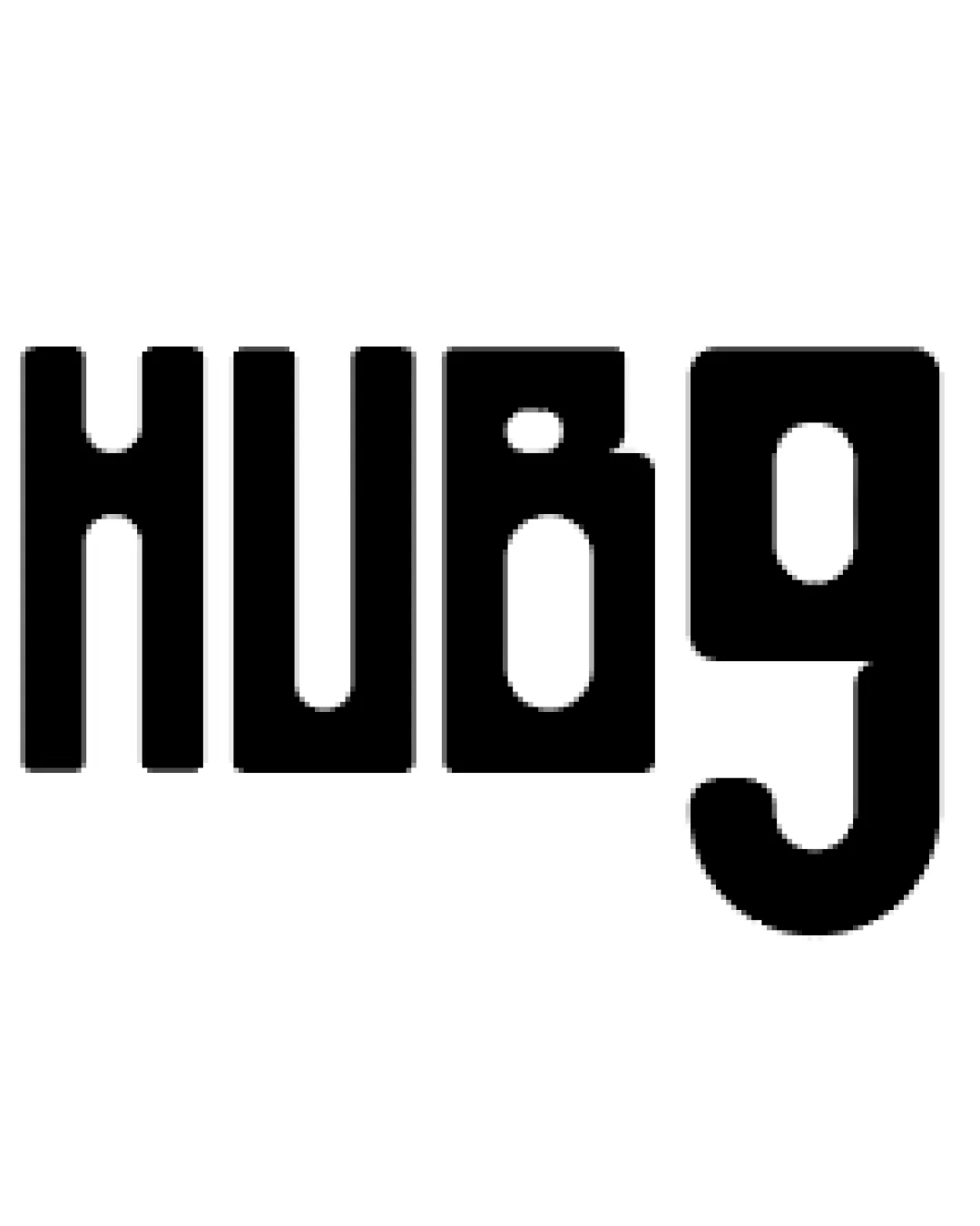
Logo review ofHubg
Review the detailed scores below to see what is working and what should be refined first.
Legibility
Originality
Misread
Balance
Scale
Action plan
What to fix first
The most important fixes to handle before polishing the full presentation.
1
Fix possible misinterpretation
High priorityThe 'B' can be misread as '8', leading to possible confusion.
Impact: High · Effort: Medium
Detailed review
Logo performance breakdown
Legibility
![]() Bold, high-contrast letters are easy to distinguish from the background.
Bold, high-contrast letters are easy to distinguish from the background.
![]() Letterforms are overly geometric, making the 'B' and 'G' especially hard to read at first glance.
Letterforms are overly geometric, making the 'B' and 'G' especially hard to read at first glance.![]() Some viewers may misinterpret 'B' as '8' due to the top gap.
Some viewers may misinterpret 'B' as '8' due to the top gap.
Originality
![]() Geometric style is somewhat distinctive.
Geometric style is somewhat distinctive.
![]() Overall execution feels generic due to lack of memorable or unique features.
Overall execution feels generic due to lack of memorable or unique features.![]() Heavily stylized fonts similar to this are somewhat common.
Heavily stylized fonts similar to this are somewhat common.
Color harmony
![]() Single black color ensures high contrast and broad usability.
Single black color ensures high contrast and broad usability.
Black
#000000
White
#FFFFFF
Balance alignment
![]() Uniform stroke width provides some visual consistency.
Uniform stroke width provides some visual consistency.
![]() The 'G' is visually heavier and larger than the other characters, disrupting the overall balance.
The 'G' is visually heavier and larger than the other characters, disrupting the overall balance.![]() Spacing between letters is uneven, especially around the 'B' and 'G'.
Spacing between letters is uneven, especially around the 'B' and 'G'.

Scalability
![]() Simple, bold shapes ensure the logo maintains clarity when scaled down.
Simple, bold shapes ensure the logo maintains clarity when scaled down.![]() Works effectively in monochrome applications.
Works effectively in monochrome applications.
![]() Potential legibility loss on very small applications due to the closed counters of 'B' and 'G'.
Potential legibility loss on very small applications due to the closed counters of 'B' and 'G'.
200x250 px
100×125 px
50×62 px
Misinterpretations
![]() The 'B' can be misread as '8', leading to possible confusion.
The 'B' can be misread as '8', leading to possible confusion.
Try your own review
Review my logo
Wondering how your logo performs?
Get a clear logo score, key risks, and priority fix ideas before your client or audience sees it.
Keep exploring


