 View review
Logo score
Logo review ofHubs
Review the detailed scores below to see what is working and what should be refined first.
Legibility
Originality
Misread
Balance
Scale
Action plan
What to fix first
The most important fixes to handle before polishing the full presentation.
1
Fix possible misinterpretation
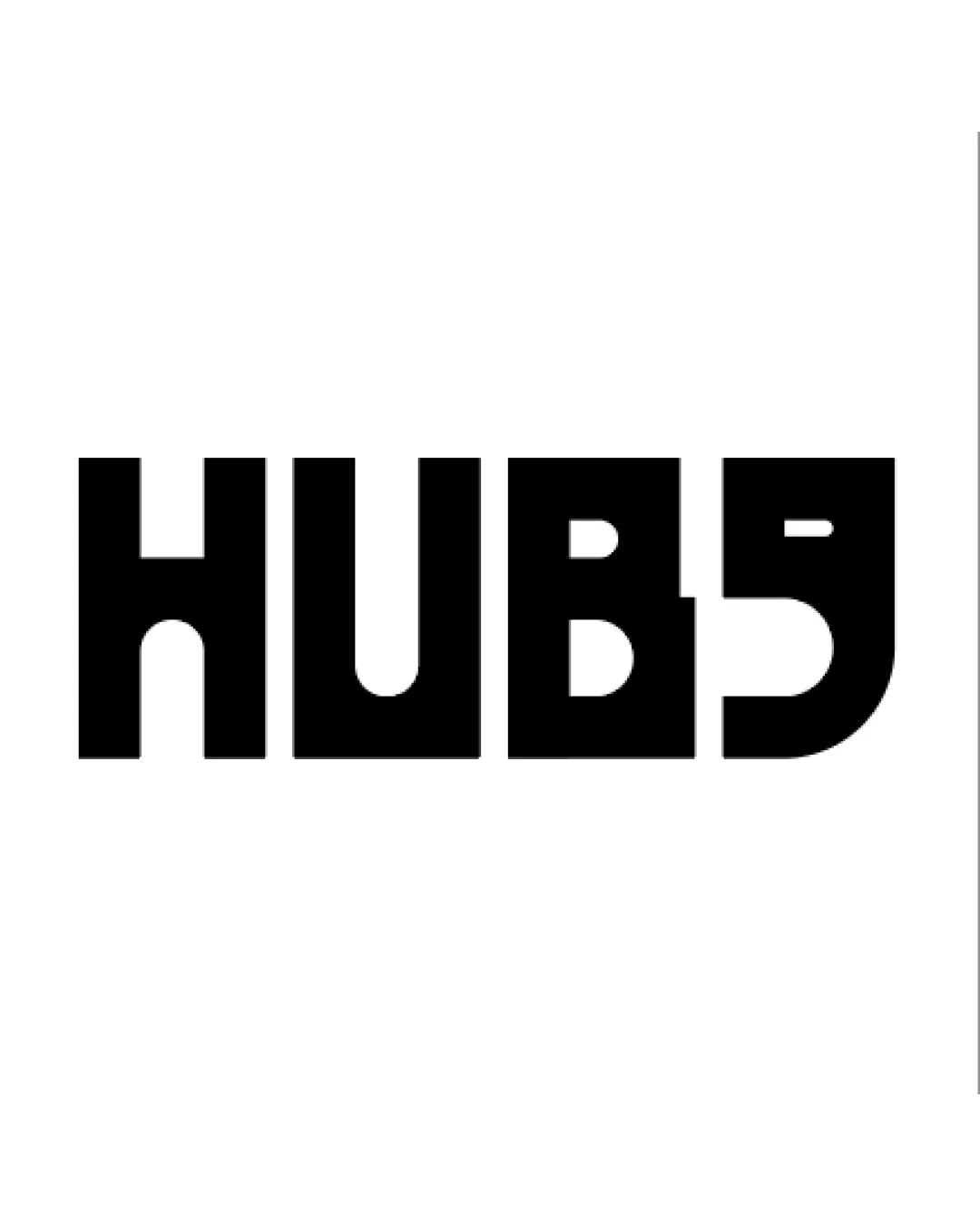
High priorityThe 'S' may consistently be misread as a '5', causing potential confusion for the brand.
Impact: High · Effort: Medium
Detailed review
Logo performance breakdown
Legibility
![]() Bold, geometric type enhances visibility from a distance.
Bold, geometric type enhances visibility from a distance.
![]() 'S' character can be easily misread as a '5', significantly undermining brand recognition.
'S' character can be easily misread as a '5', significantly undermining brand recognition.![]() Unusual forms for 'B' and 'S' affect quick readability, especially at a glance or small sizes.
Unusual forms for 'B' and 'S' affect quick readability, especially at a glance or small sizes.
Originality
![]() Distinctive architectonic letterforms are memorable.
Distinctive architectonic letterforms are memorable.![]() Geometric reinterpretation of a wordmark is uncommon.
Geometric reinterpretation of a wordmark is uncommon.
![]() Styling toes the line between unique and confusing; misreadability could be problematic.
Styling toes the line between unique and confusing; misreadability could be problematic.![]() No use of negative space or clever integration beyond hard-edged geometry.
No use of negative space or clever integration beyond hard-edged geometry.
Color harmony
![]() High contrast, black-on-white design ensures maximum clarity.
High contrast, black-on-white design ensures maximum clarity.![]() Single color approach is timeless and versatile.
Single color approach is timeless and versatile.
Black
#000000
White
#FFFFFF
Balance alignment
![]() Uniform stroke weight and geometric structure create initial balance.
Uniform stroke weight and geometric structure create initial balance.
![]() The open shape of the 'S' and asymmetry between 'U' and 'B' create visual imbalance.
The open shape of the 'S' and asymmetry between 'U' and 'B' create visual imbalance.![]() Uneven optical alignment between first/last letters—'S' feels heavier than 'H' or 'U'.
Uneven optical alignment between first/last letters—'S' feels heavier than 'H' or 'U'.

Scalability
![]() High-contrast, single-color design scales well across print and digital media.
High-contrast, single-color design scales well across print and digital media.![]() Will be easily recognizable as an app icon, sticker, or on merchandise due to simplicity.
Will be easily recognizable as an app icon, sticker, or on merchandise due to simplicity.
![]() Letter misinterpretation (S looks like 5) becomes pronounced at small sizes.
Letter misinterpretation (S looks like 5) becomes pronounced at small sizes.![]() Very blocky shapes may lose some appeal or legibility on business cards or embroidery.
Very blocky shapes may lose some appeal or legibility on business cards or embroidery.
200x250 px
100×125 px
50×62 px
Misinterpretations
![]() The 'S' may consistently be misread as a '5', causing potential confusion for the brand.
The 'S' may consistently be misread as a '5', causing potential confusion for the brand.![]() No overtly inappropriate dual meaning, though misinterpretation remains high.
No overtly inappropriate dual meaning, though misinterpretation remains high.
Try your own review
Review my logo
Wondering how your logo performs?
Get a clear logo score, key risks, and priority fix ideas before your client or audience sees it.
Keep exploring


