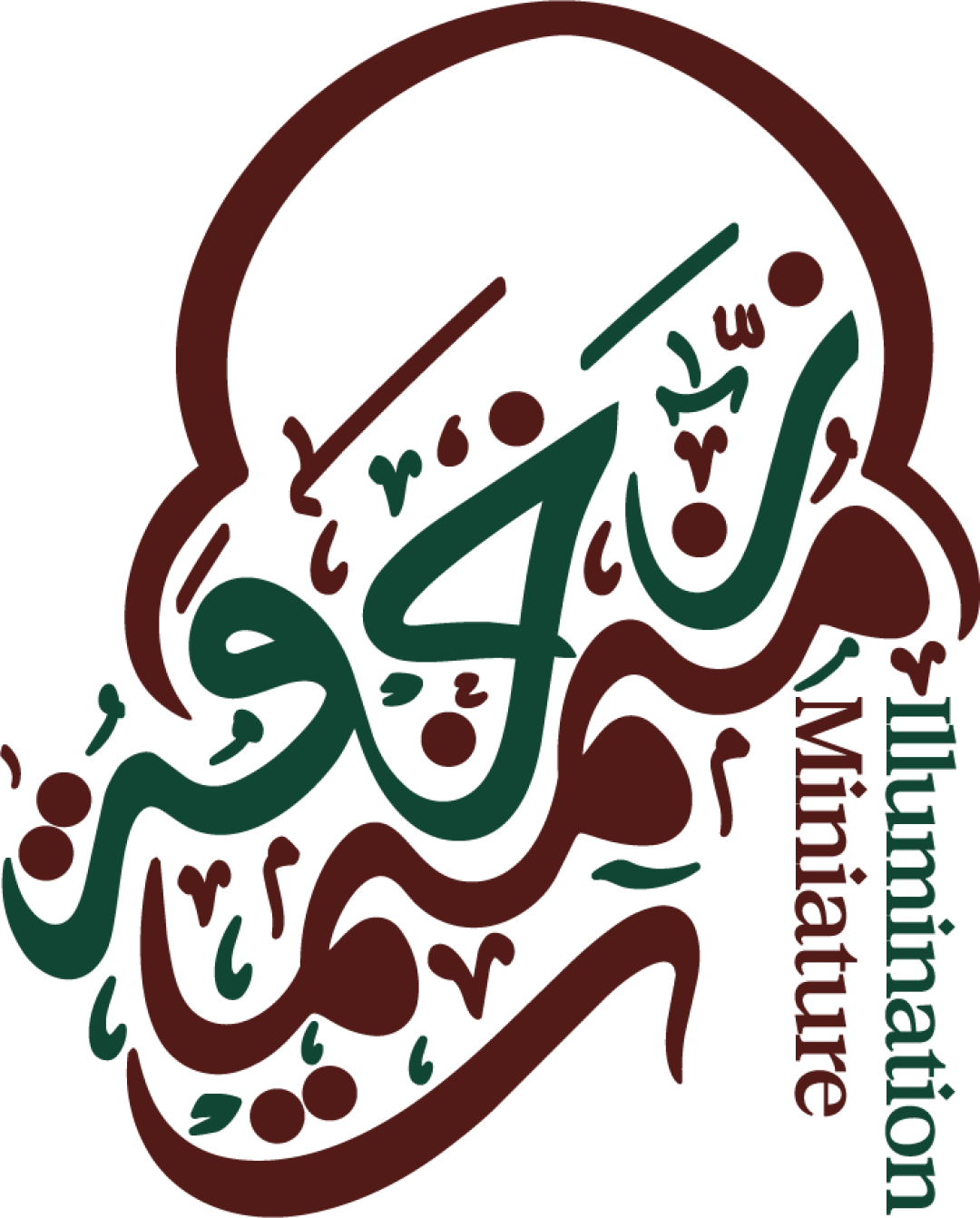
Illumination Miniature logo review
3.5/5
Logo score Combination category

Illumination Miniature

creative302475 Essential logo review

A distinctive, thematically-appropriate logo reflecting the illumination/miniature arts, but English wordmark legibility and detail scalability require improvement for broader use.

Symbols recognized:
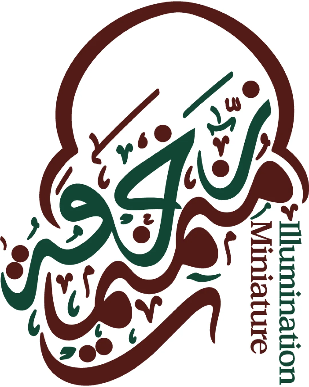
Ornate Arabic calligraphy forming an abstract mark, encircled by a thick outline reminiscent of a traditional miniature frame or illuminated manuscript motif.
Legible text:
Illumination Miniature
Combination Traditional Calligraphic Arts And Culture
3/5
Legibility
4/5
Originality
3/5
Balance
3/5
Scale
Your next steps

What to fix first

Focus on the changes that matter. Keep what makes the logo work.

What to preserve

The logo fuses Arabic calligraphy and Western serif text to evoke both traditional illumination and miniature manuscript arts.

Spelling & grammar

No obvious issue found

English text is correctly spelled and positioned; Arabic calligraphy likely forms a name/title, no clear error visible.

1

Standalone mark

Create and test a simplified mark for very small/utility usage.

High priority Worth testing Medium effort

Ornate calligraphic details may not reproduce cleanly at small sizes or in low-resolution applications.

See the category review
2

wordmark (Illumination Miniature)

Consider a more horizontal or stacked arrangement for the English words.

Medium priority Visible issue Low effort

Vertical orientation of the English wordmark reduces immediate readability, especially at small sizes or from a distance.

See the category review
Detailed review

Logo performance breakdown

Not scored

Brief & logo match

There isn't enough brand context to assess the match.

3/5

Legibility

  • Arabic calligraphy visually striking.
  • Vertical orientation of the English wordmark reduces immediate readability, especially at small sizes or from a distance.

    Visible issue wordmark (Illumination Miniature)

    Try: Consider a more horizontal or stacked arrangement for the English words.

3/5

Balance alignment

  • Traditional layout mirrors miniature manuscript framing.
  • Transition between the Arabic calligraphy and the English wordmark is abrupt, with minimal interaction and optical tension where the frame is broken.

    Optional refinement logo integration (whole logo)

    Try: Explore a more integrated framing or buffer zone between sections.

Uploaded logoAlignment guide overlay

Inspect spacing with the guide. Optical balance may differ from geometric centering.

3/5

Scalability

  • Bold mark likely recognizable at sufficient size.
  • Ornate calligraphic details may not reproduce cleanly at small sizes or in low-resolution applications.

    Worth testing Standalone mark

    Try: Create and test a simplified mark for very small/utility usage.

3/5

Symbol & text fit

  • Wordmark and mark present clear themes.
4/5

Originality

  • Distinctive fusion of Arabic calligraphy and Western typography.
  • Custom mark with cultural resonance.
4/5

Color harmony

  • Rich, harmonious traditional palette.
Green#215A42
Brown#552218

Estimated colors. Use the original design file for exact values.

Create a full color palette using these colors

Create new palette
5/5

Misinterpretations

  • No ambiguous or unintended readings supported.
Try your own review

Wondering how your logo performs?

Get a clear logo score, key risks, and priority fix ideas before your client or audience sees it.

Review my logo