 View review
Logo score
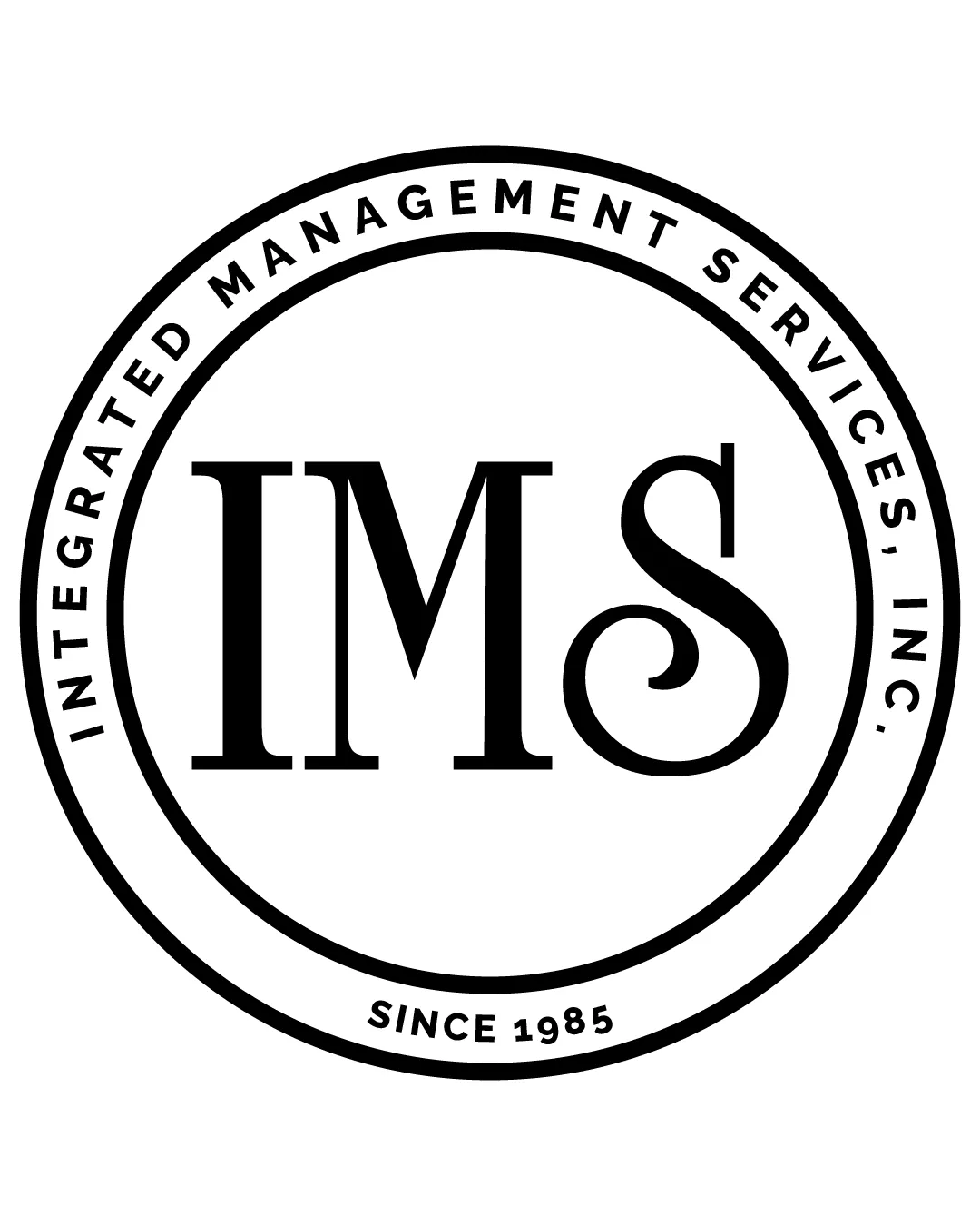
Logo review ofIms, Integrated Management Services, Inc., Since 1..
Review the detailed scores below to see what is working and what should be refined first.
Legibility
Originality
Misread
Balance
Scale
Detailed review
Logo performance breakdown
Legibility
![]() All letters are highly readable due to high color contrast.
All letters are highly readable due to high color contrast.![]() Clear sans-serif and serif distinctions enhance clarity.
Clear sans-serif and serif distinctions enhance clarity.
Originality
![]() Use of a circular badge aligns with traditional emblem styles.
Use of a circular badge aligns with traditional emblem styles.
![]() The concept and style are highly generic for the business services sector, lacking a distinctive or memorable visual element.
The concept and style are highly generic for the business services sector, lacking a distinctive or memorable visual element.![]() No creative integration or symbolism beyond standard type and circle.
No creative integration or symbolism beyond standard type and circle.
Color harmony
![]() Monochrome palette provides strong contrast and coherence.
Monochrome palette provides strong contrast and coherence.![]() Consistent color usage maintains simplicity.
Consistent color usage maintains simplicity.
Black
#000000
White
#FFFFFF
Balance alignment
![]() Symmetrical circular layout creates a well-centered composition.
Symmetrical circular layout creates a well-centered composition.![]() Internal text and rings provide visual structure.
Internal text and rings provide visual structure.
![]() Slightly heavy focus on central IMS, making the outer text less prominent.
Slightly heavy focus on central IMS, making the outer text less prominent.

Scalability
![]() Simple color scheme supports black-and-white reproduction.
Simple color scheme supports black-and-white reproduction.![]() Bold central letters retain visibility at moderate scaling.
Bold central letters retain visibility at moderate scaling.
![]() Fine outer ring and text may lose clarity in small applications such as app icons, business cards, or embroidery.
Fine outer ring and text may lose clarity in small applications such as app icons, business cards, or embroidery.![]() Circular badge may not adapt well to non-circular spaces.
Circular badge may not adapt well to non-circular spaces.
200x250 px
100×125 px
50×62 px
Misinterpretations
![]() No inappropriate or confusing secondary visual meanings detected.
No inappropriate or confusing secondary visual meanings detected.
Try your own review
Review my logo
Wondering how your logo performs?
Get a clear logo score, key risks, and priority fix ideas before your client or audience sees it.
Keep exploring


