 View review
Logo score
Logo review ofRegions
Review the detailed scores below to see what is working and what should be refined first.
Legibility
Originality
Misread
Balance
Scale
Detailed review
Logo performance breakdown
Legibility
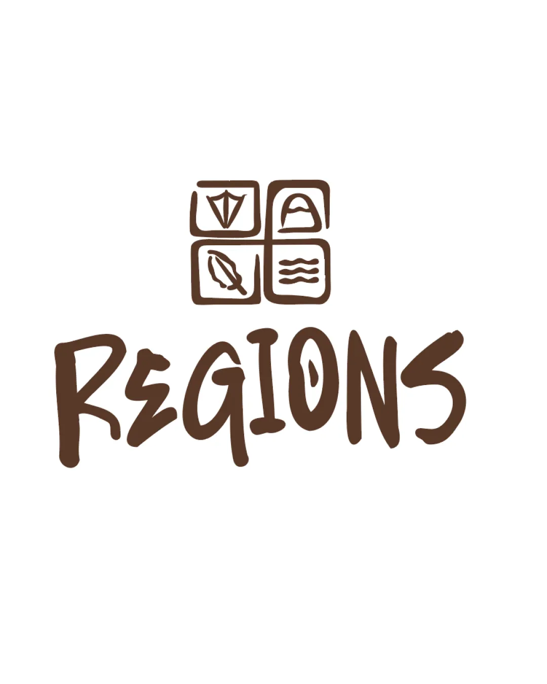
![]() Text is mostly easy to read with a playful handwritten style.
Text is mostly easy to read with a playful handwritten style.![]() Contrast between text and background is strong.
Contrast between text and background is strong.
![]() The 'E' and 'O' have irregular forms that could hinder readability at a quick glance.
The 'E' and 'O' have irregular forms that could hinder readability at a quick glance.![]() Variation in line weight might be slightly distracting.
Variation in line weight might be slightly distracting.
Originality
![]() Unique hand-drawn approach stands out.
Unique hand-drawn approach stands out.![]() Combination of four distinct icons gives creative differentiation.
Combination of four distinct icons gives creative differentiation.
![]() Use of four separate icons is busy and not highly original, as grids/four-square motifs are common in travel and tourism branding.
Use of four separate icons is busy and not highly original, as grids/four-square motifs are common in travel and tourism branding.
Color harmony
![]() Monochromatic palette ensures harmony and avoids clashing colors.
Monochromatic palette ensures harmony and avoids clashing colors.![]() Contrast with white background maximizes clarity.
Contrast with white background maximizes clarity.
Kobicha
#54351B
White
#FFFFFF
Balance alignment
![]() Centered composition aids balance between the symbol and text.
Centered composition aids balance between the symbol and text.![]() Hand-drawn unity between the wordmark and monogram.
Hand-drawn unity between the wordmark and monogram.
![]() The four-symbol grid appears top-heavy against the more casual, irregular wordmark.
The four-symbol grid appears top-heavy against the more casual, irregular wordmark.![]() Spacing between elements feels loose, causing minor imbalance.
Spacing between elements feels loose, causing minor imbalance.

Scalability
![]() Simple, thick lines help maintain clarity at medium sizes.
Simple, thick lines help maintain clarity at medium sizes.![]() Works well for casual branding and digital use.
Works well for casual branding and digital use.
![]() The detail in the four small symbols may get lost at small sizes (e.g., business card, favicon).
The detail in the four small symbols may get lost at small sizes (e.g., business card, favicon).![]() The irregular hand-drawn typography may not scale well for embroidery or very small applications.
The irregular hand-drawn typography may not scale well for embroidery or very small applications.
200x250 px
100×125 px
50×62 px
Misinterpretations
![]() No inappropriate or confusing secondary imagery detected.
No inappropriate or confusing secondary imagery detected.
Symbol & text fit
![]() Both logomark and wordmark share a casual, hand-drawn style creating visual cohesion.
Both logomark and wordmark share a casual, hand-drawn style creating visual cohesion.
![]() The geometric grid of the logomark feels slightly rigid compared to the playful wordmark below. The combination could be more unified by adjusting icon style or box shapes.
The geometric grid of the logomark feels slightly rigid compared to the playful wordmark below. The combination could be more unified by adjusting icon style or box shapes.
Try your own review
Review my logo
Wondering how your logo performs?
Get a clear logo score, key risks, and priority fix ideas before your client or audience sees it.
Keep exploring


