What to preserve
A modern, compact combination mark that fuses an abstract geometric icon with a clean, professional wordmark, referencing structure and balance suitable for finance.
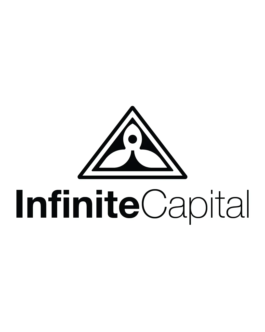
A modern, professional logo with a well-structured abstract mark and clear wordmark, slightly held back by an imbalance between component weights and somewhat generic iconography.
This logo lockup shows solid execution, supported by text readability and clarity at smaller sizes; improving distinctiveness is the clearest next step.
Focus on the changes that matter. Keep what makes the logo work.
A modern, compact combination mark that fuses an abstract geometric icon with a clean, professional wordmark, referencing structure and balance suitable for finance.
Logo preview unavailable. The written feedback is still available on this card.
lockup (symbol and name)
The geometric symbol is strongly weighted above the lighter, modern wordmark, which has a noticeable contrast in font weights between 'Infinite' and 'Capital,' creating mild visual imbalance.
See the category reviewModern geometric symbol and precise typography deliver a clear, professional look for a finance brand, though the icon's familiarity offers limited distinctiveness.
Wordmark 5/5 · Layout 4/5
Symbol 4/5 · Wordmark 4/5 · Layout 4/5
Symbol 4/5 · Wordmark 3/5 · Layout 3/5
The geometric symbol is strongly weighted above the lighter, modern wordmark, which has a noticeable contrast in font weights between 'Infinite' and 'Capital,' creating mild visual imbalance.
Try: Harmonize the type weight and symbol proportion to reduce disconnect.
Logo preview unavailable. The written feedback is still available on this card.

Inspect spacing with the guide. Optical balance may differ from geometric centering.
Symbol 3.5/5 · Wordmark 3/5
The central symbol, while abstract and stylish, draws from very familiar geometric and symmetrical motifs that are common in the finance and consulting sector.
Get a clear logo score, key risks, and priority fix ideas before your client or audience sees it.
More credits needed
Add credits to continue without losing your work.
Then $7/month. Cancel anytime.
Essential logo review with AI
Estimated progress