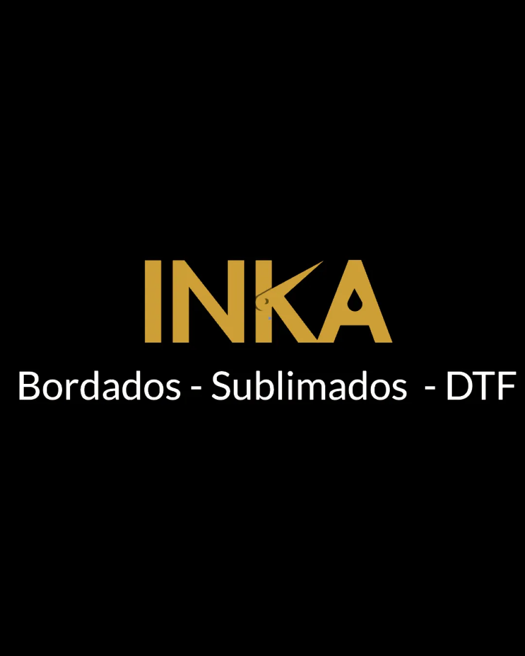
INKA, Bordados - Sublimados - DTF logo review
4.1 / 5
Logo score

Logo review ofInka, Bordados Sublimados Dtf

Review the detailed scores below to see what is working and what should be refined first.

Wordmark Minimal, Geometric Printing
4/5
Legibility
4/5
Originality
5/5
Misread
4/5
Balance
3/5
Scale
Review next
Detailed review

Logo performance breakdown

4/5

Legibility

Checkmark icon Primary brand name (INKA) is bold, clear, and easy to read
Checkmark icon Supporting text uses a clean sans-serif typeface for clarity

Warning icon The stylized K introduces a sharp stroke which could be misread at a glance or at smaller sizes
4/5

Originality

Checkmark icon The pointed K introduces a distinct visual twist
Checkmark icon Name INKA is bold and unique, making it memorable in the industry

Warning icon Other aspects of the wordmark follow common geometric sans-serif logotypes, and the style of the supporting line is generic

5/5

Color harmony

Checkmark icon Restrained use of color ensures harmony and professionalism
Checkmark icon Dark background enhances the gold and white contrast

Goldenrod
#B79934

Black
#000000

White
#FFFFFF

4/5

Balance alignment

Checkmark icon Main wordmark is well-centered and spacing between letters is mostly consistent
Checkmark icon Supporting tagline is horizontally balanced

Warning icon Sharp cut on the K disrupts the otherwise geometric flow, making the visual weight on the right side slightly heavier

logo 200x250 pixels scalability test alignment grid overlay
3/5

Scalability

Checkmark icon Simple shapes and strong contrast ensure decent legibility in larger formats such as signage or web banners

Warning icon Thin, pointed line on the K may disappear or appear distorted at small sizes, such as business cards or product tags
Warning icon Logo may not be as recognizable or clear when scaled down to favicon or embroidery applications

logo 200x250 pixels scalability test

200x250 px

logo 100x125 pixels scalability test

100×125 px

logo 50x62 pixels scalability test

50×62 px

5/5

Misinterpretations

Checkmark icon No inappropriate shapes or unintended interpretations present

Try your own review

Wondering how your logo performs?

Get a clear logo score, key risks, and priority fix ideas before your client or audience sees it.

Review my logo