 View review
Logo score
Logo review ofInner Shift
Review the detailed scores below to see what is working and what should be refined first.
Legibility
Originality
Misread
Balance
Scale
Detailed review
Logo performance breakdown
Legibility
 Text is bold, uppercase, and highly readable Strong contrast ensures clarity on both light and dark backgrounds
Originality
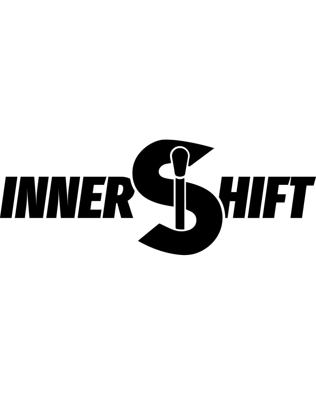
Smart integration of the makeup brush within the 'S' adds unique character Distinct visual that communicates the industry
 Big monogram letter with embedded tool is a recognizable concept in the beauty sector, so the execution is original but the core idea is not entirely fresh
Color harmony
Simple black & white palette is timeless and ensures versatility across all platforms Strong contrast underscores the logo's clarity and adaptability
Black
#000000
White
#FFFFFF
Balance alignment
Centering of the large 'S' creates a focal point and a strong axis Wordmark elements are cohesively arranged with the symbol
The oversized 'S' creates a slight imbalance compared to the rest of the wordmark, potentially overpowering the rest of the text

Scalability
Bold lines and simple forms aid scalability for most uses Works well on large-format signage and social media profiles
Makeup brush detail within the 'S' may be less obvious on very small scales such as favicons or embroidery
200x250 px
100×125 px
50×62 px
Misinterpretations
Makeup brush is clearly interpreted and connects intuitively with the brand message
Symbol & text fit
Logomark and wordmark share bold, sans-serif qualities with matching line weights and style
Integrated 'S' connects wordmark and icon seamlessly
Proportion difference between 'S' and the rest of the letters may create a visual disconnect in certain applications
Presentation kit
Finalize and present this logo
Logo description
The 'INNER SHIFT' logo employs a bold, modern typographic approach, with a dramatically oversized central 'S' that doubles as a symbolic device. Cleverly embedded within the 'S' is the silhouette of a makeup brush, directly conveying a connection to the beauty and cosmetics industry. The monochrome black-and-white palette ensures clarity and timelessness, making the mark highly adaptable to both print and digital environments. This integrated mark and wordmark combination reinforces brand memorability and imparts a strong visual hierarchy, ideal for professional and retail applications within the beauty sector. The overall composition is impactful, versatile, and communicates a sense of transformative beauty—perfect for a modern brand seeking boldness and clarity.
Tips for the logo presentation
Mockup ideas
- Cosmetic product packaging (lipsticks or compacts)
- Beauty salon signage
- Business cards with embossed printing
- Branded makeup brush sets
- Instagram profile icon and highlight covers
- Embroidered logo on beauty professional apparel
- Large-format trade show displays or banners
Try your own review
Review my logo
Wondering how your logo performs?
Get a clear logo score, key risks, and priority fix ideas before your client or audience sees it.
Keep exploring