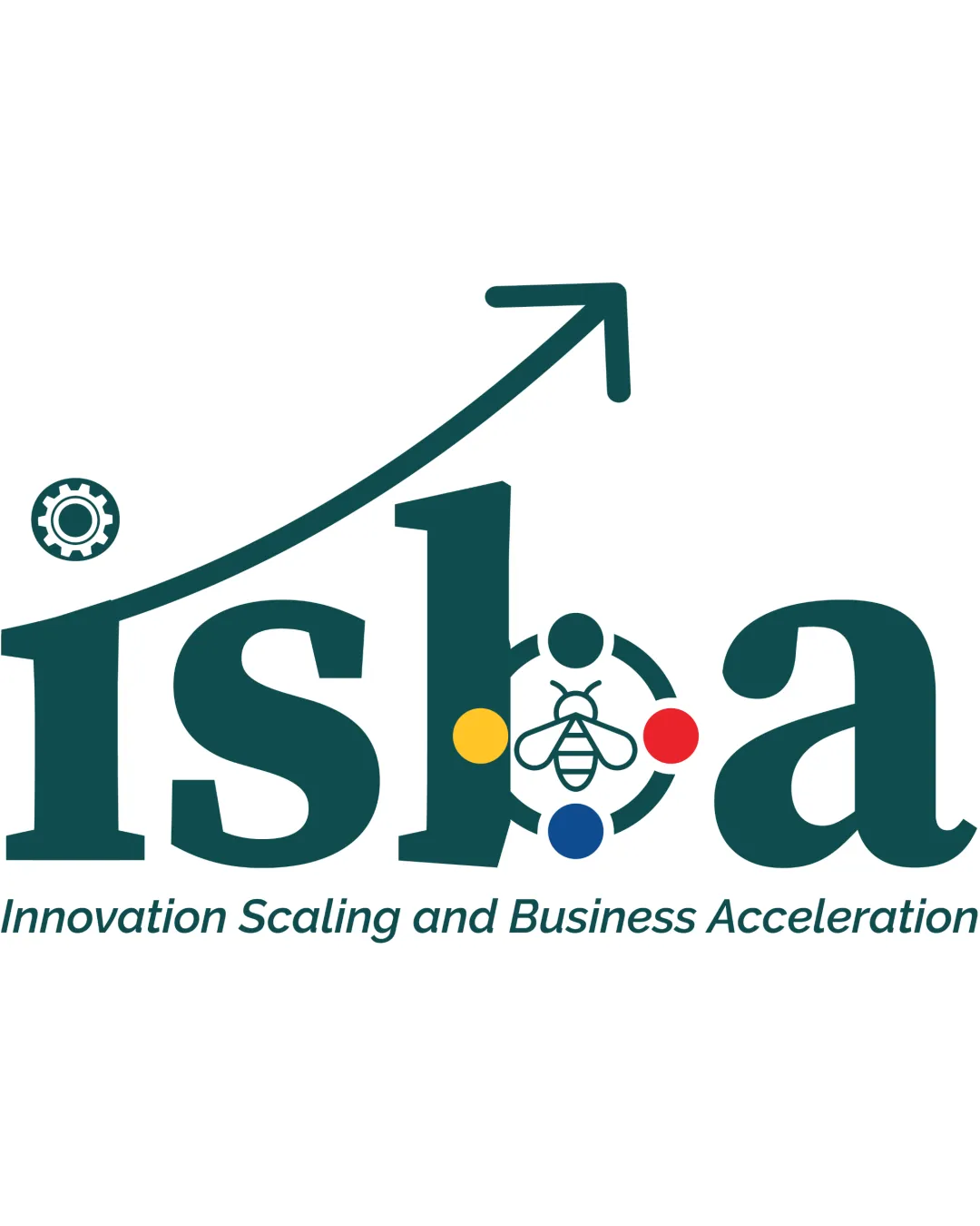
isba Innovation Scaling and Business Acceleration logo review
3.5/5
Logo score
Logo review of

Isba Innovation Scaling And Business Acceleration

A functional logo with original elements but refinement needed for scalability and integration.

Combination Corporate, Symbolic, Illustrative Accent Business Accelerator / Innovation Consultancy
4/5
Legibility
3.5/5
Originality
5/5
Misread
3/5
Balance
2.5/5
Scale
Your next steps

What to fix first

Focus on the changes that matter. Keep what makes the logo work.

1

bee/b-mark and colored dots

Simplify or thicken details of the bee and increase dot contrast for small usage.

Visible issue High priority Medium effort
Area to inspectApproximate location

Bee illustration and four colored dots may lose clarity or become hard to distinguish at small sizes.

How to check

Test legibility of the symbol in small dimensions.

See the category review
2

arrow above logo

Refine the integration of the arrow path and the gear start to improve composition unity.

Optional refinement Medium priority Medium effort
Area to inspectApproximate location

Arrowhead alignment and start-point (gear) feel slightly disconnected from the main wordmark layout.

How to check

Adjust arrow path so it flows more naturally with other elements.

See the category review
Detailed review

Logo performance breakdown

4/5

Brief & logo match

Based on an inferred industry
Compared with

Business innovation, scaling, and acceleration; supporting energetic growth and tech solutions.

Logo strongly fits an innovation and business acceleration focus, but standard motifs hold back absolute distinctiveness.

  • Innovation And Scaling

    The upward arrow and gear communicate growth and technological innovation effectively.

  • Business Acceleration

    Energetic bee inside 'b' and dynamic color palette reinforce activity and cooperation; arrow suggests acceleration.

4/5

Legibility

  • Text is readable, tagline is clear.
3.5/5

Originality

  • 'b' and bee motif is original.
  • Concept uses some familiar motifs (arrow for scaling, gear for innovation, bee for industriousness), though the geometric 'b' and bee integration add some uniqueness.

    Optional refinement overall logo

    Try: Highlight or further develop the unique 'b/bee' motif to increase distinctiveness.

    Check: Explore treatments that emphasize the signature integration.

4/5

Color harmony

  • Colors differentiate elements and add vibrancy.
Dark Teal#18534C
Yellow#EAB92D
Red#E53027
Blue#2A4B9D

Estimated colors. Use the original design file for exact values.

Create a full color palette using these colors

Create new palette
3/5

Balance alignment

  • Generally balanced wordmark.
  • Arrowhead alignment and start-point (gear) feel slightly disconnected from the main wordmark layout.

    Optional refinement arrow above logo

    Try: Refine the integration of the arrow path and the gear start to improve composition unity.

    Check: Adjust arrow path so it flows more naturally with other elements.

    Area to inspectApproximate location
Uploaded logoAlignment guide overlay

Inspect spacing with the guide. Optical balance may differ from geometric centering.

2.5/5

Scalability

  • Large-scale clarity.
  • Bee illustration and four colored dots may lose clarity or become hard to distinguish at small sizes.

    Visible issue bee/b-mark and colored dots

    Try: Simplify or thicken details of the bee and increase dot contrast for small usage.

    Check: Test legibility of the symbol in small dimensions.
    Area to inspectApproximate location
Uploaded logo at 200 pixels wide
200 × 250 px
Uploaded logo at 100 pixels wide
100 × 125 px
Uploaded logo at 50 pixels wide
50 × 63 px

Compare the detail at different sizes. Labels show the full image dimensions.

5/5

Misinterpretations

  • No negative or confusing alternate reading evident.
3.5/5

Symbol & text fit

  • Symbol elements are visually and conceptually related to text.

Black & white

Does the shape still work without color?

These tests are available only for logos uploaded in vector (SVG) format.

Background contrast

Find the surfaces where your logo stays clear.

These tests are available only for logos uploaded in vector (SVG) format.

Blur & silhouette

A 3px blur softens fine details so you can check whether the overall shape stays recognizable. If key gaps close or elements merge, the logo may rely too heavily on detail.

These tests are available only for logos uploaded in vector (SVG) format.

Try your own review

Wondering how your logo performs?

Get a clear logo score, key risks, and priority fix ideas before your client or audience sees it.

Review my logo