View review
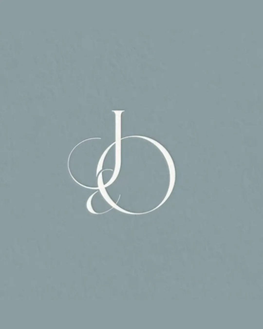
J O
Review the detailed scores below to see what is working and what should be refined first.
Logo performance breakdown
Legibility
The main J and O are somewhat distinguishable with careful inspection.
Serif details add sophistication.
The overlapping curves cause visual confusion, making the letters less instantly readable.
Thin flourishes exacerbate legibility issues, especially at small sizes.

Originality
Elegant, stylized monogram with custom flourishes for a fashion-forward personality.
Not a standard typeface, and customization is clear.
Monogram or initial-based logos are common in the industry; the elegance gives it some unique flair, but overall form isn’t fully groundbreaking.
Color harmony
Restrained two-tone palette is harmonious, professional, and unobtrusive.
Colors work well for upscale branding.
Gray
#CAD1D3
White
#F8F8F5
Balance alignment
Primary forms are visually centered and feel intentionally composed.
Vertical balance between J and O is handled gracefully.
The ornamental swash of the J's lower curve feels heavier, causing minor left-side imbalance against the simpler right side; more symmetry would help.
Scalability
Looks refined at larger sizes; suitable for high-end signage or magazine covers.
Ornate, thin lines will break down or become invisible on favicons, jewelry engraving, and small product tags.
The delicate overlapping lines do not translate well to embroidery or compact layouts.
200x250 px
100×125 px
50×62 px
Misinterpretations
No inappropriate visual innuendo or double meanings detected.
The form remains abstract and elegant.
Wondering how your logo performs?
Get a clear logo score, key risks, and priority fix ideas before your client or audience sees it.