Wondering how your logo performs? 🧐
Get professional logo reviews in seconds and catch design issues in time.
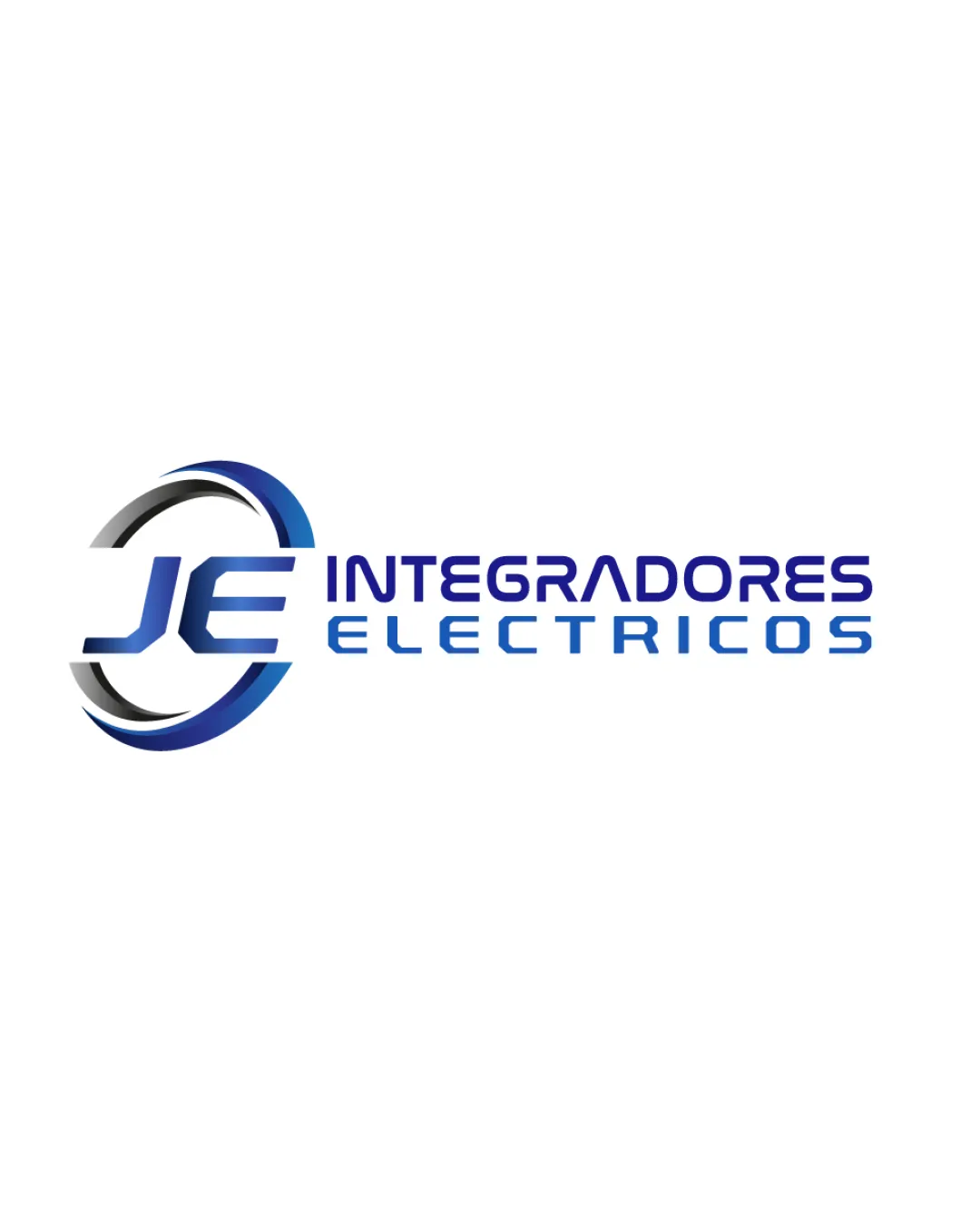
Try it Now!Logo review of JE INTEGRADORES ELECTRICOS
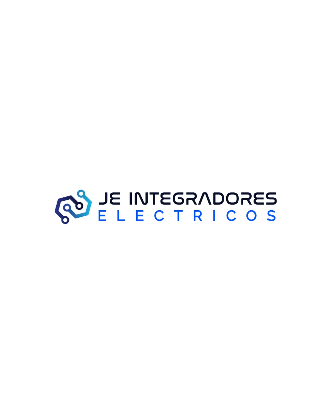
 Logo analysis by AI
Logo type:
Style:
Detected symbol:
Detected text:
Business industry:
Review requested by Wenn
**If AI can recognize or misinterpret it, so can people.
Structured logo review
Legibility
 Text is clear and readable at standard sizes. Font style maintains a modern and technological feel.
 The spacing in 'ELECTRICOS' is slightly wide, which could impair quick reading at smaller scales. Rounded letter shapes may lose definition at tiny sizes.
Scalability versatility
Logo would work on digital screens, signage, and most print formats. Symbol is simple enough to scale down for some applications.
Thin lines in the symbol may disappear or blur in small sizes or embroidery. Complexity of the full wordmark may not scale well for small merchandise, mobile favicons, or pens.
200x250 px
100×125 px
50×62 px
Balance alignment
Symbol and wordmark are horizontally aligned, giving visual stability. Consistent alignment between text and icon.
There is a slight imbalance due to the heavier weight of the icon compared to the thin letter shapes.

Originality
Circuit board/technology icon is contextually relevant. Modern font instills technological feel.
The hexagonal circuit icon is highly generic and overused in tech/electronics brands. No unique twist or custom letter modifications.
Logomark wordmark fit
Styles between the logomark and wordmark are visually compatible.
Hexagonal icon is slightly heavier than the wordmark in scale, creating a minor imbalance. Color gradient in logomark is not echoed in the wordmark, leading to a slight disconnect.
Aesthetic look
Overall look is modern and clean. Appropriate for technology/electrical business sector.
Lack of originality makes the design feel somewhat generic. Color gradient feels trendy but lacks longevity.
Dual meaning and misinterpretations
No unintentionally inappropriate or confusing secondary imagery detected.
Color harmony
Blue tones are harmonious and fit the technology sector. Color choices support industry relevance.
Gradient in the icon may complicate consistent reproduction, especially in single-color applications.
Cobalt
#0C2345
Vivid Blue
#2998FF
White
#FFFFFF