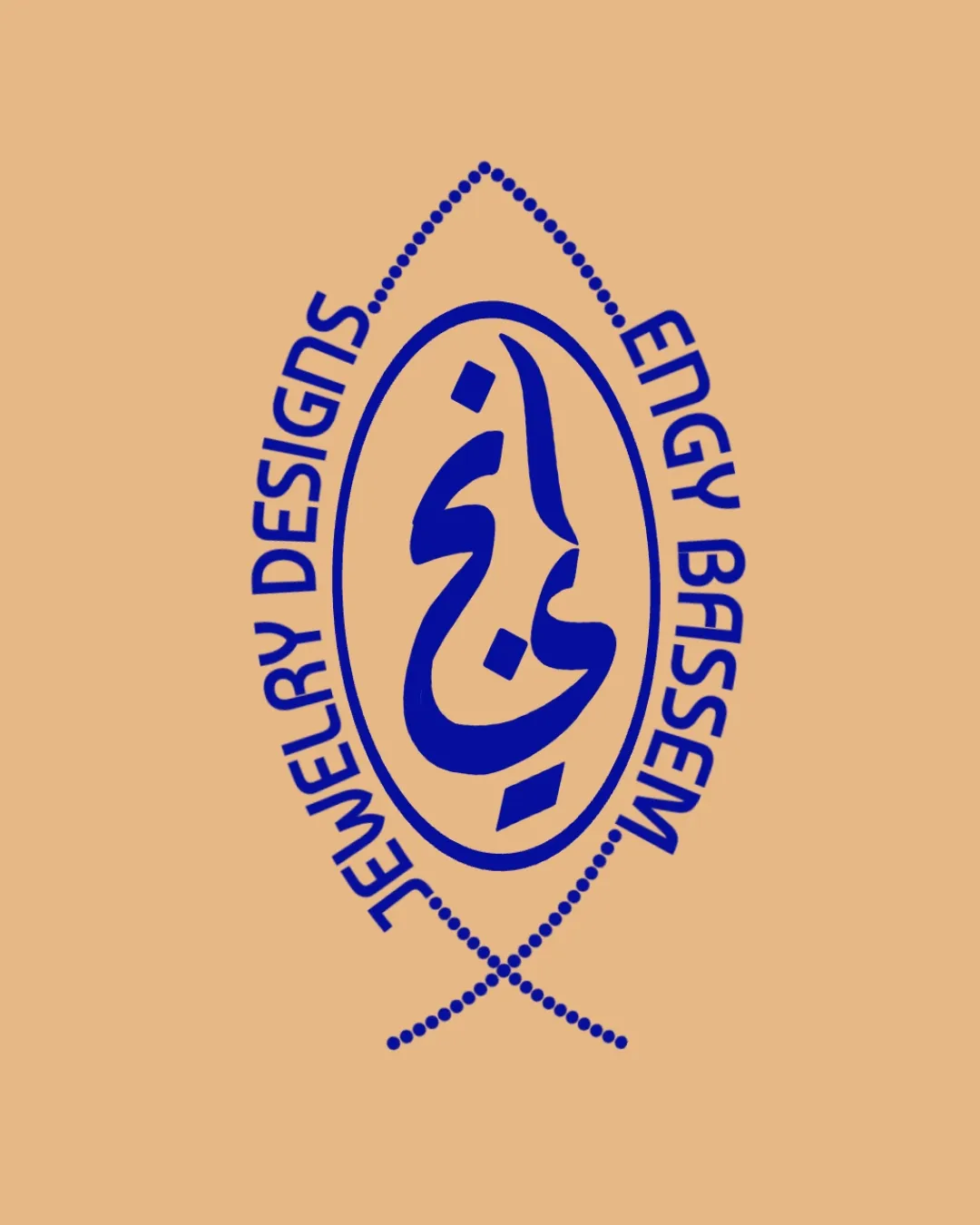
JEWELRY DESIGNS ENGY BASSEM logo review
3.4/5
Logo score

JEWELRY DESIGNS ENGY BASSEM

Review the detailed scores below to see what is working and what should be refined first.

Emblem Calligraphic, Traditional, Emblematic Jewelry
3/5
Legibility
4/5
Originality
3/5
Balance
2/5
Scale
Detailed review

Logo performance breakdown

3/5

Legibility

  • Latin text is sufficiently readable with bold, sans-serif letterforms
  • Consistent kerning and tracking in Latin type
  • Curved placement of English text reduces quick readability, especially for long brand names
  • Arabic calligraphy, while visually appealing, may not be easily legible to those unfamiliar with the script

4/5

Originality

  • Use of Arabic calligraphy gives a unique, culturally specific identity
  • Emblem structure is less common in the jewelry industry
  • Fish/eye outline is a standard ornamental shape and adds little originality
  • Combination of elements could be seen as visually busy
4/5

Color harmony

  • High contrast between blue and beige supports distinct visibility
  • Restrained color use is in line with jewelry luxury brands
  • Blue is uncommon for jewelry and may lack association with precious metals or gems
Blue#13209E
Beige#E2B383

Estimated colors. Use the original design file for exact values.

Create a full color palette using these colors

Create new palette
3/5

Balance alignment

  • Central symmetry of the oval and dotted outline creates overall vertical balance
  • Curved placement of text feels slightly off-kilter and creates visual tension
  • Calligraphy placement within the oval is not optically centered, making the logo feel lopsided
Uploaded logoAlignment guide overlay

Inspect spacing with the guide. Optical balance may differ from geometric centering.

2/5

Scalability

  • Strong contrasting colors support reproduction on light backgrounds
  • Thin dotted shapes and detailed calligraphy will lose clarity at small scales
  • Complex overlapping elements will print poorly on small jewelry tags, stamps, or embroidery
  • Not well-suited for favicon/app icon use due to intricate details
5/5

Misinterpretations

  • No inappropriate, violent, or controversial shapes detected
3/5

Symbol & text fit

  • Both wordmark and logomark leverage curved lines and bold weights
  • Angled English type doesn’t fully harmonize with organic calligraphy
  • The emblem's complex form dwarfs the legibility of both typography sets
Try your own review

Wondering how your logo performs?

Get a clear logo score, key risks, and priority fix ideas before your client or audience sees it.

Review my logo



