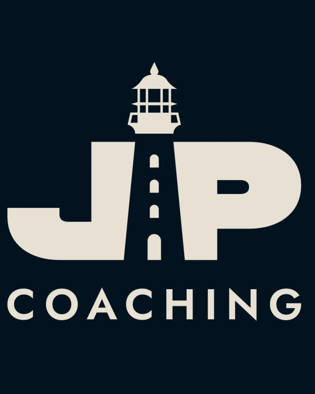
JP COACHING logo review
4.2/5
Logo score
Logo review of

Jp Coaching

A well-executed, distinctive combination mark with relevant symbolism and industry fit. Ready for rollout after minor technical adjustments.

Combination Mark Bold, Modern, Geometric Coaching
4.5/5
Legibility
4.2/5
Originality
4.5/5
Misread
4/5
Balance
4/5
Scale
Action plan

What to fix first

The most important fixes to handle before polishing the full presentation.

1

Simplify lighthouse detail for better small-scale readability.

High priority

Crucial for practical, versatile logo usage.

Impact: Ensures Logo Retains Clarity In All Applications. · Effort: Medium

2

Slightly adjust visual weight to reduce top-heaviness if possible.

Medium priority

Refining distribution can strengthen the mark's professional feel.

Impact: Enhances Overall Visual Balance. · Effort: Low

Detailed review

Logo performance breakdown

4.5/5

Legibility

Checkmark icon 'JP' and 'COACHING' are clear and readable.
Checkmark icon Strong contrast aids visibility.

Warning icon Minor complexity in the lighthouse detail could reduce clarity at small sizes.

4.2/5

Originality

Checkmark icon Unique merging of initials and a lighthouse.
Checkmark icon Relevant metaphor for coaching.

Warning icon Lighthouse-initial integration is creative but not entirely unprecedented.

4/5

Color harmony

Checkmark icon Color pairing is calm and professional.

Warning icon Palette is safe but not particularly distinctive.

Beige
#D3CABB

Navy Blue
#17212B

Your palette is close. Refine the color roles and combinations before updating the logo.

Build brand colors
4/5

Balance alignment

Checkmark icon Central lighthouse structure balances both initials.
Checkmark icon Even spacing in 'COACHING'.

Warning icon Heavy top versus lighter lower area could create slight visual top-heaviness.

logo 200x250 pixels scalability test alignment grid overlay
4/5

Scalability

Checkmark icon Bold shapes maintain integrity at most sizes.
Checkmark icon Simplified overall form.

Warning icon Lighthouse detail may be lost at very small scales.

logo 200x250 pixels scalability test

200x250 px

logo 100x125 pixels scalability test

100×125 px

logo 50x62 pixels scalability test

50×62 px

4.5/5

Misinterpretations

Checkmark icon No clear double meanings or negative space issues.

4.5/5

Logo structure & brief match

Checkmark icon Lighthouse aligns conceptually and visually with the wordmark.

Checkmark icon Symbolism: Lighthouse strongly fits guidance and coaching themes.
Checkmark icon Industry: Visuals and typography are appropriate for a coaching or mentoring business.

Try your own review

Wondering how your logo performs?

Get a clear logo score, key risks, and priority fix ideas before your client or audience sees it.

Review my logo