Concept & direction
A bold, stylized wordmark with geometric letterforms, using negative space and consistent line weight, creating a modern impression.
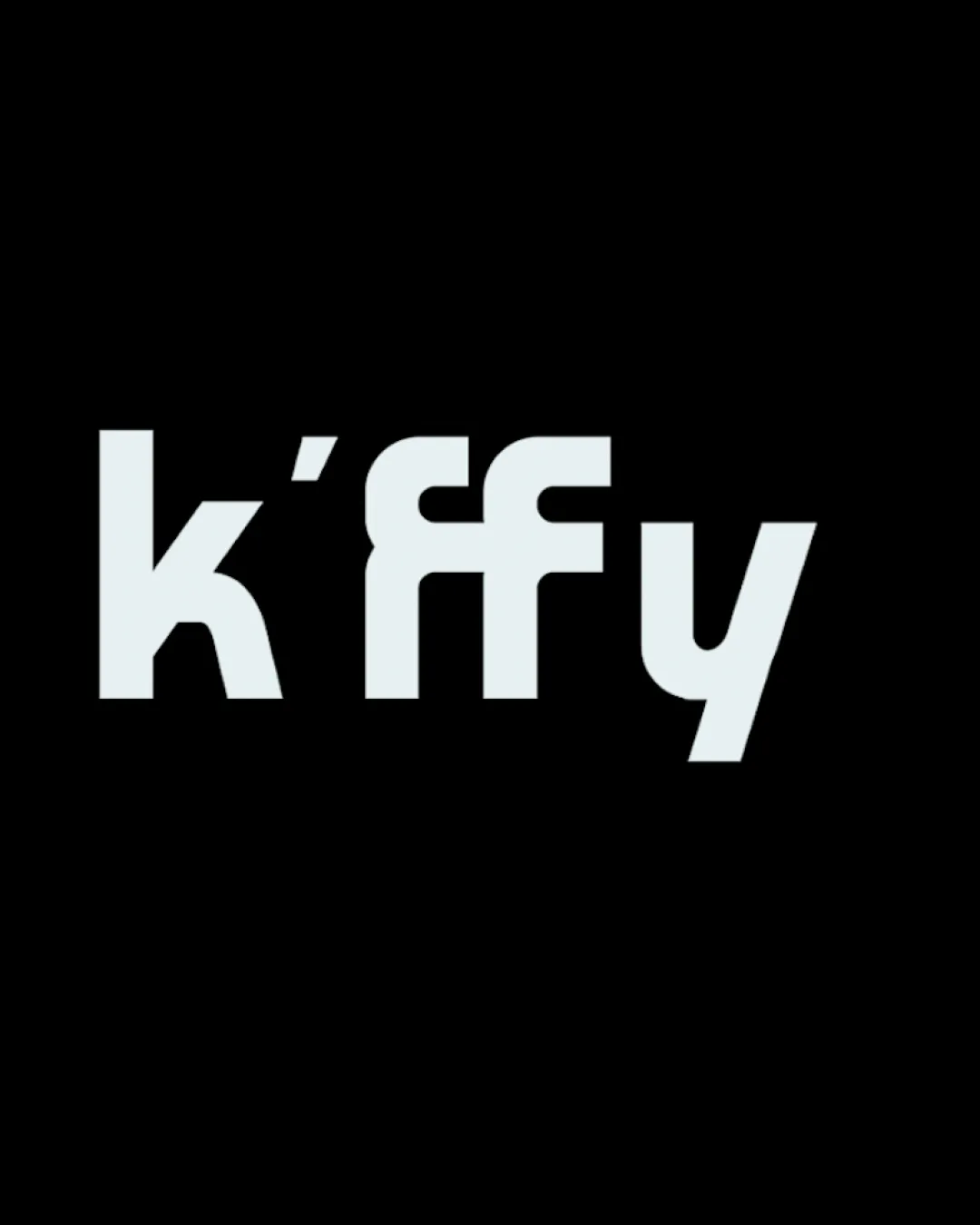
A bold, readable starting point with good geometric presence, but needs kerning refinement and extra uniqueness to become a memorable mark.
Focus on the changes that matter. Keep what makes the logo work.
A bold, stylized wordmark with geometric letterforms, using negative space and consistent line weight, creating a modern impression.
Tight spacing around unique double-f construction causes mild legibility issue.
Improves readability and smoothness of wordmark.
Twin 'f's may blur together; a minor contrast could help without breaking style.
Increases instant recognition of brand name and elevates uniqueness.

Inspect spacing with the guide. Optical balance may differ from geometric centering.
Get a clear logo score, key risks, and priority fix ideas before your client or audience sees it.
More credits needed
Add credits to continue without losing your work.
Then $7/month. Cancel anytime.
Essential logo review with AI
Estimated progress