1
Category Fit
Good fitMeets expectations for real estate professionalism; safe aesthetic.
Unlikely to alienate clients, but may not wow them either.
Strong but needs fine-tuning on details for versatile, premium deployment.
The most important fixes to handle before polishing the full presentation.
Small type will blur or vanish when logo is scaled down.
Impact: Allows Secondary Descriptor To Remain Readable On Business Cards And Digital Uses. · Effort: Low
Currently the visual curvature/styles don't fully align.
Impact: Improves Visual Unity Between Symbol And Main Text. · Effort: Medium
Logo may need to work in monochrome for embossing, faxes, or low-quality printing.
Impact: Ensures Logo Is Effective On All Substrates And Printing Scenarios. · Effort: Low
![]() Main wordmark 'Keystone Group' is highly readable with clear serif typography.
Main wordmark 'Keystone Group' is highly readable with clear serif typography.
![]() 'REAL ESTATE' in small caps may lose clarity at very small sizes.
'REAL ESTATE' in small caps may lose clarity at very small sizes.
![]() Custom monogram arrangement offers some distinctiveness.
Custom monogram arrangement offers some distinctiveness.
![]() Serif wordmark and stacked monogram are fairly common in real estate.
Serif wordmark and stacked monogram are fairly common in real estate.
![]() Muted gold and navy create a trustworthy, classic palette.
Muted gold and navy create a trustworthy, classic palette.
![]() Palette may feel expected for the category and less distinctive.
Palette may feel expected for the category and less distinctive.
LightGold
#BAA271
Navy
#1A2952
Your palette is close. Explore sharper color combinations with Colorfly.design before updating the logo.
Explore palettes![]() Good optical centering and vertical hierarchy; monogram and wordmark are well aligned.
Good optical centering and vertical hierarchy; monogram and wordmark are well aligned.
![]() 'REAL ESTATE' line feels slightly undersized compared to the main lockup.
'REAL ESTATE' line feels slightly undersized compared to the main lockup.

![]() Monogram is contained and simple enough for resizing.
Monogram is contained and simple enough for resizing.
![]() Thin detailing and letter spacing in 'REAL ESTATE' could get lost at small scales; gold color might lose contrast on light backgrounds.
Thin detailing and letter spacing in 'REAL ESTATE' could get lost at small scales; gold color might lose contrast on light backgrounds.
200x250 px
100×125 px
50×62 px
![]() No obvious negative or inappropriate visual readings.
No obvious negative or inappropriate visual readings.
![]() Monogram and wordmark share classic serif characteristics for cohesive feel.
Monogram and wordmark share classic serif characteristics for cohesive feel.
![]() Minor stylistic mismatch between monogram curvature and sharper wordmark edges.
Minor stylistic mismatch between monogram curvature and sharper wordmark edges.
![]() Industry Alignment: Classic serif font and sophisticated palette fit real estate professional context.
Industry Alignment: Classic serif font and sophisticated palette fit real estate professional context.
![]() Trustworthiness: Color and typography choices support a perception of reliability and prestige.
Trustworthiness: Color and typography choices support a perception of reliability and prestige.
Adequate category alignment with moderate risk of blending in.
Design fits real estate norms but does not clearly stand out from similar marks; potential for greater market distinction exists with further monogram refinement or bolder palette variation.
Meets expectations for real estate professionalism; safe aesthetic.
Unlikely to alienate clients, but may not wow them either.
Common monogram/serif approach is familiar in sector.
Could be mistaken for similar brands unless monogram details or colors push further.
Trusted, established, premium-feeling.
Signals stability and experience, fitting for the industry.
Where the logo is ready to use, where it needs adjustment, and where it may break in real applications.
Full lockup is clear and distinguished at standard web sizes.
Monogram is distinctive when used by itself.
Must verify all elements maintain clarity and contrast in monochrome contexts.
Monogram works alone but 'REAL ESTATE' won't be legible.
Logo will reproduce well in print, but tagline may require adjustment for large signage.
A practical checklist of the logo versions to prepare before sending the final files to a client or team.
Core logo lockup for most uses.
Essential for icons, avatars, and tight spaces.
Needed for printing, signage, and promotional products.
Useful where symbol is redundant or tiny.
Ensures flexibility on dark backgrounds.
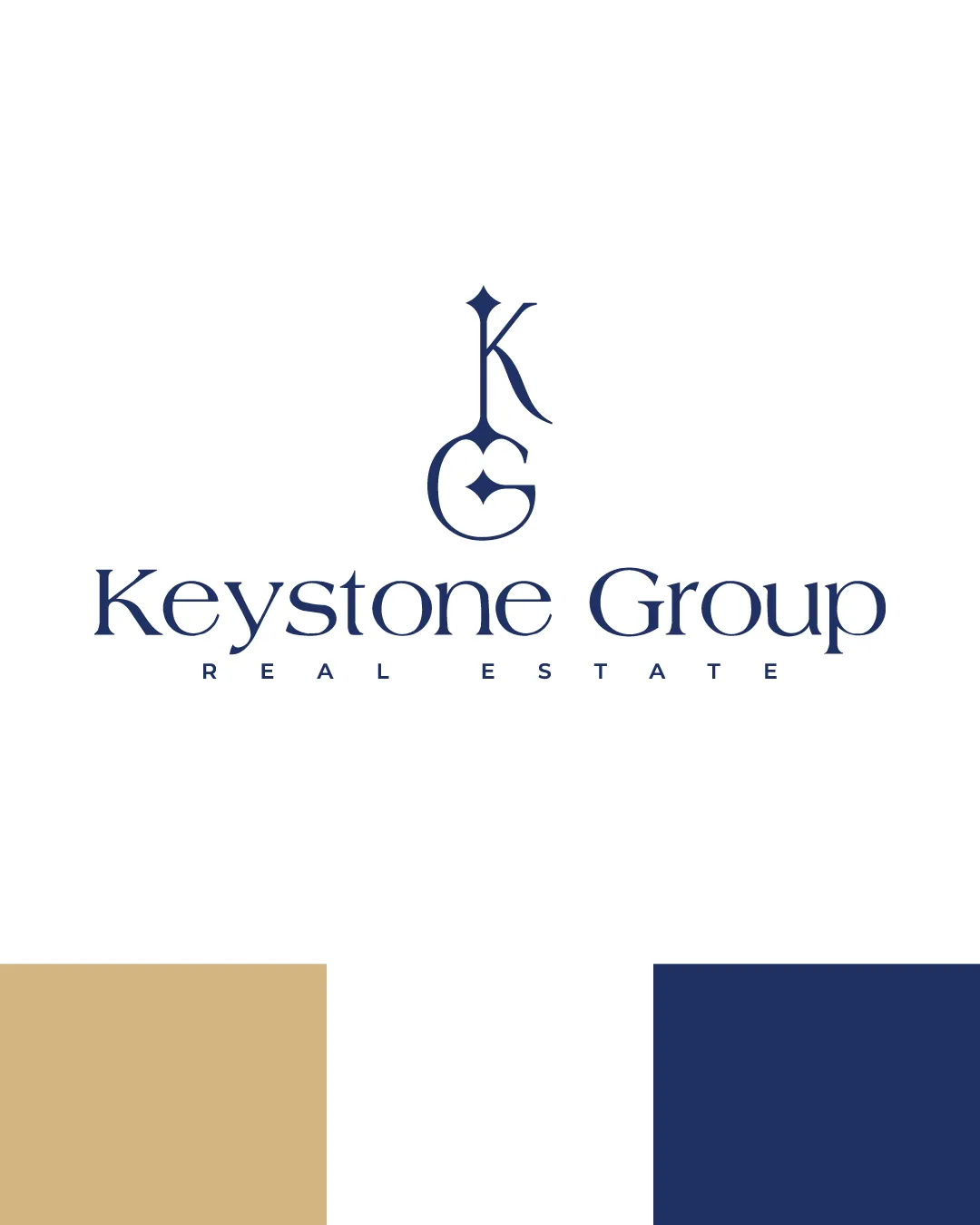
The logo features a classic serif wordmark 'Keystone Group' with an architecturally-inspired, stacked 'KG' monogram above, and a small-cap 'REAL ESTATE' descriptor underneath.
'Keystone Group' is set in an elegant serif typeface that balances approachability with premium gravitas.
The 'KG' monogram is vertically stacked, interlocking, and geometric, referencing both keystone architecture and luxury branding motifs.
The brand iconography uses a muted gold (#BAA271) and deep navy (#1A2952) to evoke trust, sophistication, and stability.
A premium, professional brand mark blending heritage-inspired monogram styling with modern real estate confidence.
The serif wordmark establishes trust and stability, resonating with traditional values in real estate.
The KG monogram provides a memorable, versatile visual symbol for signage and marketing.
Get a clear logo score, key risks, and priority fix ideas before your client or audience sees it.


