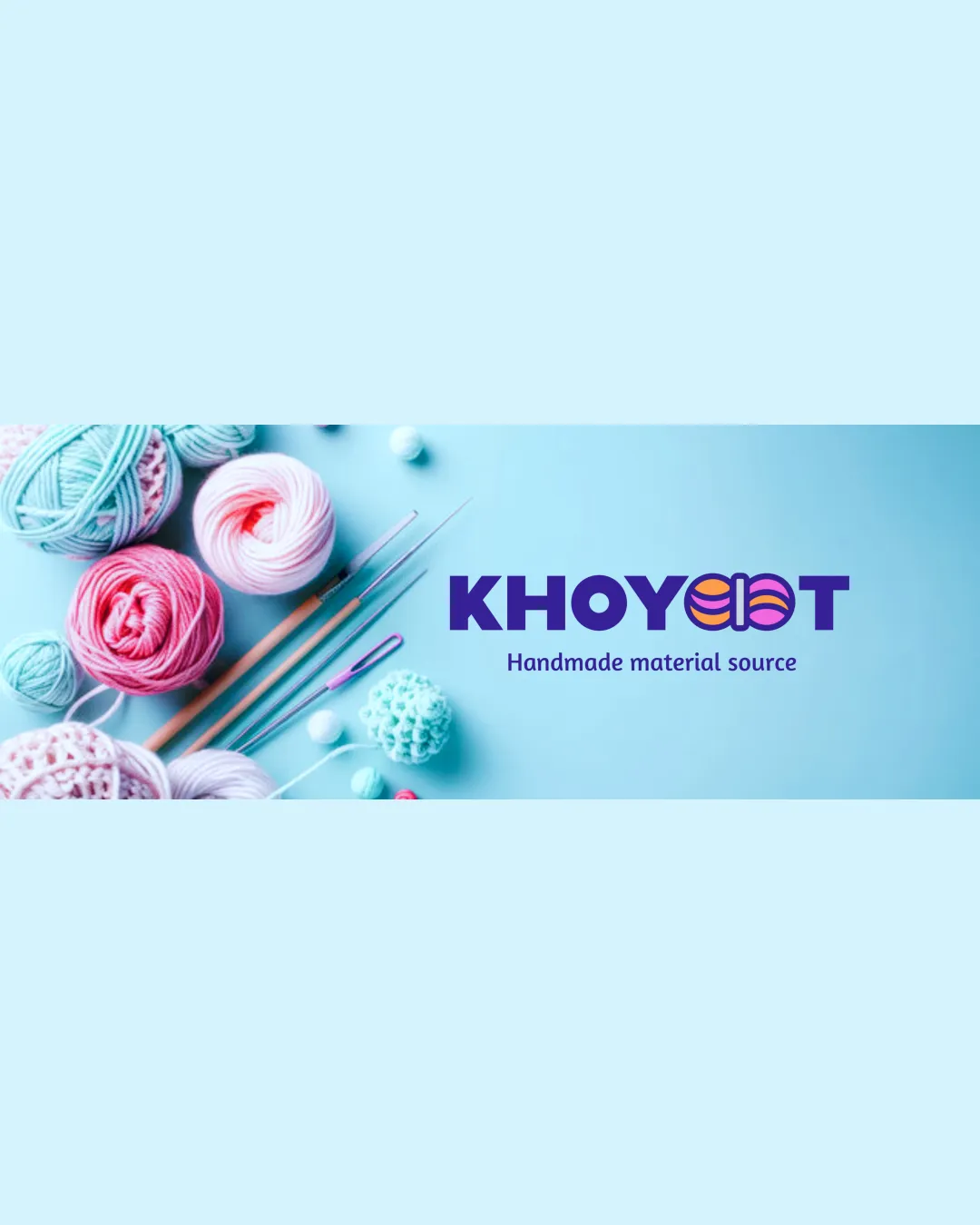
KHOYOOT Handmade material source logo review
4/5
Logo score
Logo review of

Khoyoot Handmade Material Source

Distinctive and relevant, with an inviting craft character. Recommend final tweaks on symbol simplification for maximum versatility.

Combination Mark Modern, Playful, Crafty Handmade Crafts
4/5
Legibility
4/5
Originality
5/5
Misread
4/5
Balance
3.5/5
Scale
Your next steps

What to fix first

Focus on the changes that matter. Keep what makes the logo work.

1

Test logo at small sizes and simplify yarn-ball detail if needed.

High priority Medium effort

Key symbol clarity is crucial for merchandise and small applications.

Prevents detail loss and ensures recognition at all scales.
Detailed review

Logo performance breakdown

Not scored

Brief & logo match

From the original review
  • Handmade Threads Material Source

    Logo clearly represents handmade yarn and crafts; visually aligns with core audience.

4/5

Legibility

  • Main wordmark is bold and readable.
  • Tagline is clear in sufficient size contexts.
  • Yarn-ball motif slightly reduces instant recognition of double 'O'.
4/5

Originality

  • Creative yarn integration into wordmark.
  • Distinct for craft materials segment.
  • Yarn-ball in text is a moderately common handmade logo motif.
4/5

Color harmony

  • Vibrant palette fits handmade/crafty brand personality.
  • Good contrast between logo elements.
  • May not adapt ideally to all backgrounds without a solid or outline version.
Violet#3D2188
Pink#EF5DA8
Orange#FF9D28

Estimated colors. Use the original design file for exact values.

Create a full color palette using these colors

Create new palette

4/5

Balance alignment

  • Well-centered composition.
  • Good proportional spacing between letters and symbol.
  • Tagline size feels slightly small compared to the main wordmark.
Uploaded logoAlignment guide overlay

Inspect spacing with the guide. Optical balance may differ from geometric centering.

3.5/5

Scalability

  • Bold forms generally reproduce well.
  • Yarn-ball detailing in the 'O's could lose clarity at very small sizes.
Uploaded logo at 200 pixels wide
200 × 250 px
Uploaded logo at 100 pixels wide
100 × 125 px
Uploaded logo at 50 pixels wide
50 × 63 px

Compare the detail at different sizes. Labels show the full image dimensions.

5/5

Misinterpretations

  • No confusing or offensive dual readings.
4.5/5

Symbol & text fit

  • Integration of yarn mark with text is cohesive and conceptually relevant.

Black & white

Does the shape still work without color?

These tests are available only for logos uploaded in vector (SVG) format.

Background contrast

Find the surfaces where your logo stays clear.

These tests are available only for logos uploaded in vector (SVG) format.

Blur & silhouette

A 3px blur softens fine details so you can check whether the overall shape stays recognizable. If key gaps close or elements merge, the logo may rely too heavily on detail.

These tests are available only for logos uploaded in vector (SVG) format.

Try your own review

Wondering how your logo performs?

Get a clear logo score, key risks, and priority fix ideas before your client or audience sees it.

Review my logo



