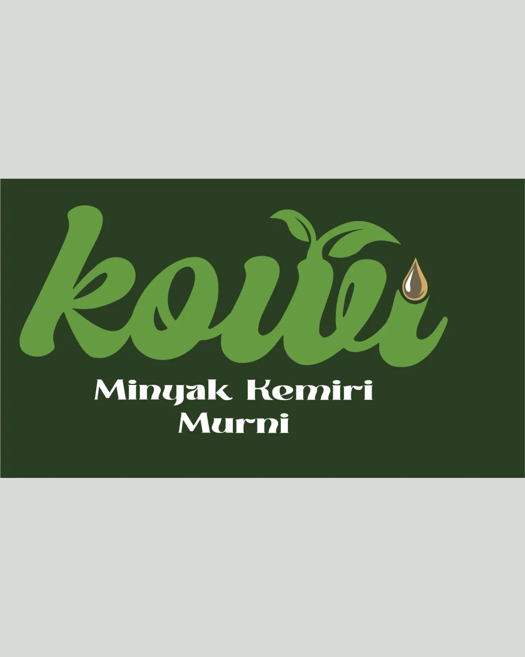
kouii Minyak Kemiri Murni logo review
3.2 / 5
Logo score
Logo review of

Kouii Minyak Kemiri Murni

Solid foundation and concept, but overused graphic tropes and minor execution issues hold back uniqueness and polish.

Objective AI feedback. Your creative decision.

Combination Mark Playful Natural Script With Supporting Text Natural Products
3.5/5
Legibility
3/5
Originality
4/5
Misread
3.5/5
Balance
3/5
Scale
Action plan

What to fix first

The most important fixes to handle before polishing the full presentation.

1

Tighten letter spacing and clarify leaf flourishes for better readability and scaling

High priority

The current script/leaf construction is slightly crowded, affecting quick recognition and scalability.

Impact: Improves Brand Clarity And Logo Effectiveness Across Sizes · Effort: Medium

2

Integrate the oil drop more seamlessly with the wordmark or consider simplifying it

Medium priority

The oil drop is currently a side element rather than feeling fully connected to the primary wordmark.

Impact: Reduces Visual Clutter And Strengthens Holistic Impression · Effort: Medium

Detailed review

Logo performance breakdown

3.5/5

Legibility

Checkmark icon "kouii" is quite readable in the script style
Checkmark icon Supporting text is clear

Warning icon Script font is a bit crowded, especially around 'u' and 'i'
Warning icon Leaf accents slightly interfere with quick reading

3/5

Originality

Checkmark icon Leaf and oil drop additions support the product theme

Warning icon Script with leaves and droplets is a common approach in natural product branding

3.5/5

Color harmony

Checkmark icon Shades of green reinforce natural message
Checkmark icon Brown/yellow oil drop adds differentiation

Warning icon Palette is expected for category
Warning icon Contrast between dark background and tagline could be stronger

Green
#4C7C2B

Dark Green
#1D2E13

Light Brown
#F5C16C

White
#FFFFFF

Your palette is close. Refine the color roles and combinations before updating the logo.

Build brand colors
3.5/5

Balance alignment

Checkmark icon Elements are generally well-proportioned
Checkmark icon Tagline sits clearly below the wordmark

Warning icon Leaf flourishes add some visual heaviness to the top
Warning icon Oil drop feels visually tacked on rather than integrated

logo 200x250 pixels scalability test alignment grid overlay
3/5

Scalability

Checkmark icon Relatively simple forms

Warning icon Leaf shapes and oil drop could lose detail at very small sizes
Warning icon Script weight might blend together if reduced

logo 200x250 pixels scalability test

200x250 px

logo 100x125 pixels scalability test

100×125 px

logo 50x62 pixels scalability test

50×62 px

4/5

Misinterpretations

Checkmark icon No clear alternative readings or problematic shapes

3 / 5

Logo structure & brief match

Checkmark icon Leaves and oil drop tie thematically to main wordmark

Warning icon Oil drop mark feels visually separate rather than holistic

Checkmark icon Category Relevance: Clearly communicates plant-based or natural oil product
Checkmark icon Product Differentiation: Oil drop and leaf are common but do relate directly to the product

Try your own review

Wondering how your logo performs?

Get a clear logo score, key risks, and priority fix ideas before your client or audience sees it.

Review my logo