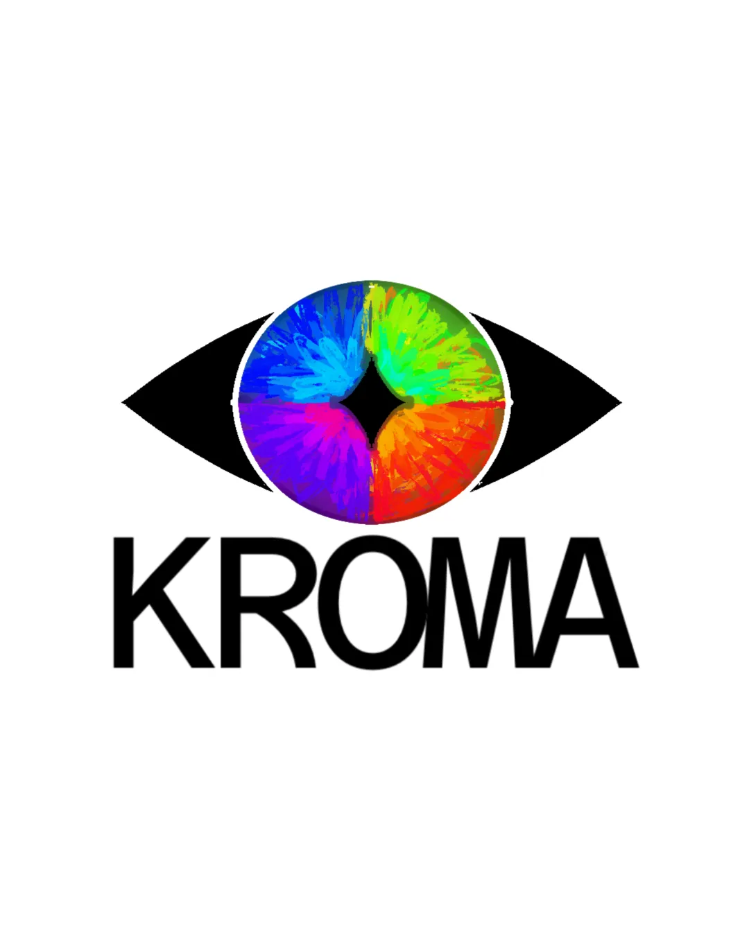
KROMA logo review
4.0 / 5
Logo score
Logo review of

Kroma

Strong creative logo concept, just needs detail and spacing refinement for versatility.

Combination Mark Colorful Abstract Creative Arts
4/5
Legibility
4/5
Originality
4/5
Misread
5/5
Balance
3/5
Scale
Action plan

What to fix first

The most important fixes to handle before polishing the full presentation.

1

Fix possible misinterpretation

High priority

Complex color burst may cause minor visual confusion but not explicit misread
Impact: High · Effort: Medium

2

Simplify the iris/brush stroke detail to improve clarity at small sizes.

High priority

Fine details will blur in small or single-color applications.

Impact: Improves Scalability And Recognizability In More Use Cases. · Effort: Medium

3

Slightly increase letter spacing in 'KROMA' for better legibility.

Medium priority

Current tight spacing reduces quick readability.

Impact: Boosts Clarity, Especially On Small Formats And Digital Use. · Effort: Low

Detailed review

Logo performance breakdown

4/5

Legibility

Checkmark icon Text 'KROMA' is bold and easy to read

Warning icon Letter spacing is a bit tight, could affect clarity at small sizes

4/5

Originality

Checkmark icon Creative use of color and brush textures in the eye

Warning icon Eye as a motif is somewhat common in creative industries

4/5

Color harmony

Checkmark icon Rainbow palette is vibrant and fitting for creative context

Warning icon Full spectrum can feel visually aggressive if not balanced carefully

Black
#000000

Blue
#2576E1

Green
#23C33A

Red
#E62C2C

Yellow
#F7D237

Orange
#F07F2F

Purple
#8929C9

Your palette is close. Refine the color roles and combinations before updating the logo.

Build brand colors
5/5

Balance alignment

Checkmark icon Well-centered composition
Checkmark icon Mark and wordmark are visually balanced

logo 200x250 pixels scalability test alignment grid overlay
3/5

Scalability

Checkmark icon Large shapes and thick lines aid scalability

Warning icon Detail in the iris may get lost or muddy at small sizes

logo 200x250 pixels scalability test

200x250 px

logo 100x125 pixels scalability test

100×125 px

logo 50x62 pixels scalability test

50×62 px

4/5

Misinterpretations

Checkmark icon No inappropriate shapes detected

Warning icon Complex color burst may cause minor visual confusion but not explicit misread

5 / 5

Logo structure & brief match

Checkmark icon Both elements complement, emphasizing the brand's likely focus on color or vision

Checkmark icon Detected Industry: The vibrant, colorful eye and bold wordmark are suitable for a creative arts or visual industry brand.

Try your own review

Wondering how your logo performs?

Get a clear logo score, key risks, and priority fix ideas before your client or audience sees it.

Review my logo