Refine letter placement and integration with the eagle.
Current placement distracts and reduces overall clarity of the monogram.
Improved legibility and unified design.
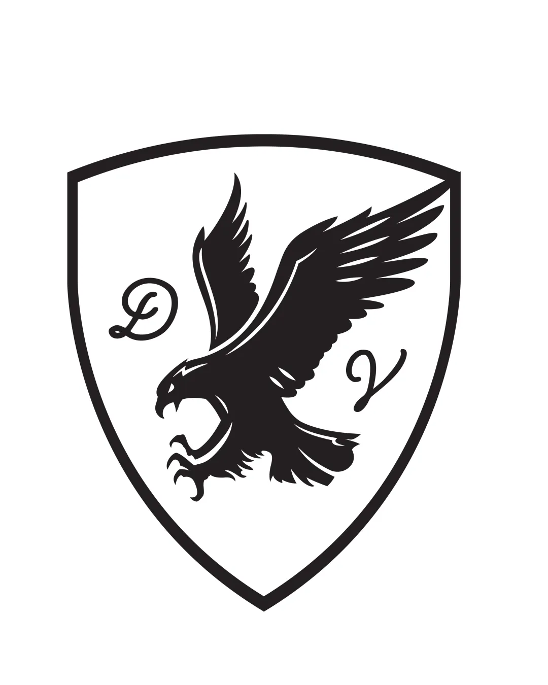
Solid construction and classic presence, but lacks distinctiveness and clear letter integration to be exceptional.
Focus on the changes that matter. Keep what makes the logo work.
Current placement distracts and reduces overall clarity of the monogram.
Improved legibility and unified design.
Crested eagle shields are generic; a unique trait would help the logo stand out.
Greater brand distinctiveness and memorability.
Matches traditional industries needing a badge-like authority (sports, security, prestige).

Inspect spacing with the guide. Optical balance may differ from geometric centering.
Get a clear logo score, key risks, and priority fix ideas before your client or audience sees it.
More credits needed
Add credits to continue without losing your work.
Then $7/month. Cancel anytime.
AI logo review
Estimated progress