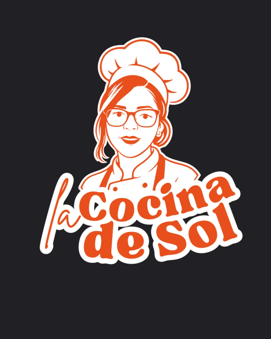
la Cocina de Sol logo review
4/5
Logo score
Logo review of

La Cocina De Sol

A strong, inviting mascot logo with minor scalability and alignment refinements needed for wider use.

Mascot + Wordmark Retro Illustrative, Friendly, Bold Food/restaurant
4/5
Legibility
4/5
Originality
5/5
Misread
4/5
Balance
3/5
Scale
Your next steps

What to fix first

Focus on the changes that matter. Keep what makes the logo work.

1

mascot

Test reduced-size versions and simplify details if necessary.

Visible issue High priority Medium effort
Area to inspectApproximate location

Illustrated face and small features in the chef may lose clarity at small sizes.

How to check

Verify legibility and brand recognition at small logo sizes.

See the category review
2

wordmark

Subtly tune wordmark alignment and interaction for improved visual harmony.

Optional refinement Medium priority Low effort
Area to inspectApproximate location

The energetic, playful typography overlaps and interacts dynamically with the mascot, but the baseline isn't perfectly controlled, which could reduce polish.

How to check

Visually confirm smoother alignment especially between initial 'la' and the main text block.

See the category review
Detailed review

Logo performance breakdown

4/5

Brief & logo match

Based on your brief
Compared with

cocina oculta, comidas como arepas, empanadas y hamburguesas gourmet

Successfully conveys a hidden kitchen with artisanal, gourmet food through a warm mascot and bold type.

  • Chef/food Personality

    Mascot reinforces the personal, handmade quality of a cocina oculta.

  • Warm, Gourmet Appeal

    Handwritten and bold typography with orange hues communicates friendliness and approachability, aligning with gourmet comfort food offerings.

4/5

Legibility

  • Bold, friendly wordmark is highly readable.
4/5

Originality

  • Personal chef mascot offers memorable, custom character.
4/5

Color harmony

  • Warm color palette feels inviting and fits food theme.
Orange#F24E1E
White#FFFFFF
Black#292929

Estimated colors. Use the original design file for exact values.

Create a full color palette using these colors

Create new palette
4/5

Balance alignment

  • Organic wordmark-mascot placement adds energy.
  • The energetic, playful typography overlaps and interacts dynamically with the mascot, but the baseline isn't perfectly controlled, which could reduce polish.

    Optional refinement wordmark

    Try: Subtly tune wordmark alignment and interaction for improved visual harmony.

    Check: Visually confirm smoother alignment especially between initial 'la' and the main text block.

    Area to inspectApproximate location
Uploaded logoAlignment guide overlay

Inspect spacing with the guide. Optical balance may differ from geometric centering.

3/5

Scalability

  • Large elements and outlines help at moderate sizes.
  • Illustrated face and small features in the chef may lose clarity at small sizes.

    Visible issue mascot

    Try: Test reduced-size versions and simplify details if necessary.

    Check: Verify legibility and brand recognition at small logo sizes.
    Area to inspectApproximate location
Uploaded logo at 200 pixels wide
200 × 250 px
Uploaded logo at 100 pixels wide
100 × 125 px
Uploaded logo at 50 pixels wide
50 × 63 px

Compare the detail at different sizes. Labels show the full image dimensions.

5/5

Misinterpretations

  • No unintended readings present.
4/5

Symbol & text fit

  • Mascot and typography feel cohesive in style and intent.

Black & white

Does the shape still work without color?

These tests are available only for logos uploaded in vector (SVG) format.

Background contrast

Find the surfaces where your logo stays clear.

These tests are available only for logos uploaded in vector (SVG) format.

Blur & silhouette

A 3px blur softens fine details so you can check whether the overall shape stays recognizable. If key gaps close or elements merge, the logo may rely too heavily on detail.

These tests are available only for logos uploaded in vector (SVG) format.

Try your own review

Wondering how your logo performs?

Get a clear logo score, key risks, and priority fix ideas before your client or audience sees it.

Review my logo